Over the last year, we’ve been working on a new interactive tool for urban data exploration. The tool will allow you to analyze existing site conditions, measure urban indicators, and perform location analysis — directly in the browser.
We are happy to share that after months of design and development, Morphocode Explorer is approaching its beta launch! You can watch the video preview here:
Morphocode Explorer: Video Preview
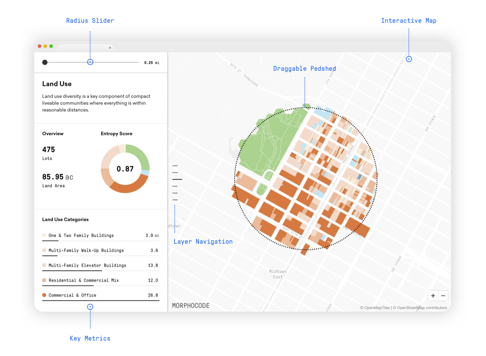
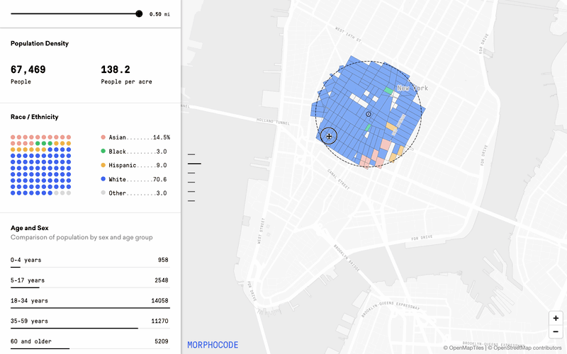
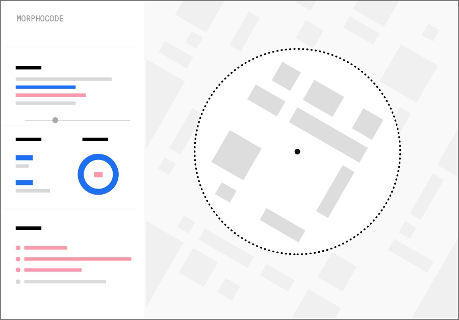
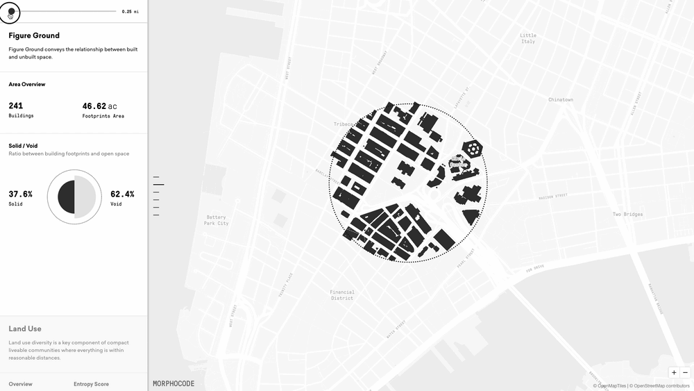
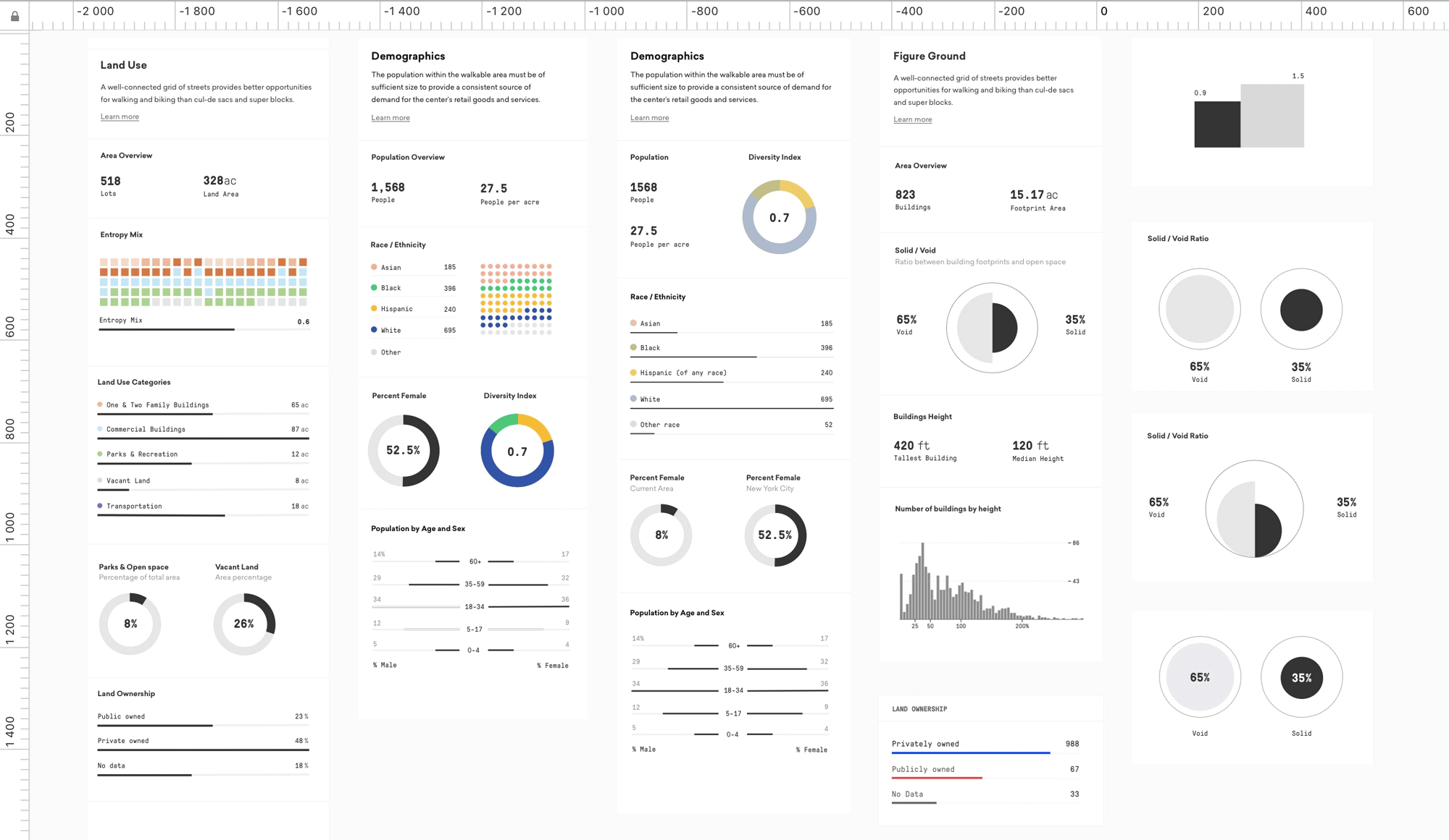
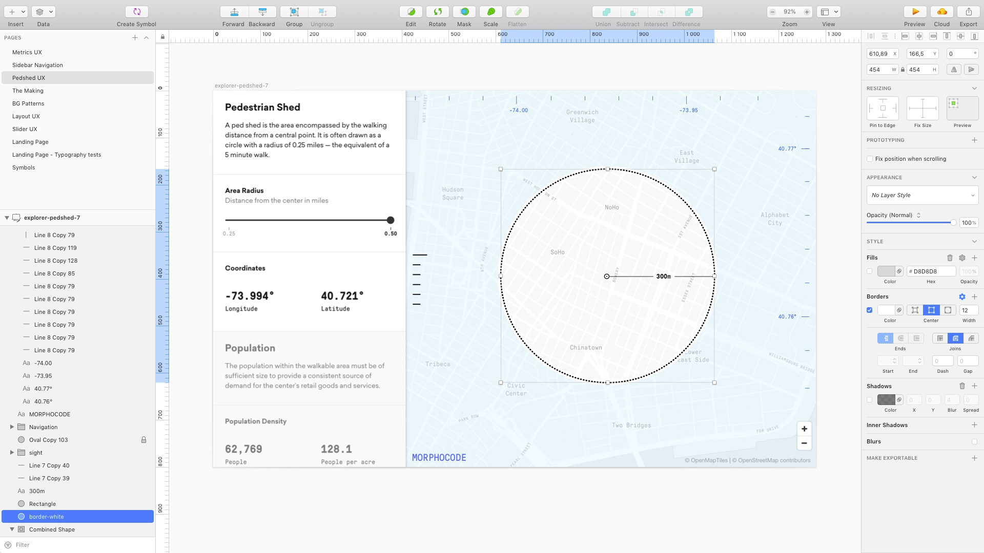
The interface combines a map and a sidebar containing various urban indicators. The metrics are organized into separate layers: land use, development intensity, transit network, demographics, and figure-ground.
You can scroll through the sidebar to switch between the layers and explore the various charts and data visualizations. Dragging the interactive pedshed updates the metrics in real-time and gives you instant location insights.
To make this work, we had to develop a custom web application from the ground up. In this story, we share with you some of the design challenges and lessons learned along the way.
From idea to implementation
The workflow consists of three main tasks: designing the user experience, transforming the various raw datasets into a compressed data format, and developing the “live” functionality using HTML, CSS, and JavaScript.
In the initial phase, we rely on pen and paper and design mock-ups to test various ideas on how to organize the interface:
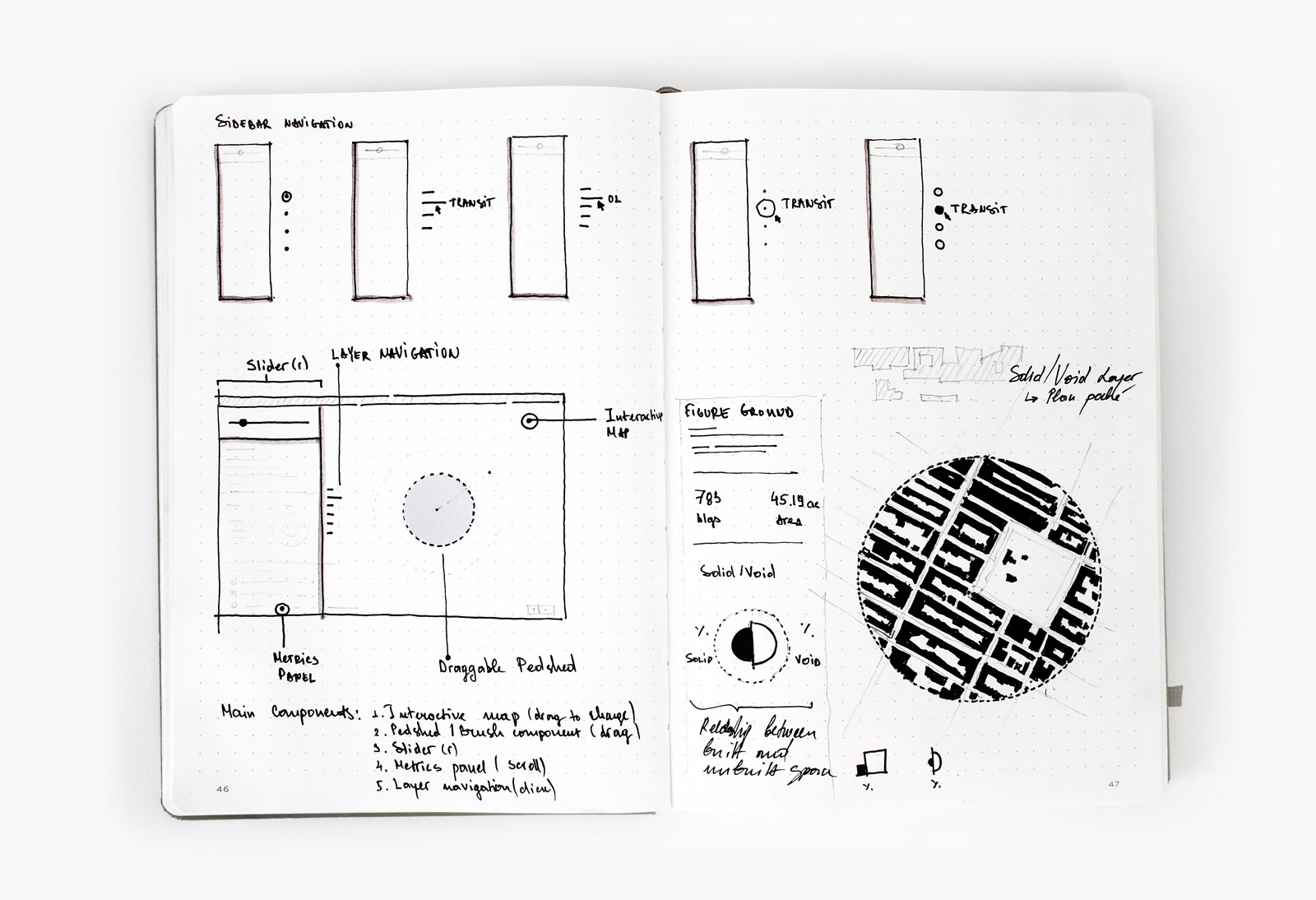
As Dieter Rams famously said, “Good design is as little design as possible.” So it is essential to identify the main user interactions early on and put them at the core of the tool.
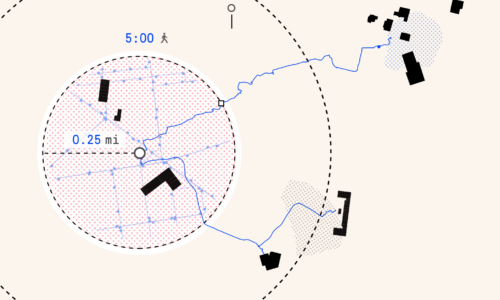
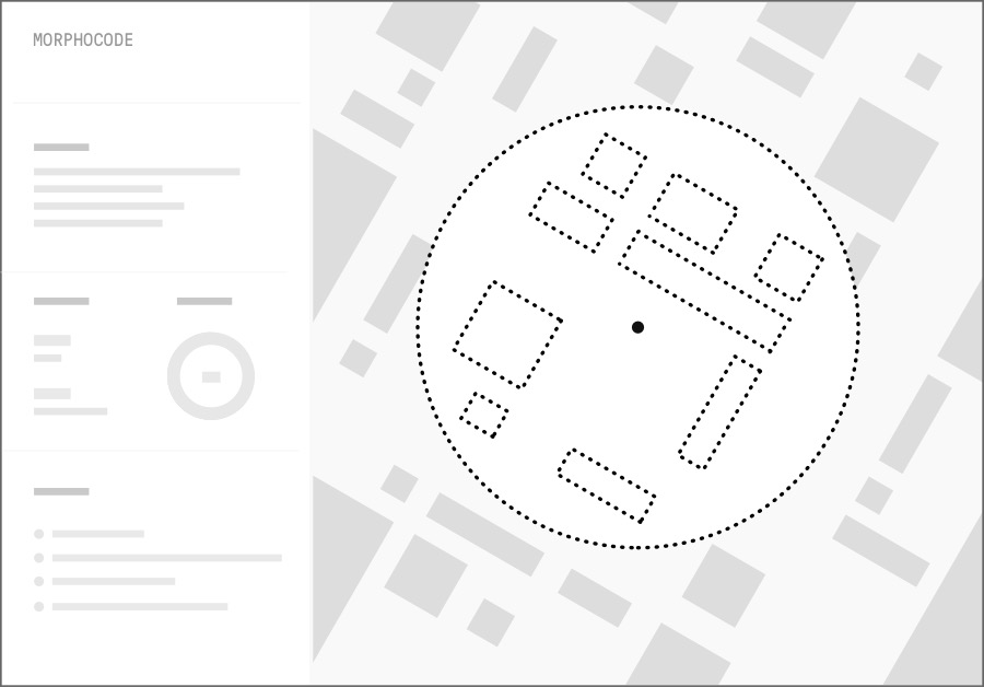
In Morphocode Explorer, you can drag the circular pedshed to select a particular location on the map, while the sticky slider in the sidebar lets you quickly adjust the radius of the selected area.
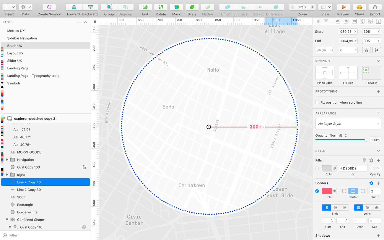
We also experimented with various data visualization typologies for displaying the metrics. The main goal was to provide a consistent visual language and avoid cluttering the sidebar with too much information.
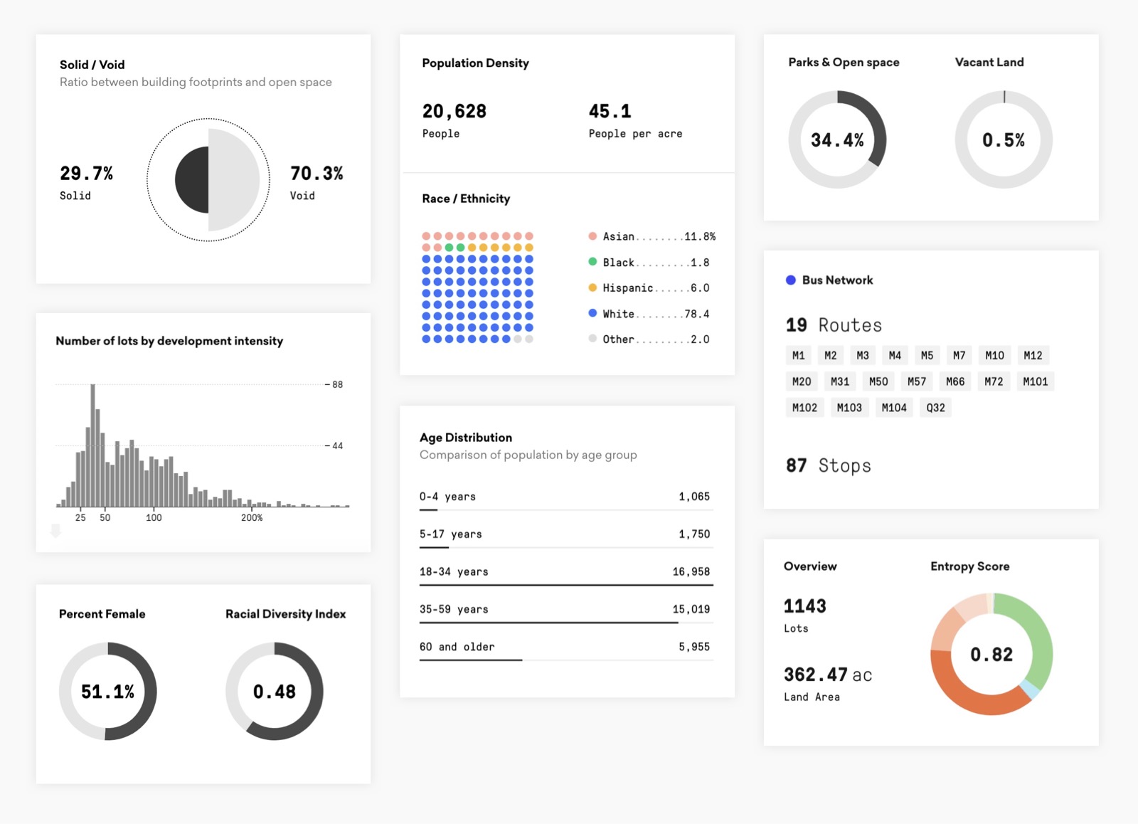
To provide a rich visual experience and create a sense of discovery, we ended up designing various charts, including proportional area charts, histograms, donut charts, bar charts, and dot matrixes.
The Challenge
Traditionally, location analysis is done on the desktop using GIS and statistical applications such as ArcGIS, QGIS, and RStudio. These applications are more powerful than the browser when it comes to crunching large amounts of data and performing spatial analysis.
Analyzing large datasets in the browser is possible, but there’s a “catch” — the heavy computations must be offloaded to a remote database that is powerful enough to make the analysis. For example, the web platforms OmniSci and Kinetica run on top of powerful GPU-based engines, Carto uses PostgreSQL under the hood, while the ArcGIS API lets you query an ArcGIS server.
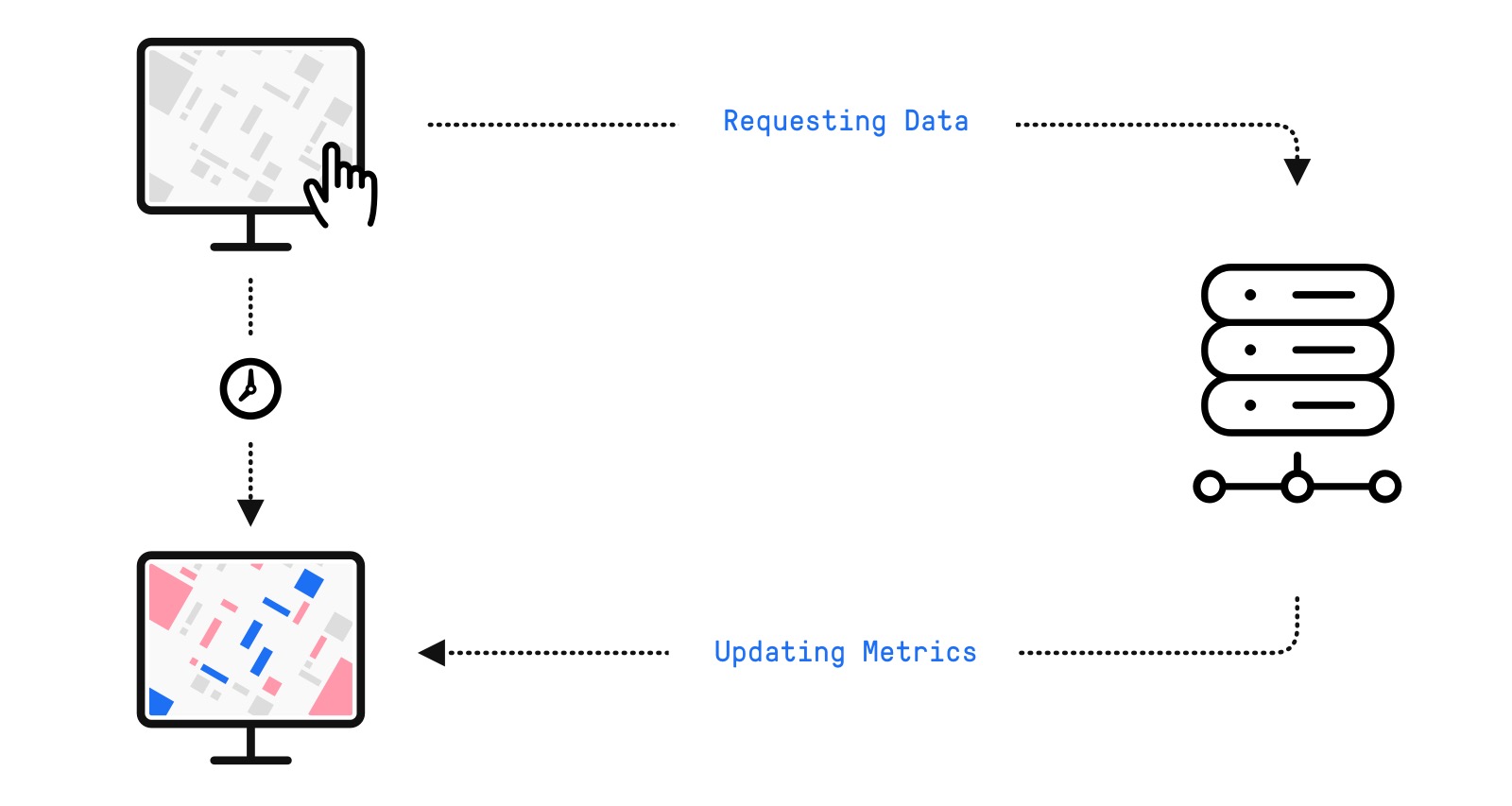
This client-server architecture lets you scale your analysis to billions of data points. The downside is that your browser needs to continuously make requests to the server. This causes a noticeable delay between dragging the pedshed and updating the metrics.
Real-time interaction
To achieve real-time interaction the data analysis must happen in the browser. This approach removes the delay associated with client-server communication.
The algorithm has three steps:
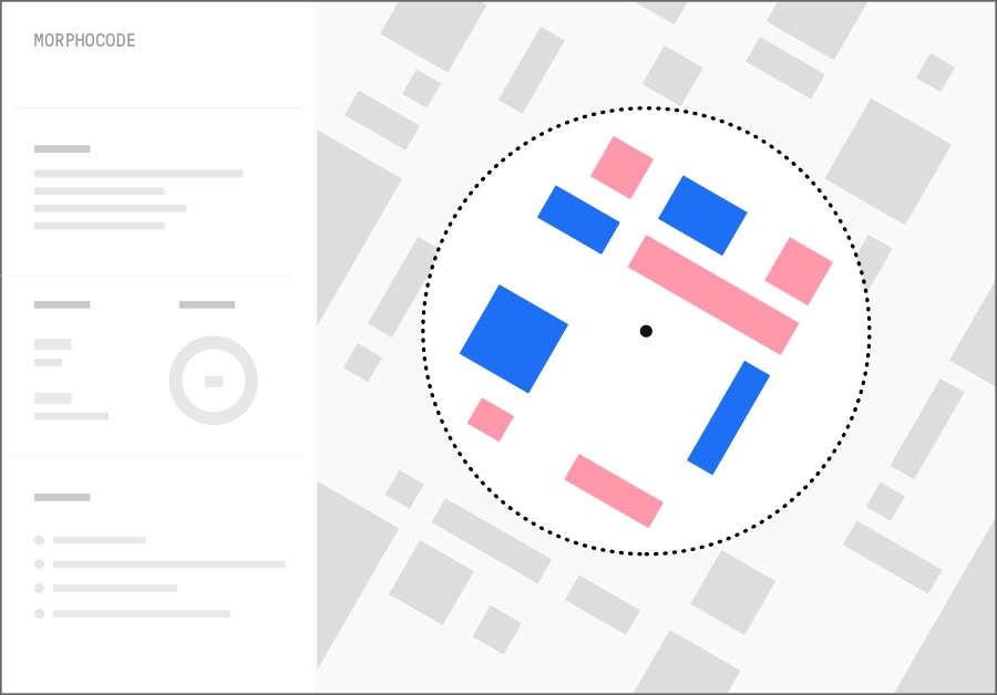
- Find all features (lots, buildings, census blocks, etc.) within the area
- Draw only the selected features
- Calculate the metrics and update the charts with the new data
Performance issues
When you drag the pedshed or pan the map, the browser updates the interface. This process should run at 60 frames per second to provide a smooth user experience.
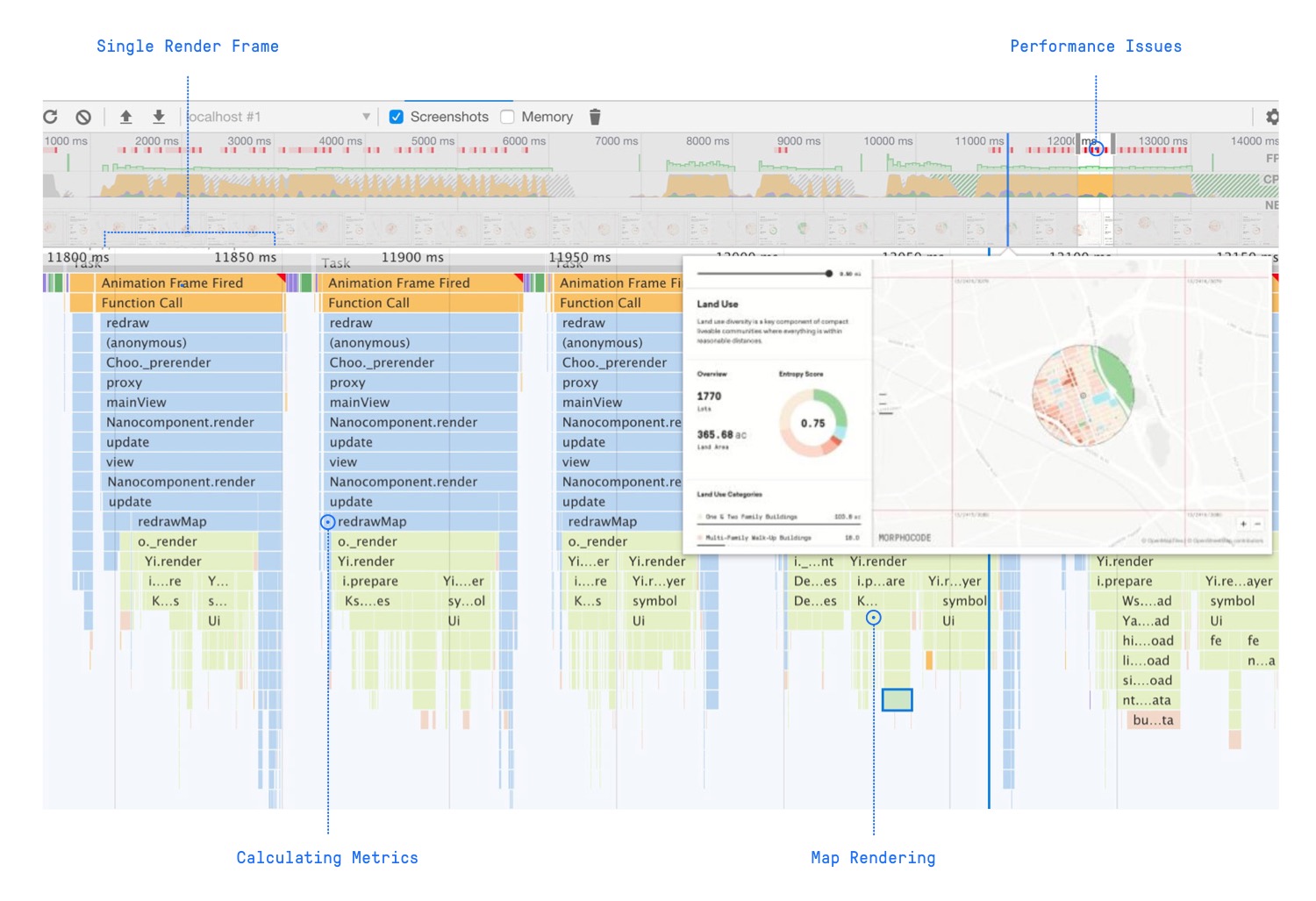
For each frame, the browser runs multiple tasks: it moves the pedshed to a new location, finds the features within the boundary, calculates the metrics, and redraws the map.
To keep the interaction smooth, you need to analyze how these operations perform and minimize the time required to render a single frame.
Fast data exploration
Finding the features within the study area is the first thing that happens when you change the radius or the location. This is a geospatial operation known as a spatial query.
To speed up the query, Morphocode Explorer checks whether the geometric center of each feature (building, lot, station, etc.) is within the boundary of the circular buffer.
Morphocode Explorer uses the open-source library mapbox-gl-js to render the map. The library is extremely fast because it draws the features using WebGL.
Nevertheless, updating thousands of features while dragging the pedshed presents a particular challenge. We ended up customizing how mapbox-gl-js works under the hood to speed up the rendering algorithm.
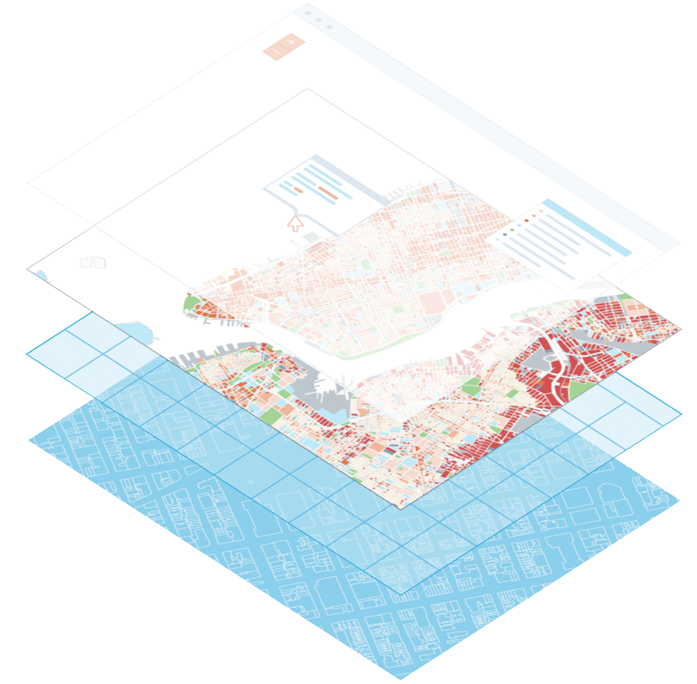
The data pipeline
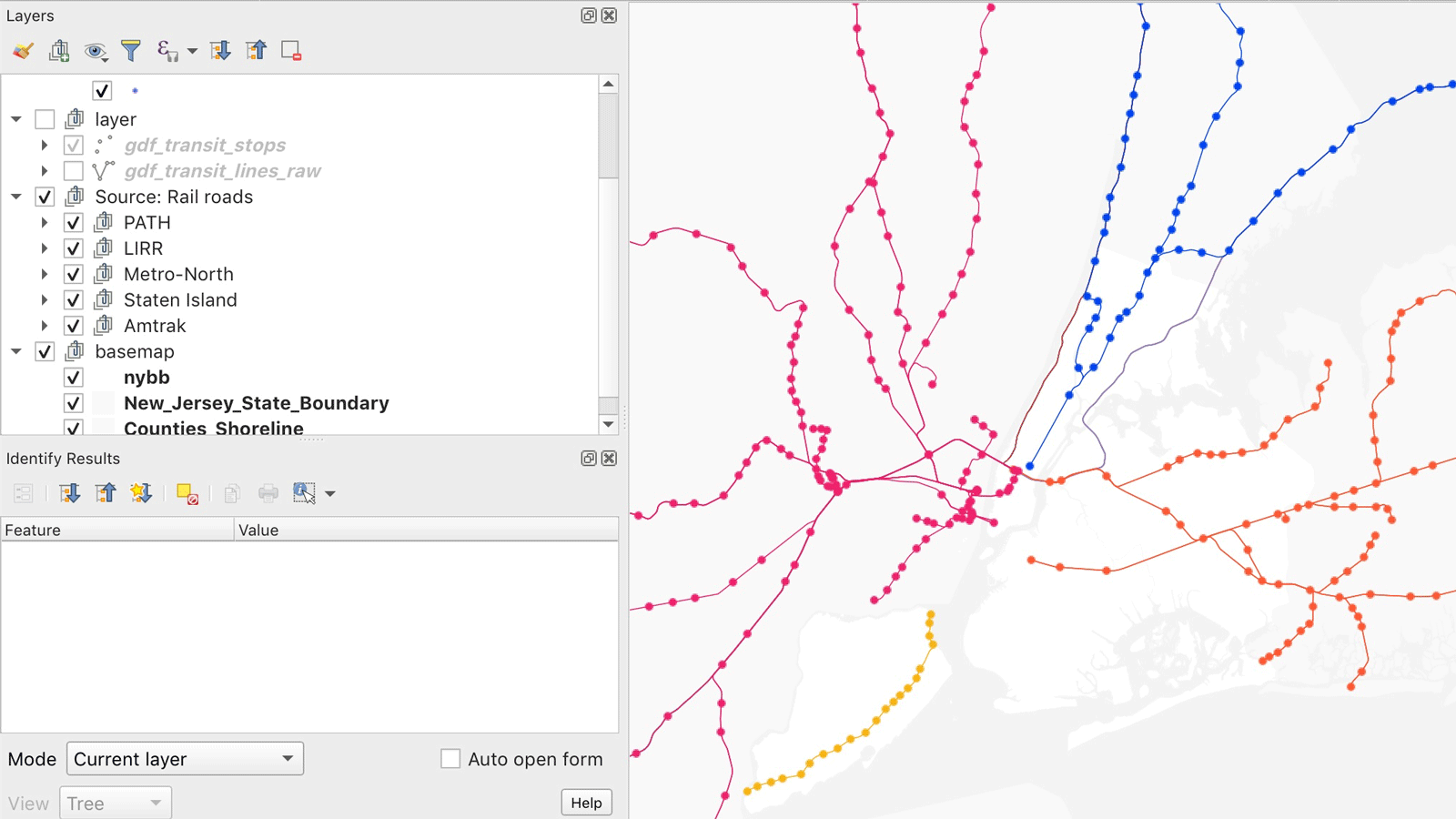
At the core of Morphocode Explorer are various datasets: census data, tax lot information, transit routes, building footprints, etc. These datasets are acquired from multiple sources and come in a variety of file formats.
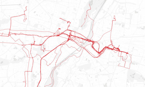
For example, the Transit Network layer is composed of over 15 different datasets — the subway lines are extracted from a static GTFS feed provided by MTA, the New Jersey railroads are published as a shapefile, the Staten Island railroad is extracted from the LION dataset, while the Amtrak routes are retrieved from OpenStreetMap.
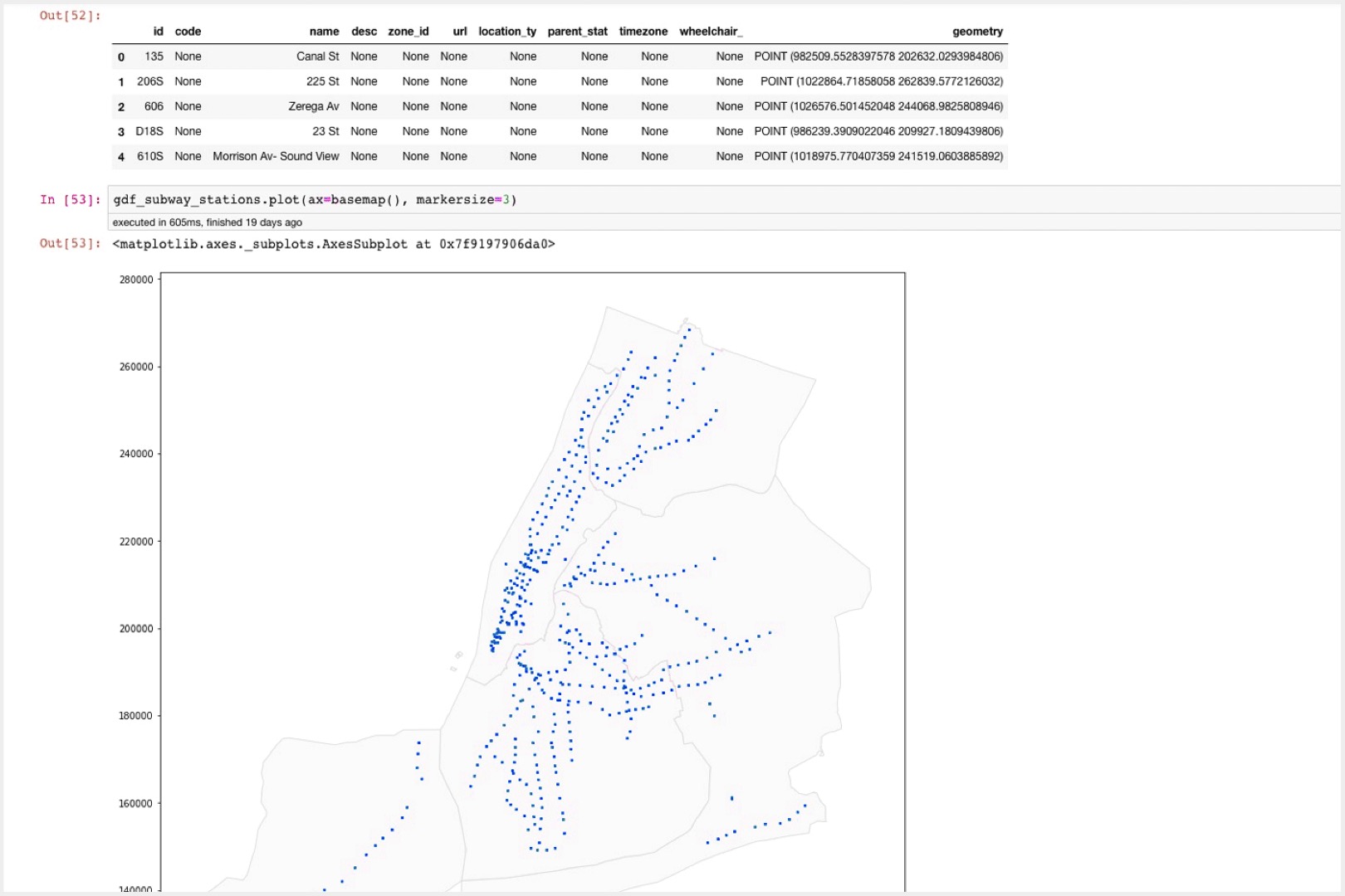
We use python and jupyter notebooks to clean, transform, merge and refine the datasets. This approach helps document and automate data processing.
The notebooks are organized in a sequence and form a data pipeline that takes raw data as input and produces web-friendly map tiles as output.

Visual Design
Good design introduces a clear visual hierarchy that guides the eye and brings attention to the most important elements of the interface. You can use typography, color, and negative space to create contrast and group related elements together.
Before building the “live” interactive charts and map layers, we design multiple mock-ups. These visual experiments provide quick feedback and let us compare different layouts, font families, and color palettes.
Exploring different design options
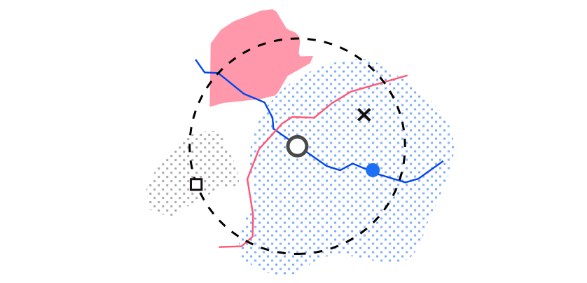
When designing data visualizations, color plays an important role – it is a visual variable that encodes data values. For example, on a land-use map, different colors encode land use categories, while on a transit map they represent modes of transportation.
It is usually a good idea to keep the surrounding interface visually neutral and let the data “pop.” This can be achieved by keeping the UI elements monochrome and using black as a primary accent color.
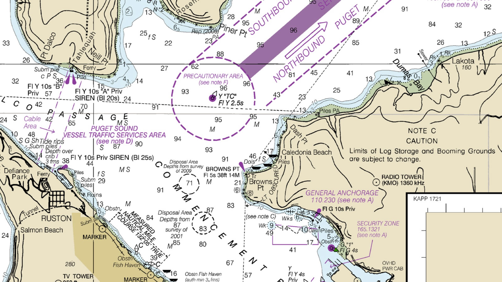
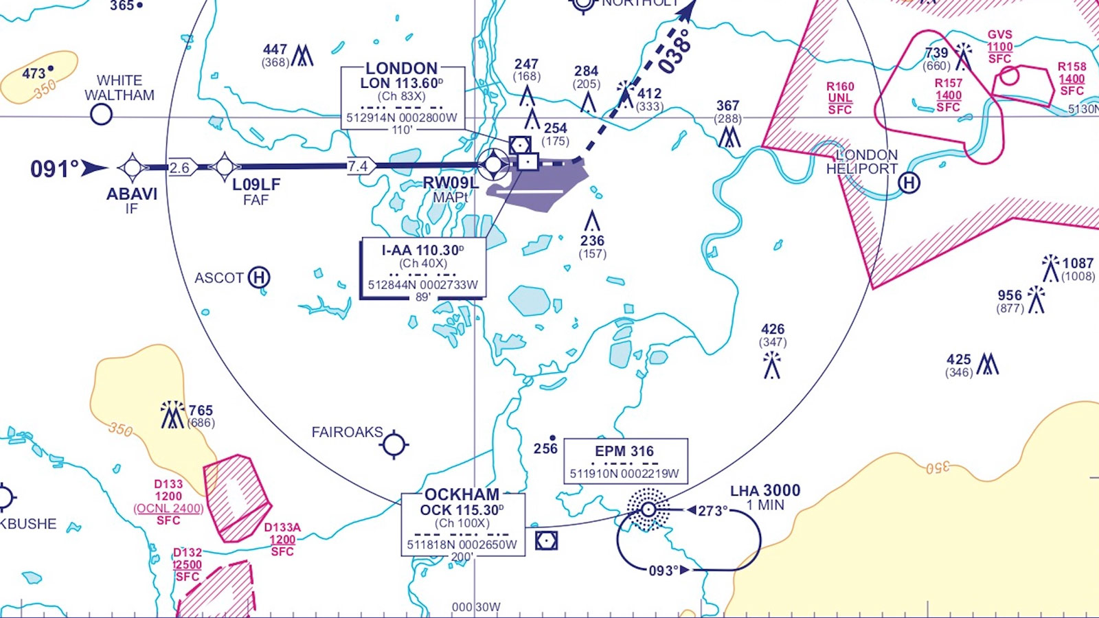
Design Inspiration. Aeronautical charts were a great source of inspiration while designing the interface of the tool. They are a special type of map, designed to assist pilots. These maps help them determine the position of the aircraft, choose the best course to a destination, or a safe landing area in case of an emergency.
Bring focus to your analysis
We are very excited about the launch of Morphocode Explorer! The tool’s exploratory interface will allow planning professionals, architects, and analysts to do spatial research faster than ever.
While the beta version is launching with several map layers for New York City, Morphocode Explorer can be customized to meet specific requirements. The number of metrics and map layers can be expanded with additional topics and data visualization components.
You can subscribe below to get notified about the release!
Join the beta!
Mapping Urban Data
We have launched our first video course Mapping Urban Data. It contains 30 carefully organized and beautifully illustrated videos that will lay a solid foundation for your mapping skills.
Learn More