Pedestrian activity is a direct reflection of the city’s livability and vibrancy. The variety of factors inclining our travelling preferences in favour of walking, range from access to transit and population density to perceived pedestrian safety and street design. Currently, there isn’t a standard approach to measuring walkability. Nevertheless, it is a common belief that a compact and well-connected urban environment, offering a diverse mixture of uses is fundamental to get people to walk.
According to Jeff Speck‘s “General Theory of Walkability“, the first thing you need to do is offer citizens a reason to walk and then make the walk safe, comfortable and interesting. Julie Campoli, an other urban designer with a passion for walkable cities, believes that there are six key elements to the perfect pedestrian environment: Design; Diversity; Density; Distance to Transit; Destination Accessibility and Parking.
As the world’s most liveable city, Melbourne is already exhibiting good results when considering these indicators, yet walkability patterns vary from one location to another. In the last couple of months we explored data from the city’s pedestrian counting system to visualize movement patterns and network interdependencies. Here is a sneak peak of the project’s current state.
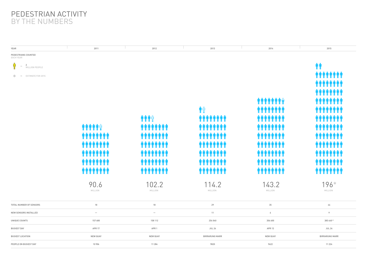
Above: Total number of pedestrians counted by year, including busiest day and busiest location. Image by Morphocode.
Melbourne’s Pedestrian Counting System
Melbourne is considered to be the most liveable city in the world according to The 2015 Economist Intelligence Unit ranking. The city is also exemplary for its mindful use of data in urban analytics and for its Open Data Policy allowing simple access to Council-owned information.
In the last six years, local authorities has installed 44 sensors to measure pedestrian activity at strategic locations throughout the city. Each sensor is installed on a street pole or under an awning to cover a pedestrian counting zone on the footpath below. The counts are updated regularly and are published in .csv file format on Melbourne’s Open Data Portal. The raw data is a tabular representation of hourly numbers of pedestrians at each measurement point. We used this open dataset and a visualization technique called “Horizon Graph” to reveal movement patterns in a seamless urban electrocardiogram.
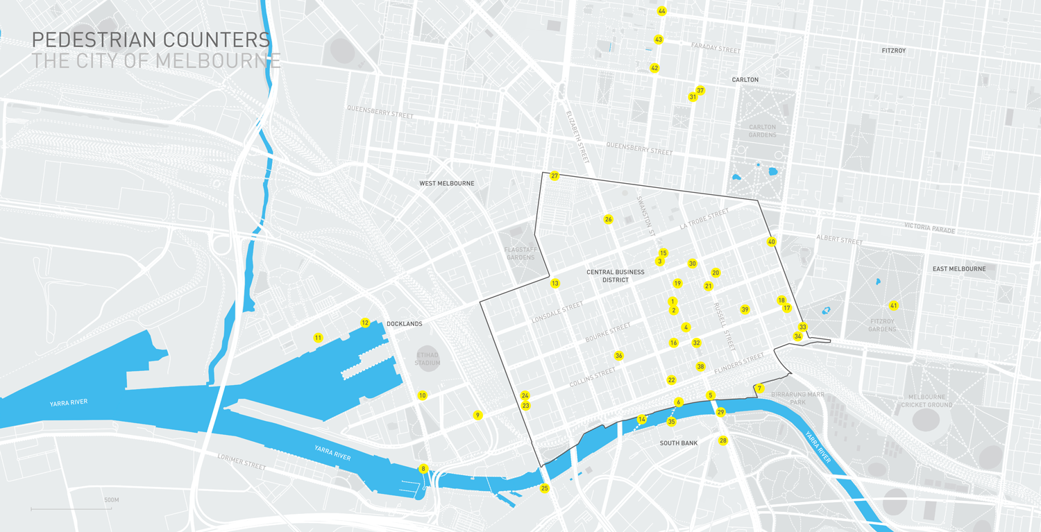
Above: Location of pedestrian counting sensors in the City of Melbourne. Image by Morphocode.
For more than 30 years the City of Melbourne has been transforming the municipality’s walking environment. Melbourne’s iconic Bourke Street Mall opened officially in 1983. Guided by the Places for People studies in 1994 and 2005, the City of Melbourne has widened footpaths, laid high quality pavements, encouraged outdoor dining and reduced traffic signal cycle times to support improvements to public transport to make Melbourne a more attractive place to be.
City of Melbourne Walking Plan (2014-2017)
The average block size in the Central Business District of Melbourne is 200 by 100 meters. This iconic layout was named after Robert Hoddle, who conceived it in 1837: initially a square grid, the plan was subsequently subdivided in smaller rectangular blocks and still preserves the strong hierarchy of the street system. The Hoddle Grid covers the area from Flinders Street to Queen Victoria Market, and from Spencer Street to Spring Street. Melbourne’s numerous Arcades and Lanes are an important feature of the city’s cultural heritage and provide through-block pedestrian shortcuts that increase connectivity. The majority of the pedestrian counting sensors, installed by the municipality of Melbourne are located in the Central Business District and provide a better understanding of how people navigate through the area.
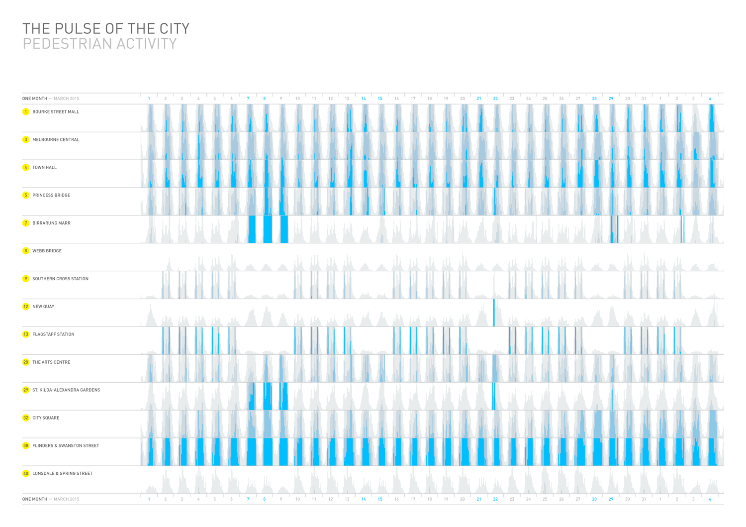
Above: Visualization of pedestrian activity in March 2015 shows significant spikes accross the city during a 3-day Moomba Festival. Image by Morphocode.
Visualizing Pedestrian Activity with Horizon Graphs
To build the visualization we’ve used Cubism.js – a d3 plugin for visualizing time series. The library was developed by Mike Bostock and is built around a visualization technique called Horizon Graph. Horizon graphs are similar to traditional area charts, but allow to fit the same data into less space while preserving resolution. They are often used in data dashboards to monitor real-time activity such as CPU usage and stock exchange data.
Cubism.js comes with built-in support for real-time sources such as Cube and Graphite. It is not well-suited for static data sources such as Melbourne’s Pedestrian Counts dataset. We had to implement a custom Metric to load the pedestrian data from past periods and then plot them on the canvas using a custom Context.
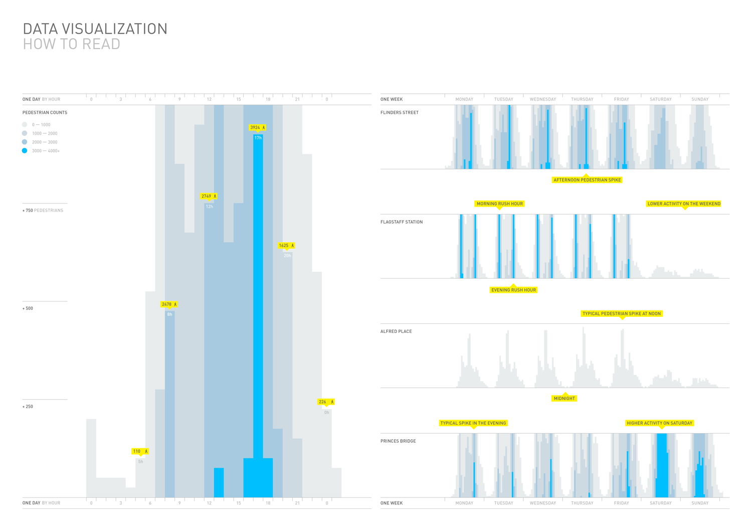
Above: Increasing data density while preserving resolution – how to read a Horizon Graph of pedestrian activity. Image by Morphocode.
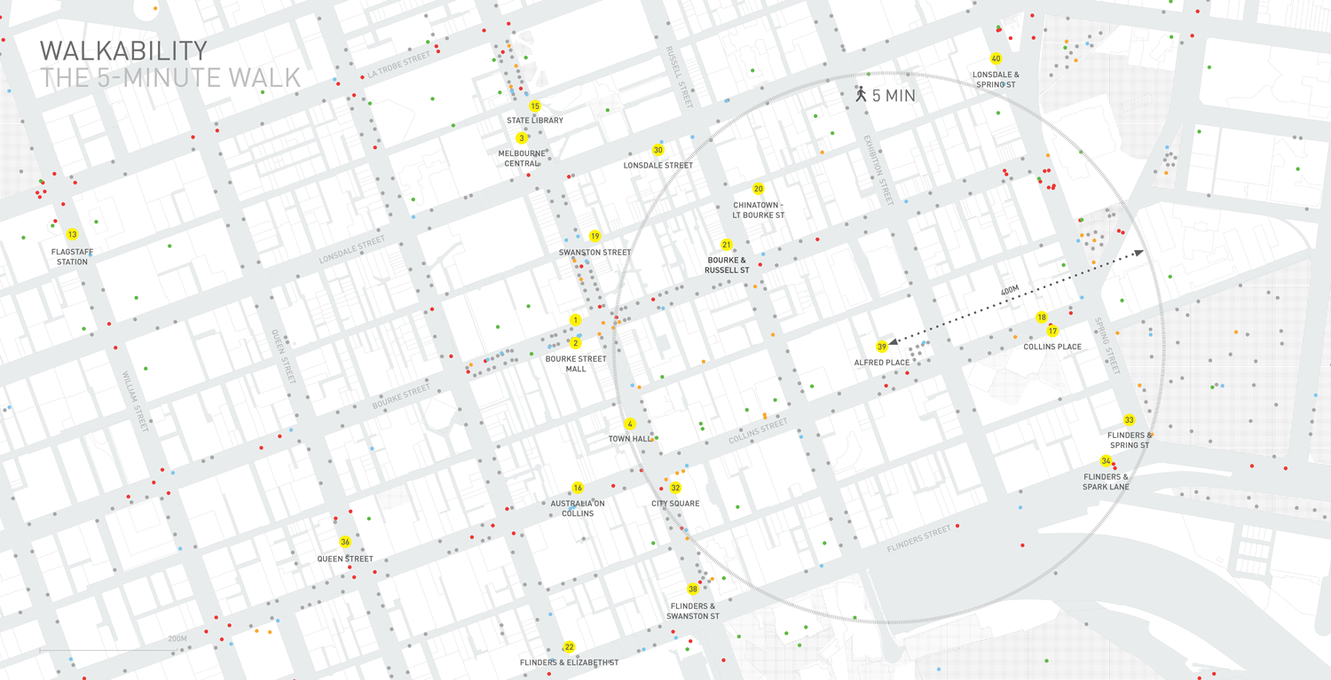
Above: The 5-minute walk. Access to a wide variety of amenities and services within a short distance can increase pedestrian flows and encourage people to walk. Image by Morphocode.
The 5-minute walk
During the research we also explored access to different types of amenities within the Central Business District of Melbourne, where the majority of the pedestrian counting sensors are located. The map above shows access to basic amenities around the sensor at Alfred Place – a pedestrian shortcut, cutting through the width of a block. Plotted dots visualize the density of 5 types of elements:
● Landmarks and places of interest
● Public Transport stops
● Outdoor furniture
● Public memorials and sculptures
● Drinking fountains
The walking distance standard has slight variations across the globe but it is considered that a person would cover 80 meters within a minute of walking. This is the reason why a 5-minute walk is usually represented as a circle of 400-meter radius.
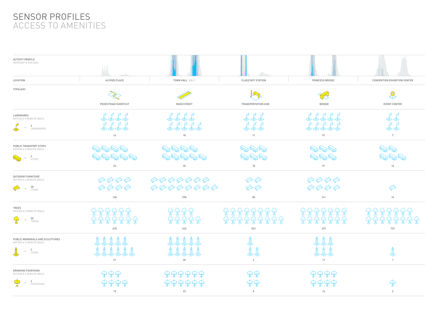
Above: Sensor profiles show variations in pedestrian activity accross different types of locations. Image by Morphocode.
Places for People: Melbourne’s long-term commitment to walkability
The Places for People study began in 1993 when the city invited Professor Jan Gehl for the first time to assess the quality of public space and public life in Melbourne. The study was reassessed in 2005 and again, another decade later, in 2015. This lengthy data collection period has provided rigorous insight into how the city performs at a local, everyday level for people and continues to inform urban strategies in their long-term commitment to increasing the levels of pedestrian accessibility.
“Places for People focuses on walking as the primary mode of transport in the city.”
City Strategy and Place, 2015
Through the years, a variety of measures have been undertaken to make the urban environment more appealing for walking – the amount of footpath space has been expanded by nearly 15 per cent since 2007; a speed limit of 40 km/h has been set in the central city; numerous public spaces have been renovated and through-block laneways have been enhanced and converted to active uses.
Currently, walking accounts for 66 per cent of all trips within the municipality of Melbourne.
What’s next?
We are currently developing an interactive version of the data visualization that will allow you to explore pedestrian activity by location and time. The project will be published soon on our website. You can subscribe to our newsletter for more updates.
Pedestrian activity visualization looks really amazing. Fantastic work! When we can expect to see the source that goes behind it to understand how this is working.
Hello Krish,
Thank you for your interest. We are about announce our upcoming course “Mapping Urban Data”. It will be an introductory course on how to create web maps and work with data. Stay tuned for details!
Best Regards,
Morphocode
This will help me in the development of public services for Moscow. Thanks for sharing this excellente statistics!
hi! Somehow the link does not work
https://participate.melbourne.vic.gov.au/application/files/4114/3890/9931/Walking_Plan_full_version.pdf