The use of color in maps and data visualizations has a long tradition. Color, along with position, size, shape, value, orientation, and texture is one of the primary means to encode data graphically.
Since William Playfair‘s revolutionary introduction of statistical graphs in the 1786 “Commercial and Political Atlas“, color has been used as a tool to convey categorical and quantitative differences in data visualization. Playfair used color coding to emphasize variations in economic trends and to differentiate variables in his graphs, which were hand-colored and distributed in limited editions.
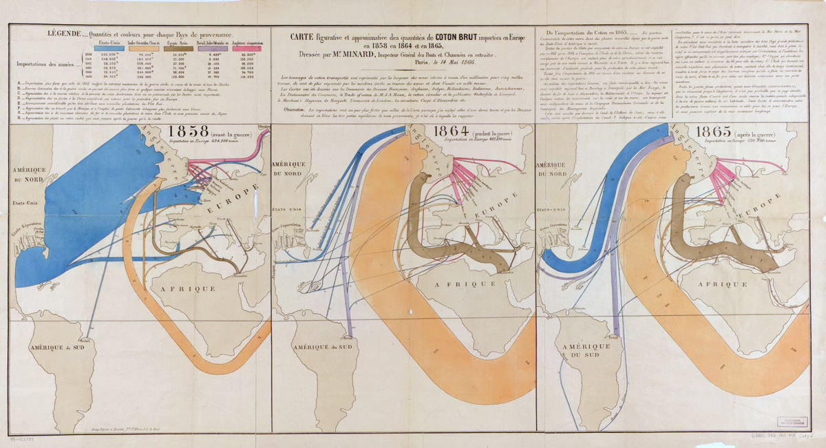
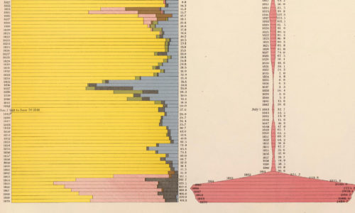
Charles Joseph Minard is another pioneer of information graphics who used color to visualize flows of goods and people across countries in his thematic maps. The main purpose of his graphic explorations was to make ordinal relationships immediately visible to the eye and the use of color was a central aspect of this process. Minard is widely known for the invention of the flow map. He also authored the famous “Figurative Map of the successive losses in men of the French Army in the Russian campaign 1812-1813” – a map that, according to E. J. Marey, defied the pen of the historian with its brutal eloquence.
Although color has been present for centuries in handcrafted maps, it was not until the mid-nineteenth century, that the adaptation of lithographic techniques to printing allowed its wider use in graphic works. At that time, color became an important perceptual feature in the design of thematic maps and statistical diagrams (Friendly, 2009).

Color as a visual variable
Color, along with position, size, shape, value, orientation, and texture is what Jacques Bertin calls a visual variable:
a set of symbols that can be applied to data in order to convey the underlying information. In that sense the wise and often conservative use of color is a prerequisite for accuracy in the graphic interpretation of data. When not used properly, color in maps can obscure the data and mislead the reader by concealing the actual state of the observed problem.
In order to apply color to maps effectively, a designer needs to manipulate properly the three perceptual dimensions that characterize it: Hue, Saturation and Lightness. Hue is what we associate with color names – red, green, blue etc. Saturation is the vividness of a color and is also known as Chroma or Intensity. Lightness is a relative measure describing how much light appears to reflect from an object compared to what looks white in the scene (Brewer, 1999). Lightness is perhaps the most important of the three perceptual dimensions when it comes to data representation and is used to show ordered differences.
Color is applied to maps to encode or highlight data, but it also has an aesthetic dimension, perhaps best illustrated in the works of swiss mapmaker Eduard Imhof whose school maps and atlases are world famous examples of excellence in the domain of cartography. In his classic book on relief representation, Imhof dedicates a whole chapter to the use of color, providing invaluable guidance with a set of rules for color compositions. Although the chapter concerns mostly the use of hypsometric tints and the selection of colors for elements of the landscape, Imhof’s rules are timeless and applicable in other cases as well. Imhof insisted that strong, heavy rich and solid colors should be limited to the small areas of extremes in order to avoid the unbearable effects of placing them next to each other over large areas. He also suggested that base-colors are equally important since they allowed for the smaller, brighter areas to stand out: a principle that puts up the lighter shades of gray among the most versatile colors.
Types of color schemes
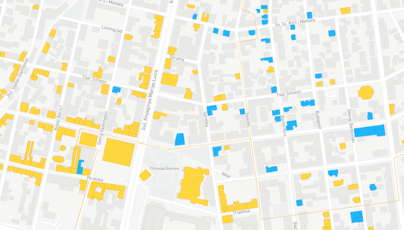
There are three main types of color schemes applied to maps: Qualitative, Sequential and Diverging. Binary schemes are also used to visualize nominal differences between two categories. Variation in all three perceptual dimensions of color – Hue, Saturation and Lightness – are applied to show differences in the data. The basic principle is that variations in hue visualize nominal/categorical differences while variations in lightness visualize ordinal differences. But the strict application of this rule varies from one case to another: qualitative schemes may apply plenty of variations in lightness, especially when there is a large number of categories to display and sequential scales can benefit from hue variations when they are first and foremost ordered by lightness.

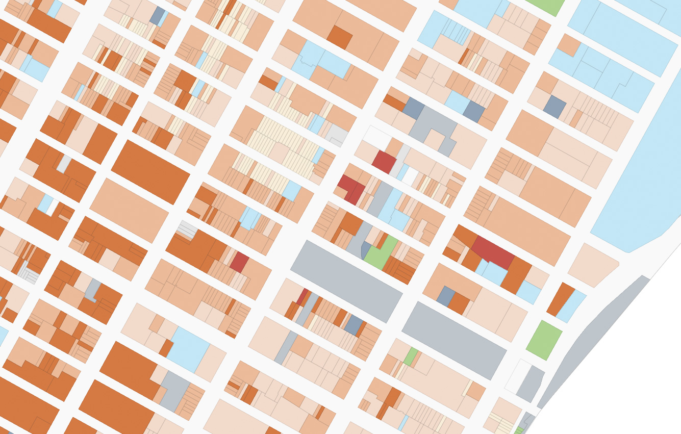
Qualitative schemes are applied to discrete unordered classes of nominal data such as race or ethnicity. They are not appropriate for mapping ordered numerical data. The distinction between classes becomes visible through variations in hue, ideally with no or slight lightness differences between colors. If a class needs to be highlighted it is possible to use a darker or more saturated color to visualize it. Qualitative schemes may also consist of paired hues with lighter and darker shades of the same color, applied to related categories (ex: related land use categories such as single and multifamily residential buildings).

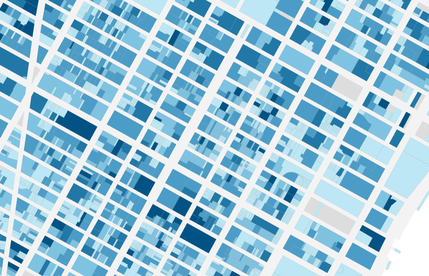
Sequential schemes are applied to ordered, often numerical data such as floor area ratio per lot or population density per square mile. Changes in color lightness correspond to the progression from low to high: light colors are used for lower values and the dark colors are used for higher values. Sequential schemes can derive from both single and multi-hue combinations. The higher the number of data classes – the more difficult the distinction between each step.

Diverging schemes are often described as a combination of two sequential schemes with a critical break point in the middle. The two sequences “diverge” from a shared light color that stresses important mid-ranges in the data. The two extremes are visualized by contrasting dark hues while changes in lightness are used to display intermediate values. Diverging schemes are usually symmetrical but specific data distribution may require shifting the break point towards either one of the extremes. Common examples of data suitable for diverging color scales are temperature variations and stock exchange dynamics.
Design for the color-blind
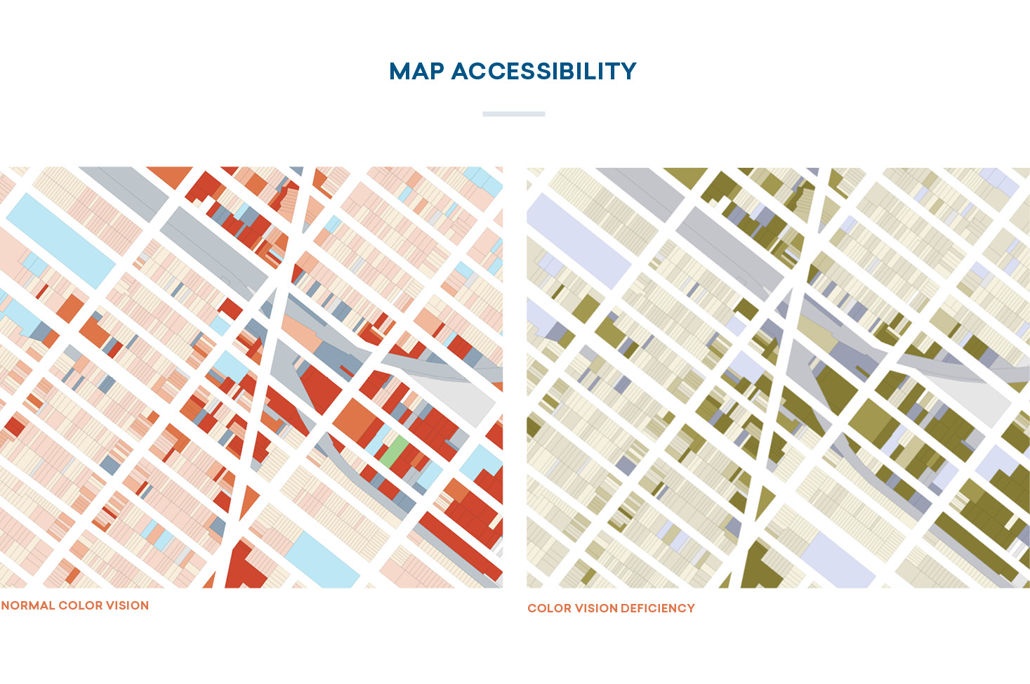
Making a map accessible for people with color vision deficiency is another important thing to consider while designing color scales. Approximately 4.5 percent of the population worldwide is color blind with the red–green color blindness being the most common type. This decreased ability to recognize color affects more often men than women: around 8 percent of the male population is color blind while only 0.5 percent of women have some sort of color vision impairment.
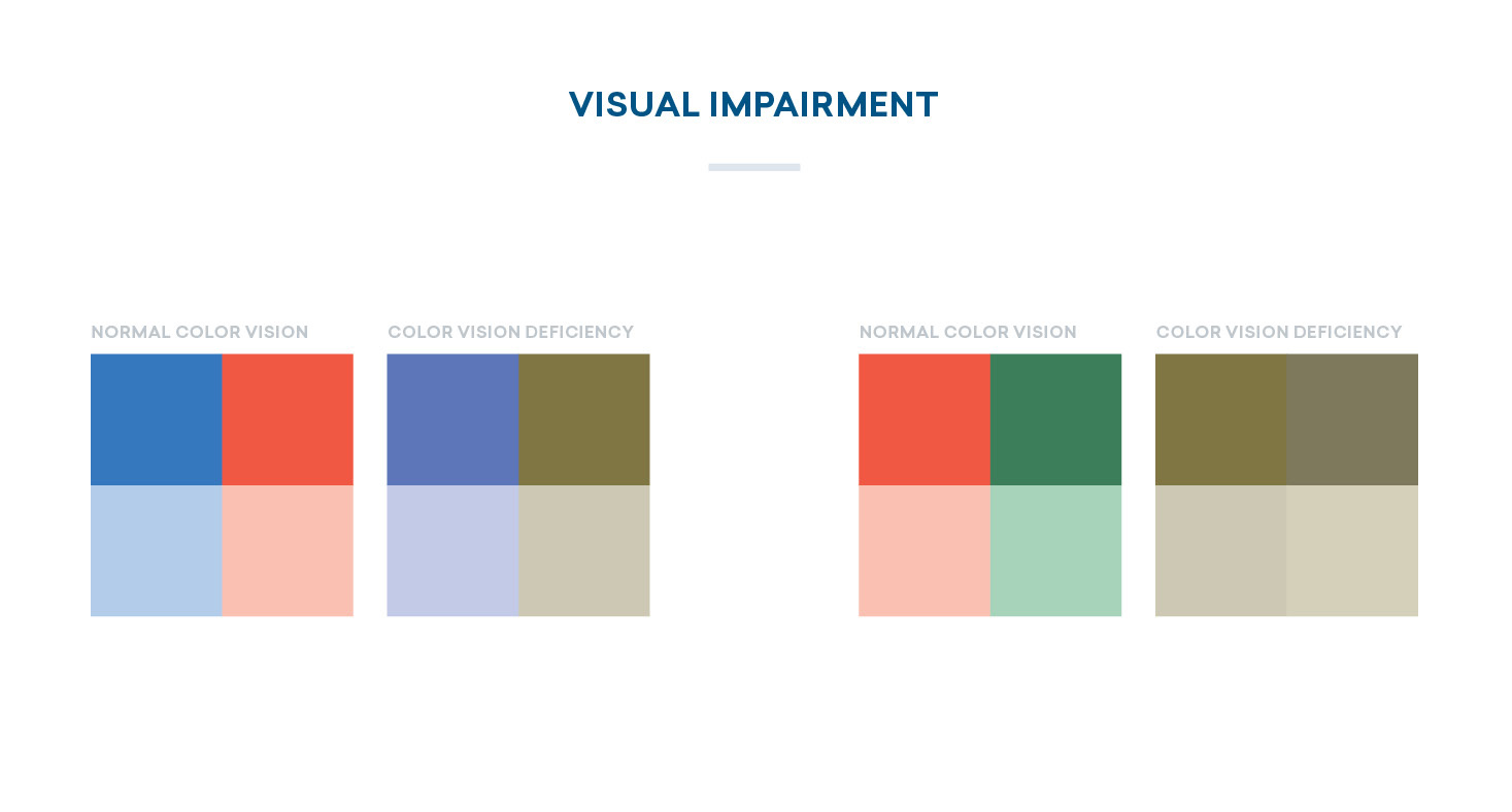 People who are color-blind can still see lightness differences and a fairly wide range of hue differences (Brewer, 1999). However qualitative schemes remain particularly difficult to read by color-blind users; sequential schemes, on the other hand, are much more accessible due to the lightness variation between each step. In order to make a categorical map readable by an audience with color vision impairment it is necessary to add variations in both hue and lightness between each step. Even then, if the categories are more than “the magical number 7” it would be almost impossible to make the map accessible. A possible solution to that problem is to add texture to make the steps more distinguishable from one another.
Mapping Urban Data: Online Course
In our upcoming online course Mapping Urban Data we will discuss in further detail the use of color to represent data on maps. You will learn how to design and apply sequential and categorical schemes through a series of practical examples. The course takes a hands-on approach to data visualization through a range of New York City–based case studies covering topics such as built density, land use and sidewalk cafés.
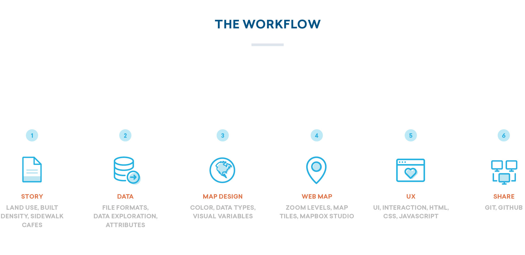
Choosing the right color scheme is part of the process of creating an interactive urban data visualization. The entire workflow will guide you through the process of spatial data exploration, map design, web mapping and map tiles generation, user interaction design, along with the coding skills required to finish the project. The course will be available soon offering special discounts to Morphocode Academy subscribers.

Course Overview
The course page is now live, with detailed information about its content, structure and key takeaways!
Image sources:
1. Imports of cotton in Europe for the years 1858, 1864 and 1865. Charles Joseph Minard (1866) is courtesy of Library of Congress Geography and Map Division Washington, D.C.
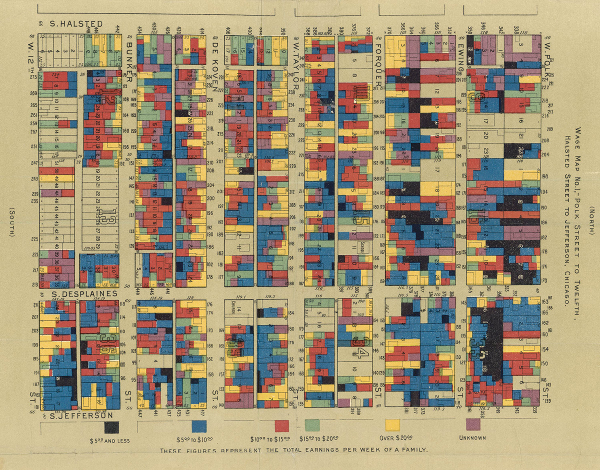
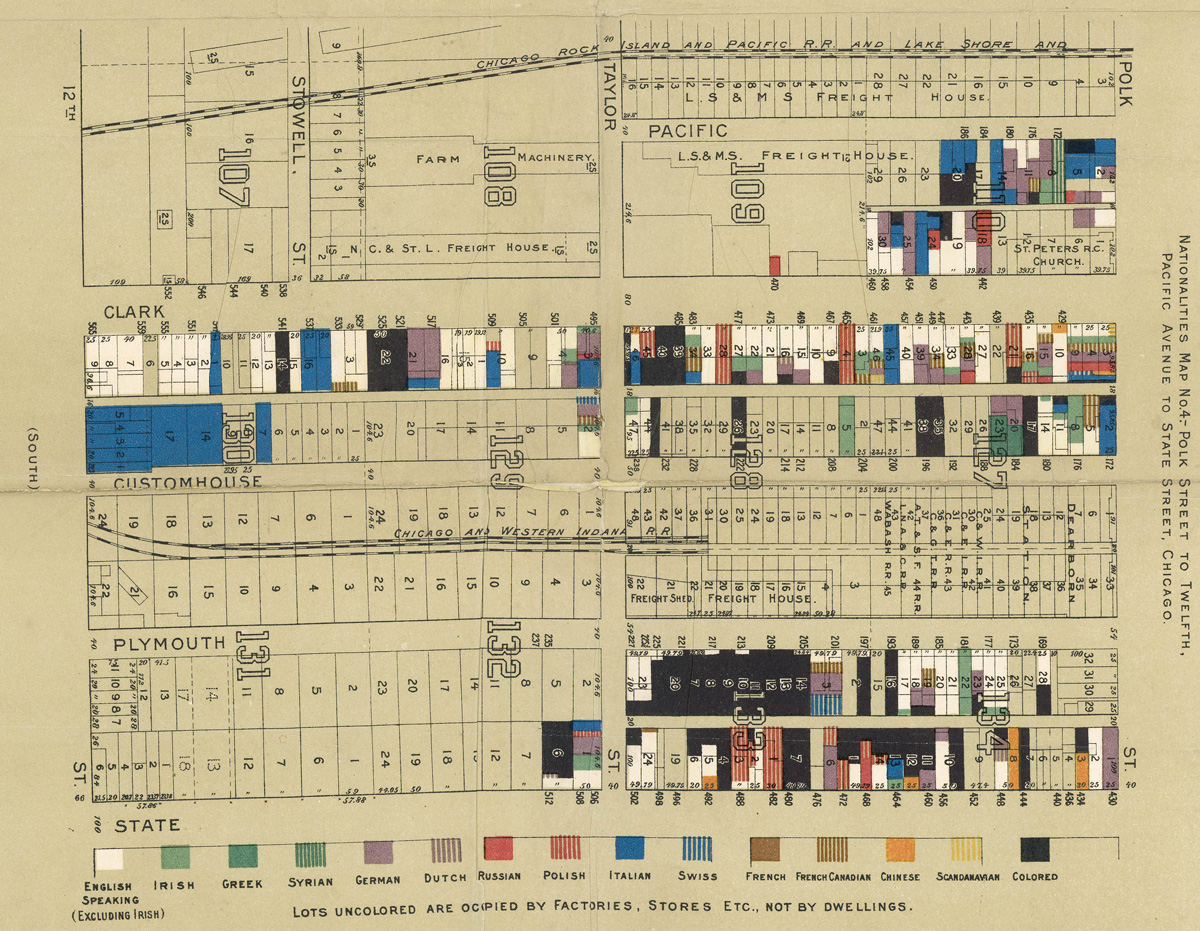
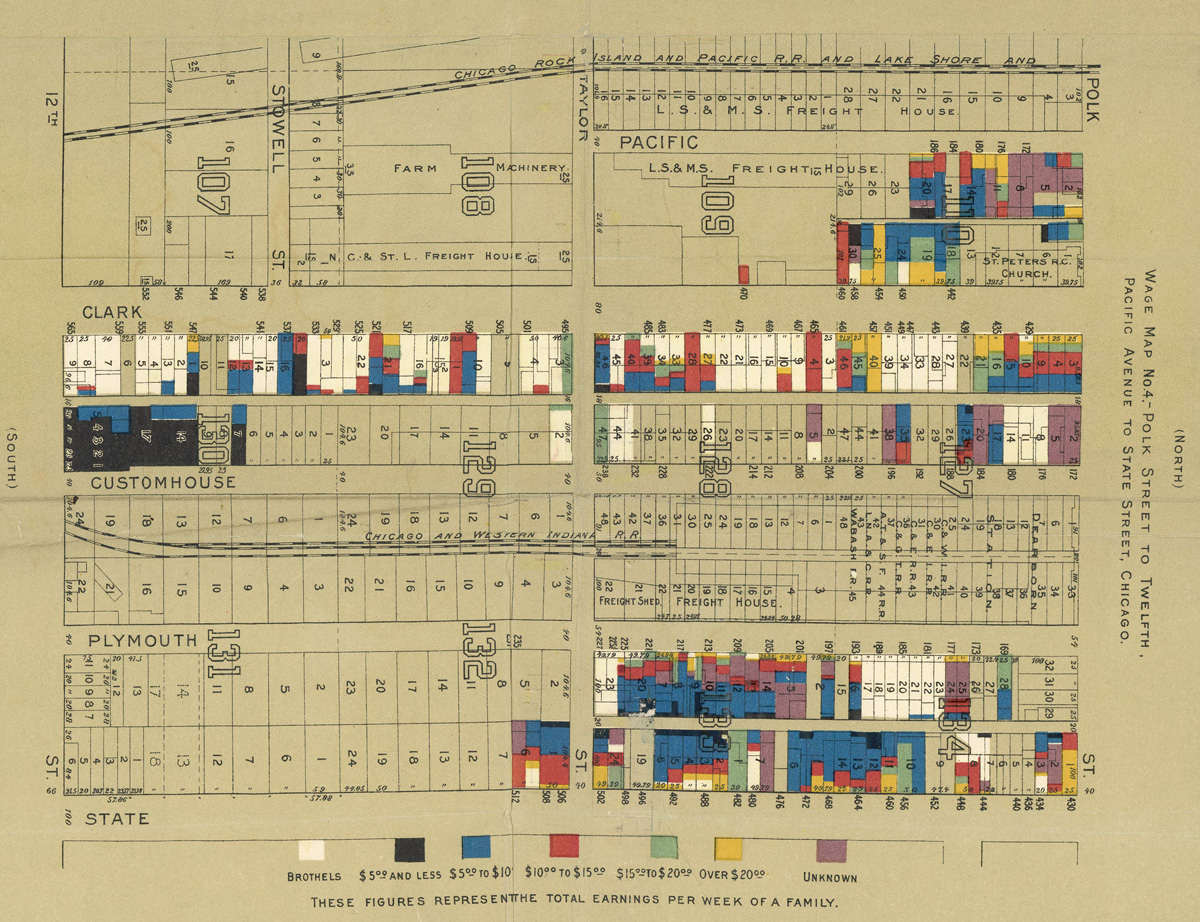
2. Wage and nationality maps, “Hull House Maps and Papers ” (1895) – a groundbreaking study, led by Jane Addams and Florence Kelley. The study was influenced by Charles Booth’s poverty maps of London.
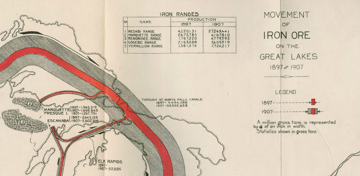
3. Movement of Iron Ore on the Great Lakes, 1897 and 1907. The Newberry Digital Collection
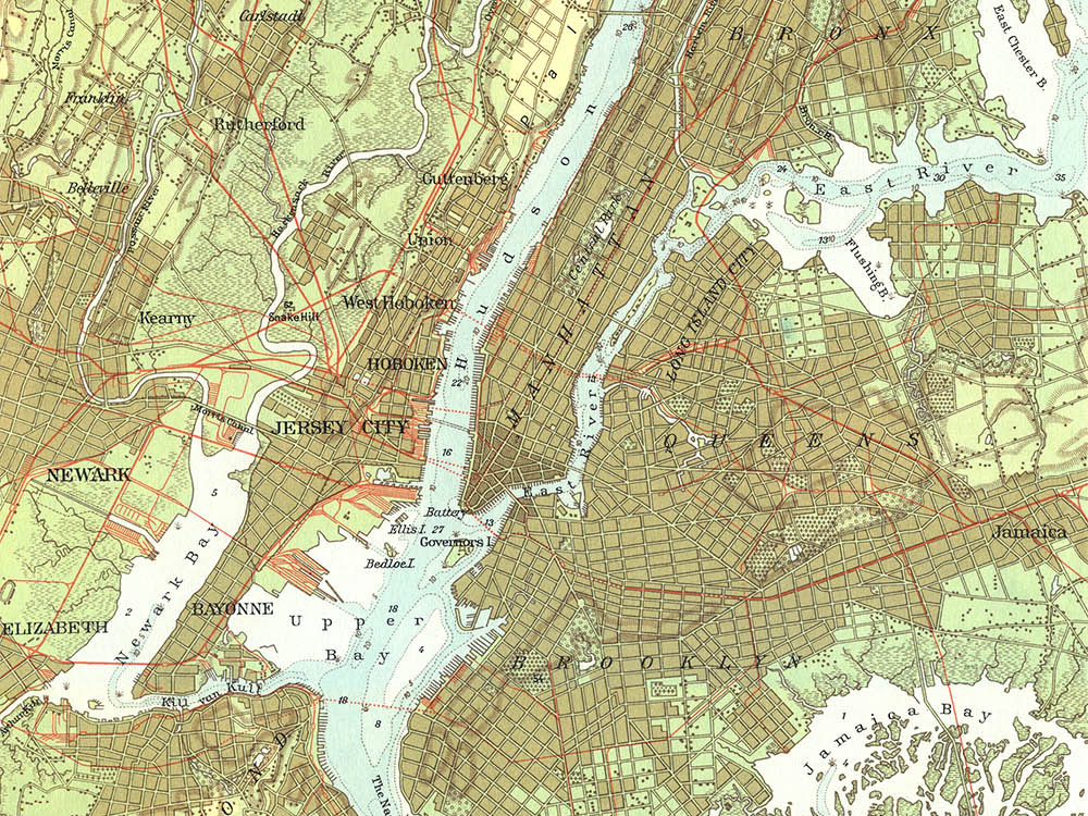
4. 1958 map of New York City by Eduard Imhof. Source: wonderful Codex99 blog
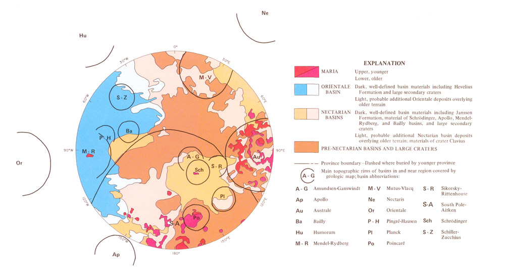
5. Generalized geologic map of the moon. Detail from I-1162 Geologic Map of the South Side of the Moon. USRA Lunar and Planetary Institute.
All other images are courtesy of Morphocode
Readings:
1. Bertin, J. (1967). “Sémiologie Graphique: Les diagrammes, les réseaux, les cartes”. Gauthier-Villars, Paris.
2. Brewer, C. A. (1999). “Color Use Guidelines For Data Representation”. Proceedings Of The Section On Statistical Graphics, American Statistical Association.
3. Friendly, M. (2008). “The Golden Age of Statistical Graphics“. Statistical Science 2008, Vol. 23, No. 4, 502–535
4. Imhof, E. (2007). “Cartographic Relief Presentations” , English ed. ESRI Press, Redlands, CA
5. Marey, E.]. (1885). “La Méthode graphique dans les sciences expérimentales et principalement en physiologie et en médecine“, G. Masson, Paris, p.73: “Toujours il arrive a des effets saisissants, mais nulle part la representation graphique de la marche des armees n’atteint ce degre de brutale eloquence qui semble defier la plume de l’historien.”
6. Playfair, W. (2005). The Commercial and Political Atlas and Statistical Breviary, Edited and Introduced by Howard Wainer and Ian Spence, Cambridge University Press, New York, NY.
Hey Guys, How about this course. Is it available? How to subscribe?
Hi Gus,
The course is still in the works. It is taking longer than expected, because it will contain over 30 videos covering data exploration & GIS, map design, UX & coding skills. We will post an update on the progress these days. You can subscribe for Morphocode Academy and we will send you an email notification when the course is available.
Best Regards!
Thanks. Very Insightful Write up. Look forward to reading more on the Course.
Hi Mansee,
Thanks for appreciating our work! You can learn more about the course here: https://morphocode.io/mapping-urban-data/