“As in the case of space, where it is believed that it appears only where matter occurs and these notions are inseparable, time (time passing, as a matter of fact) takes place only where events occur.”
E. Hajnicz . “Time Structures”
About the age of three, children are already capable of understanding the temporal priority principle stating that causes must always precede their effects. This is a fundamental principle in causal reasoning, and its inviolability shapes our linear perception of time.
In information design, this perception usually translates into a horizontal axis with time running from left to right. A timeline, combined with some sort of graphic notation to mark a sequence of events, is the most common way to visually present temporal data.
Time as a framework
The use of time as a structuring device in information design can be traced back to some early historiographic works. From the fourth century, in Europe, most attempts to structure visually historical events took the unsurprising shape of a chronologic table. The most prominent of these early examples is Eusebius’ Chronicon. Eusebius had developed a sophisticated table structure (Rosenberg and Grafton 2010, p.15) that worked as parallel timelines, comparing Jewish, pagan, and Christian chronologies.
Later on, during what is now known as the golden age of statistical graphics (Friendly 2008), the visual representation of temporal data took more diverse forms.
“The timeline seems among the most inescapable metaphors we have. And yet, in its modern form, with a single axis and a regular, measured distribution of dates, it is a relatively recent invention. Understood in this strict sense, the timeline is not even 250 years old.”
D. Rosenberg, A. Grafton . “Cartographies of Time: A Visual History of the Timeline”
In the mid-eighteenth century, new linear formats emerged and were quickly adopted. Notable examples from that period are Joseph Priestley‘s famous time charts. His 1765 Chart of Biography traces the life of about two thousand historical figures born between 1200 B.C. and 1800 A.D.
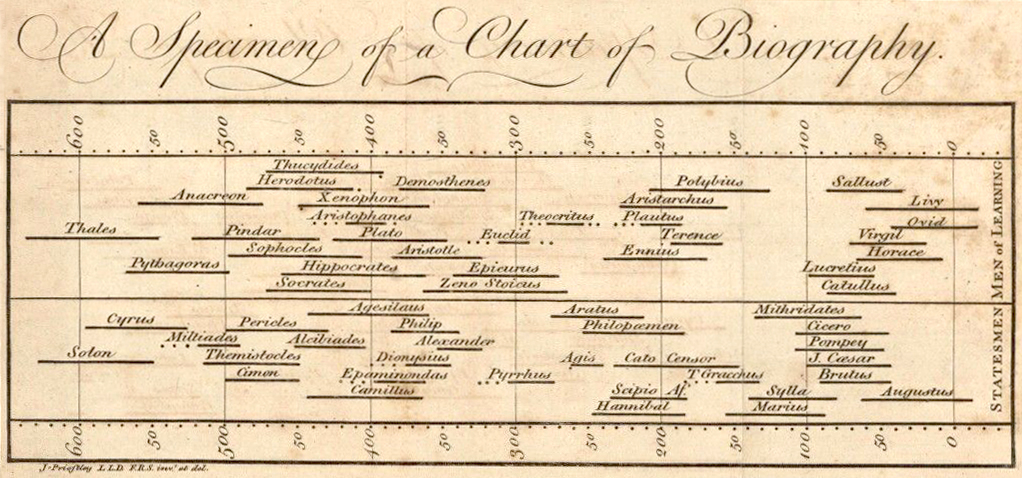
Priestley’s time map was organized into several thematic classes and used horizontal lines to convey duration. The date of birth and death of each person were marked by the beginning and the end of the line. Certainty was expressed by a full line, while uncertainty in the occurrence of an event was expressed by a dotted or a broken line (Priestley 1764, p.11).
A few years later, in 1769, followed The New Chart of History. The simplicity and visual language of Priestley’s first chart were further developed to provide, what he believed to be “the most excellent mechanical help to the knowledge of history” (Priestley 1786, p.11).
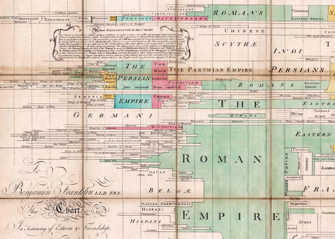
If a person carries his eye horizontally, he sees, in a very short time, all the revolutions that have taken place in any particular country, and under whose power it is at present; and this is done with more exactness, and in much less time, than it could have been done by reading.
J. Priestley. “A Description of A New Chart of History”
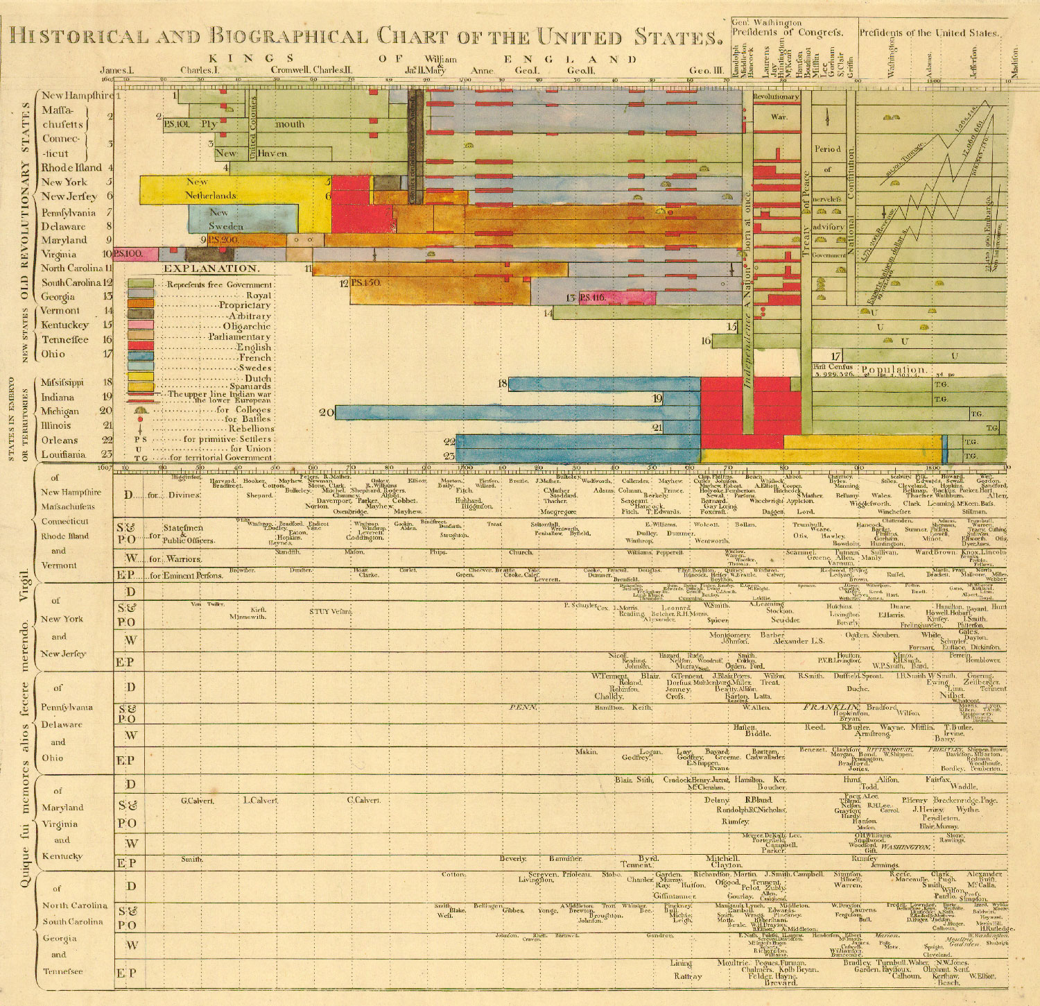
This approach had many adepts. David Rumsey, for example, adopted the same technique for visualizing historical and biographical data but combined them in a single chart: The Historical and Biographical Chart of the United States.
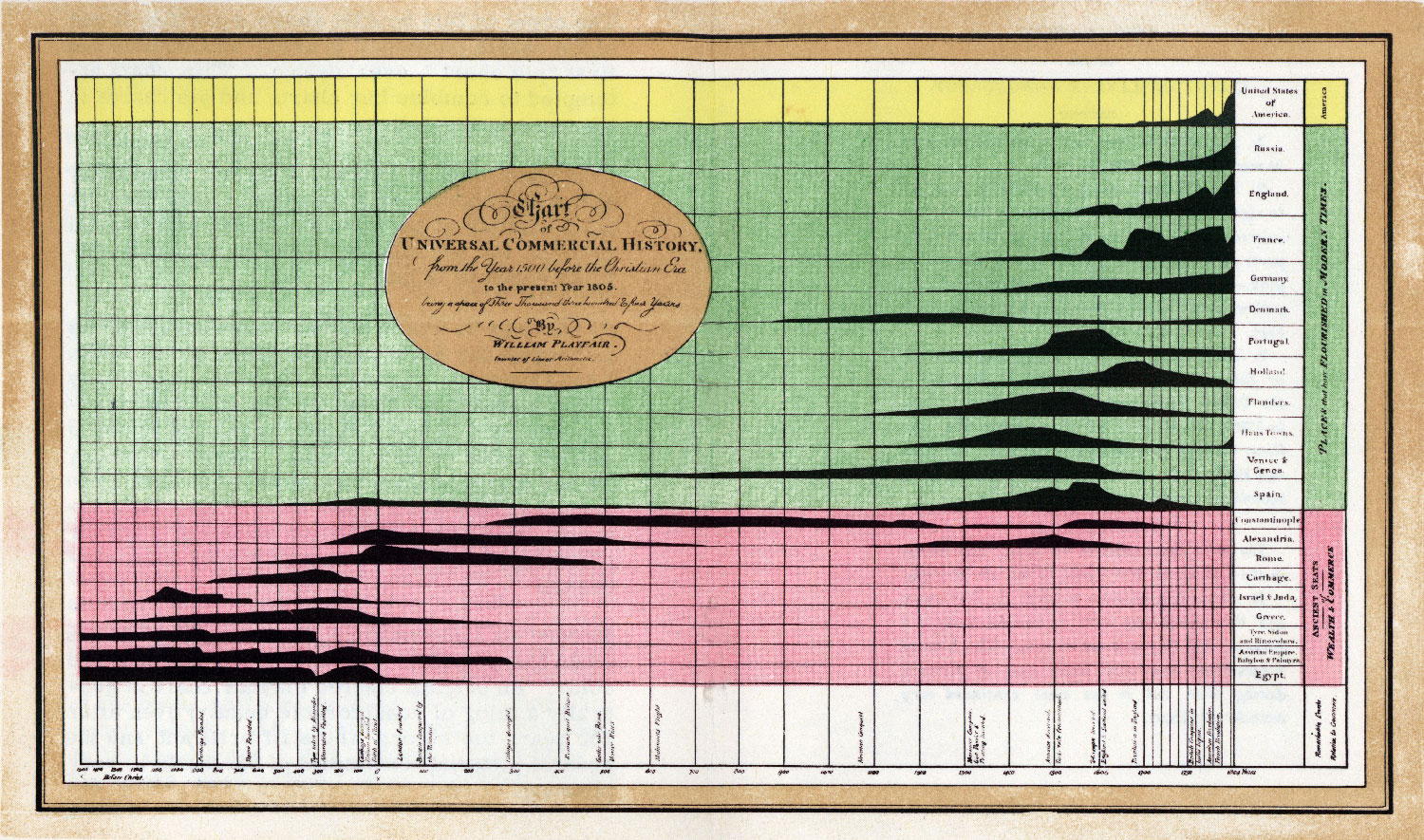
Priestley’s famous timelines also influenced the work of William Playfair – a pioneer in statistical graphics who invented the time-series line graph, the bar chart, and the pie chart. In 1786, Playfair published his Commercial and Political Atlas, featuring 43 time series line graphs and presumably the first ever bar chart.
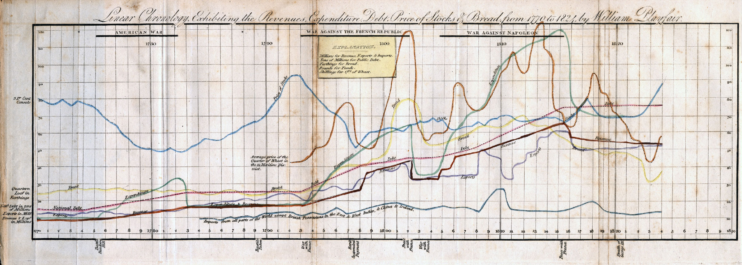
Playfair drew inspiration for the bar chart from Priestley’s work, but the roots of his time series line graphs can be traced back to his childhood. His elder brother – the world-renowned geologist and mathematician John Playfair – made him keep a graphical record of daily temperatures. This simple task taught William that “whatever could be expressed in numbers could be represented by lines” (Klein 1995) and became the inspiration for his time series charts.
Line graphs were developed by William Playfair largely to show the changes in economic indicators (national debt, imports, exports) over time and to show the differences and relations among multiple time-series. Playfair also invented comparative bar charts to show relations of discrete series for which no time metric was available (e.g., imports from and exports to England) and pie charts and circle diagrams to show part-whole relations.
M. Friendly. “The Golden Age of Statistical Graphics”
The 19th century was even richer in graphical innovations. Some of the best works from that period visualize data in relation to time.
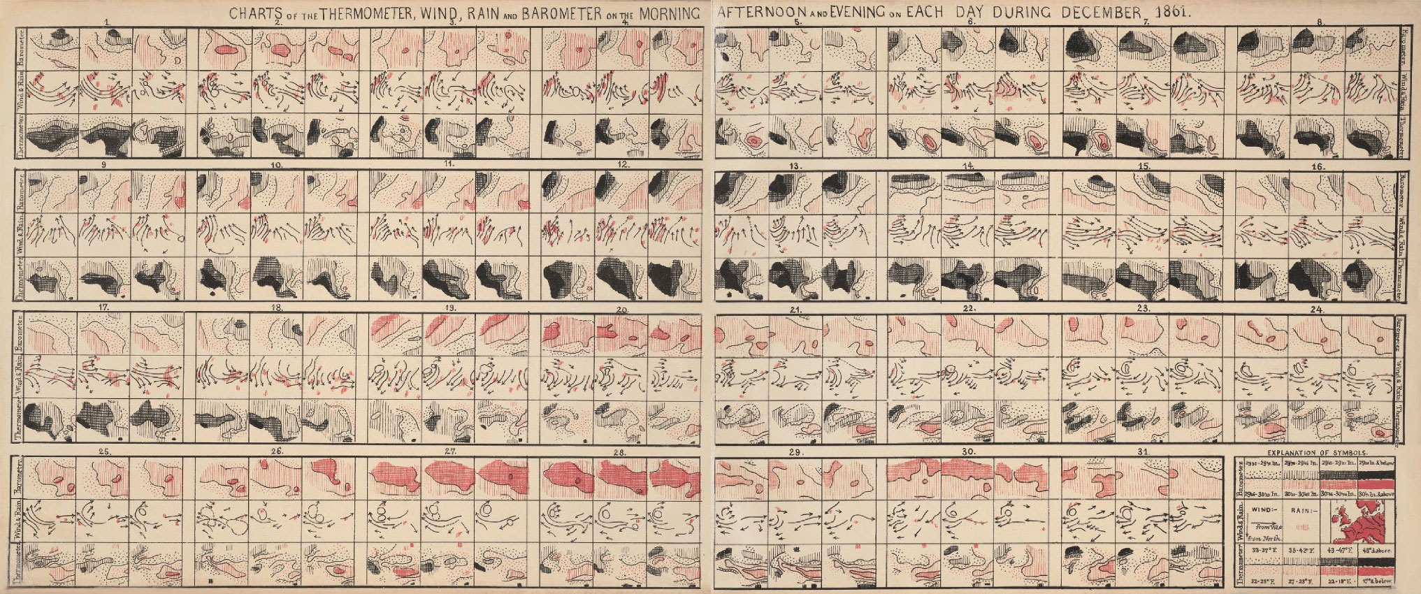
Florence Nightingale invented the polar area diagram to show the causes of mortality among British soldiers during the Crimean War; Francis Galton’s methods of mapping the weather included small multiples to provide a snapshot of the conditions on each day during December 1861; while Minard used his famous flow map technique to visualize how Napoleon’s Russian campaign unfolded in space and time.
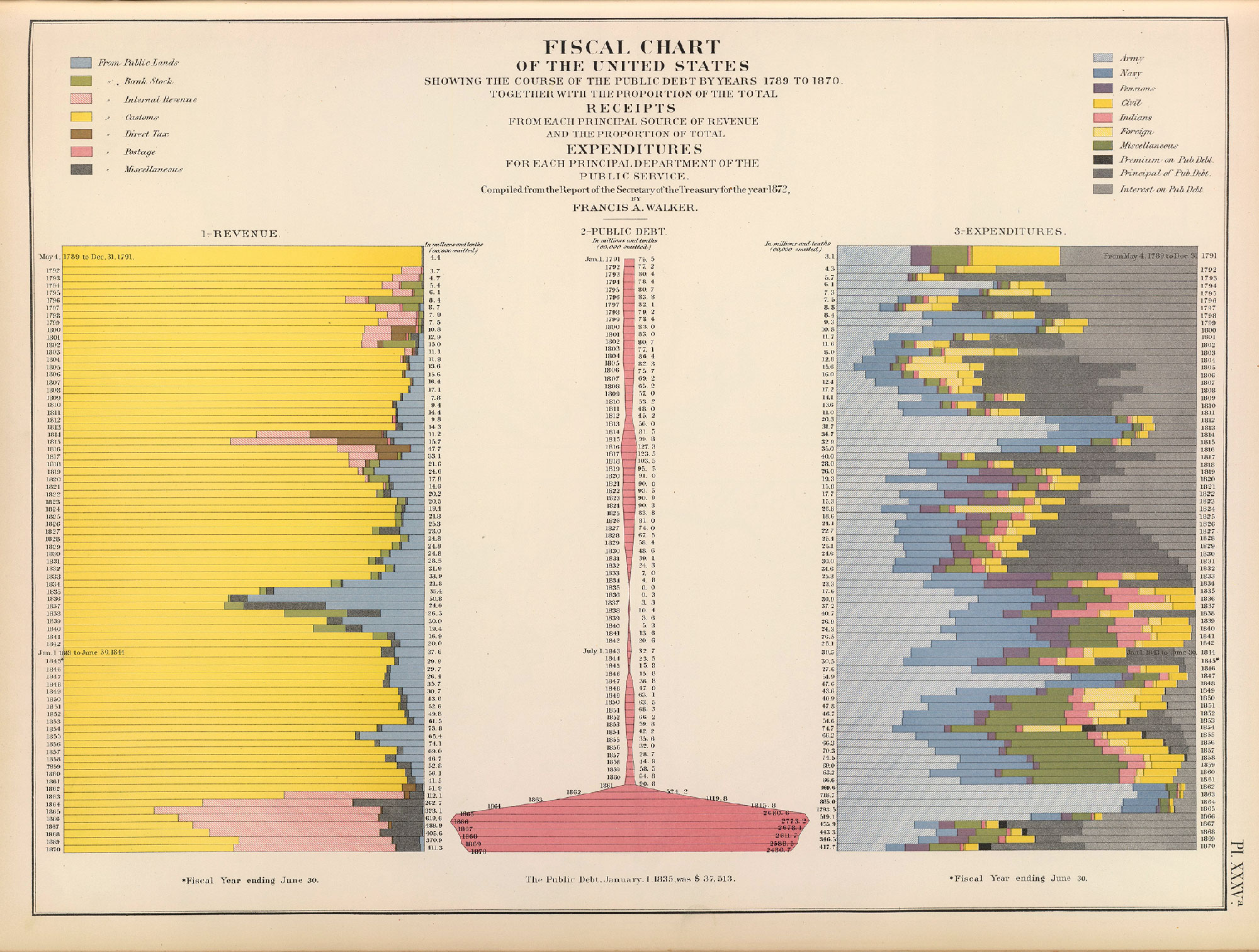
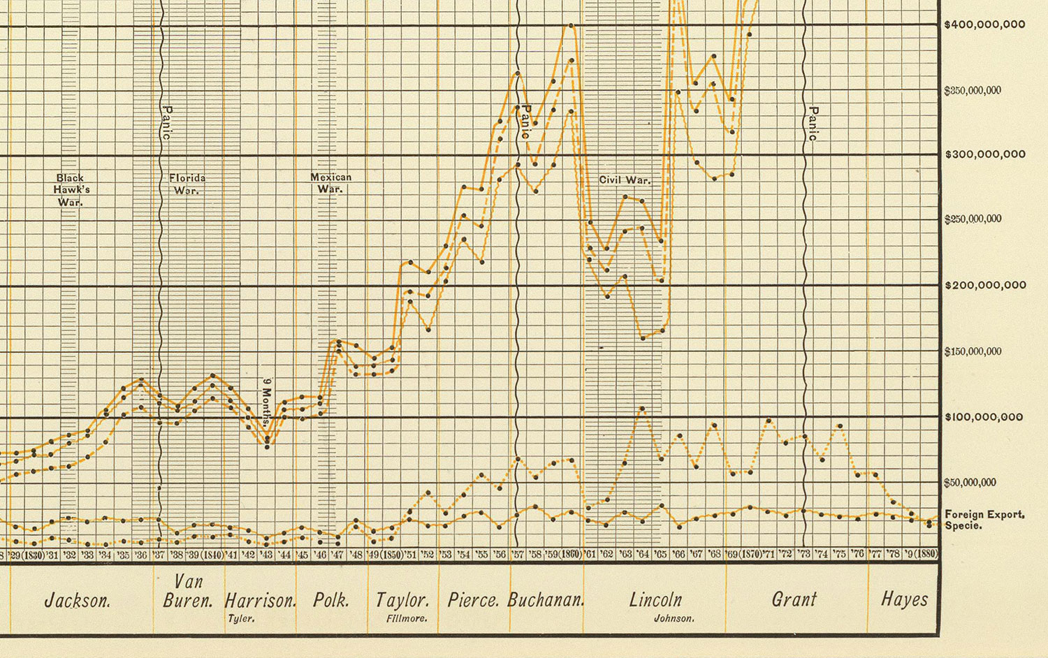
Meanwhile, in the USA, Francis A. Walker became the nation’s leading statistician and was appointed superintendent of both the 1870 and 1880 census. This led to the publication of the First U.S. Statistical Atlas in 1875 that was recognized worldwide as a work of excellence.
Following the next two censuses, the Atlas was updated under the supervision of chief geographer Henry Gannett, whose magnificent work pushed the boundaries of cartography and statistical graphics even further. These new national atlases showed changes in statistical data over time through a wide range of visualization techniques.
Real-time data
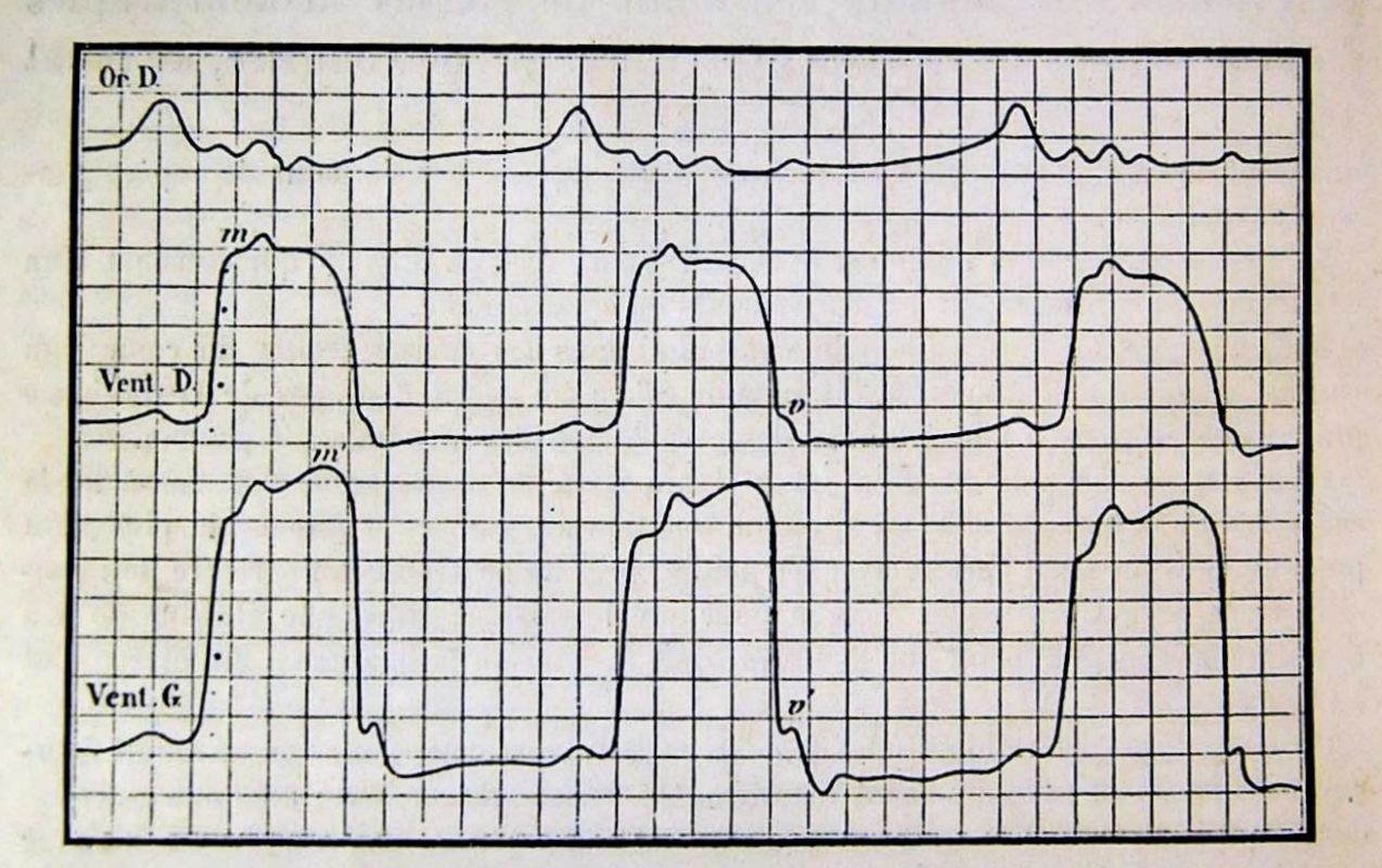
By the end of the 19th century, real-time data recording methods also surged. The work of Eadweard Muybridge and especially Étienne-Jules Marey is noteworthy. They both developed new methods for visualizing time and motion by means of chronophotography.
Marey understood movement as a function of space and time. He was interested in the application of new graphical methods both as a means of expression and as a research tool and wrote a book on that matter – “La Méthode graphique dans les sciences expérimentales”.
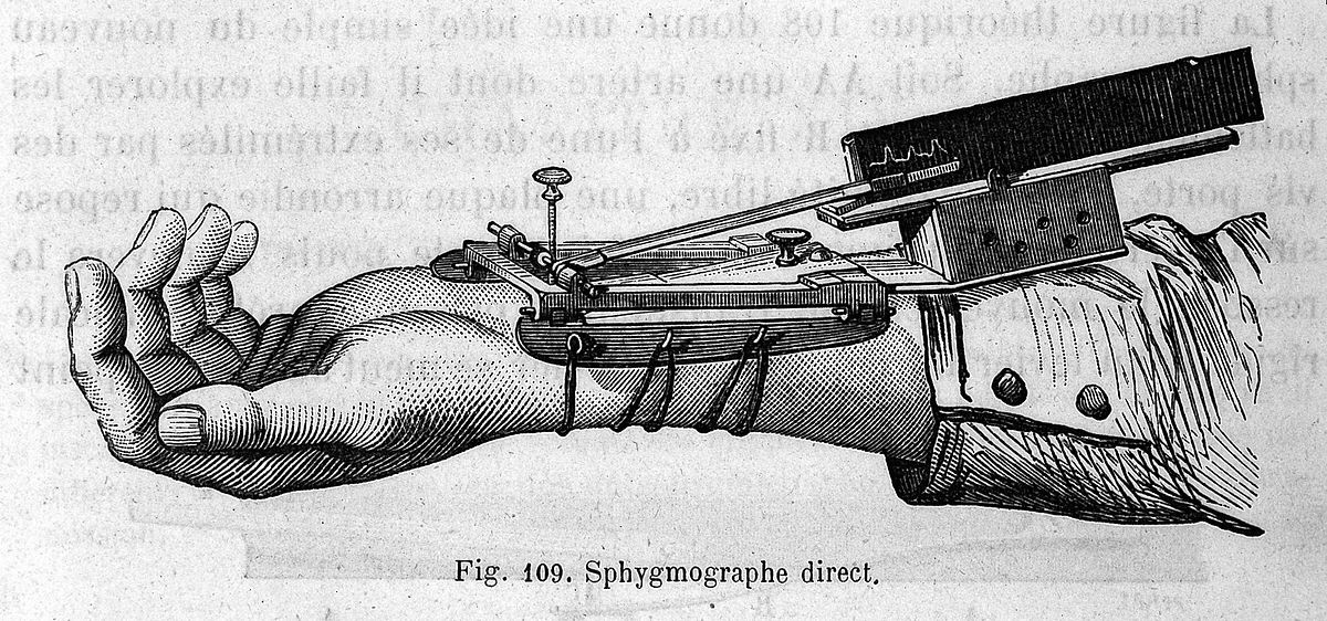
His passion for collecting real-time data – whether it involved the study of motion or experimental physiology – inspired him to develop various recording devices. The sphygmograph, for example, recorded the pulse graphically in real-time. He also invented the “chronophotographic gun” which is considered a focal point in the history of cinematography.
For Marey, these new devices all represented a development of the chronographic tradition of Priestley and Playfair, and he was explicit about the connection. But while Priestley and Playfair created systems for representing temporal phenomena, Marey’s interest was in graphically recording them.
D. Rosenberg and A. Grafton. “Cartographies of Time: A Visual History of the Timeline”
Beyond the linear metaphor
Time puts structure in place. Observing changes over time allows us to make assumptions about the future or to identify trends and cyclical patterns in the data. There are numerous methods for visualizing changes over time including bar charts; line graphs; Gantt charts; heat maps; stacked graphs; small multiples etc.
More sophisticated data visualization methods include, but are not limited to horizon charts and cycle plots. We will discuss all of these as well as other concepts related to time, such as temporal primitives and time structures in part two of the blog post. We will also discuss how location and time intersect in urban data analysis.
Image sources:
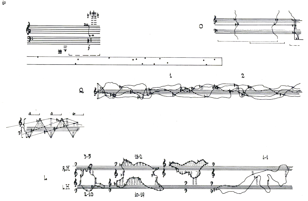
1.John Cage, Experimental music notations. The image comes from this amazing gallery.
2. Joseph Priestley, Specimen of a New Chart of Biography (1765). Image source: Joseph Priestley House.
3. Joseph Priestley, Detail from A New Chart of History (1769). Full-size image can be seen here.
4. David Rumsey, Historical and Biographical Chart of the United States (1810). Image source: “Historical Charts and David Ramsay’s Narrative of Progress“.
5. William Playfair , Linear Chronology (1824). Source: Wikipedia
6.William Playfair, Chart of Universal Commercial History (1805). From “Commemorating William Playfair’s 250th birthday”
7. Francis Galton, Small multiple diagrams visualizing weather conditions in December 1861. Source: Harvard University – Collection Development Department, Widener Library, HCL / Galton, Francis. Meteorographica
8. Francis A. Walker, Fiscal chart of the United States showing the course of the public debt by years from 1789 to 1870. Image courtesy: David Rumsey map collection
9. Henry Gannett, United States exports. Detail from Scribner’s statistical atlas of the United States (1883).
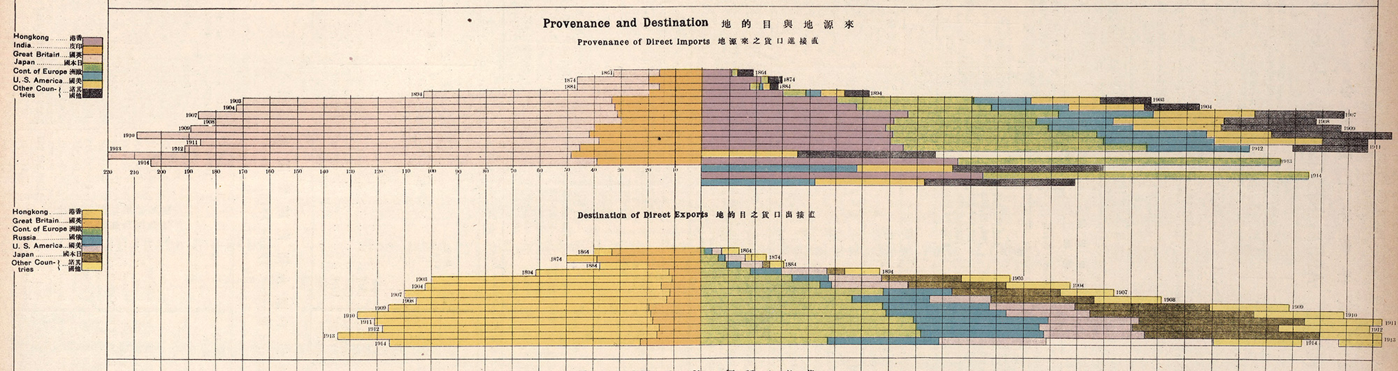
10. John Edwin Dingle, Aspects of the Course of China’s Trade for Half a Century (1917). Detail from The New Atlas and Commercial Gazetteer of China. Image courtesy: David Rumsey map collection.
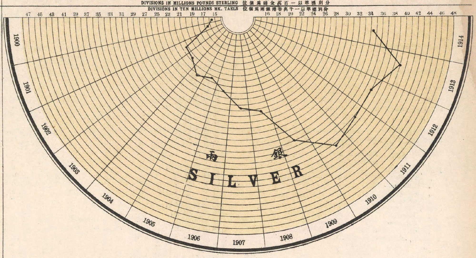
11. John Edwin Dingle, Aspects of China’s Trade in Gold and Silver Values (1917). Detail from The New Atlas and Commercial Gazetteer of China. Image courtesy: David Rumsey map collection.
12. Marey, E-J. – Heart rate data traced from a horse. La circulation du sang (1881). Image source.
Readings:
1. Friendly, M. (2008). “The Golden Age of Statistical Graphics“. Statistical Science 2008, Vol. 23, No. 4, 502–535
2. Galton, F. (1863). Meteorographica, or Methods of Mapping the Weather. Macmillan, London.
3. Hajnicz, E. (1996). Time Structures. Formal Description and Algorithmic Representation. Lecture Notes in Artificial Intelligence, vol. 1047. Springer, Berlin, Heidelberg
4. Klein, J. (1995). The Method of Diagrams and the Black Arts of Inductive Economics, in: Rima, I. H. (ed.) Measurement, Quantification and Economic Analysis. Routledge, London & New York, p.116
5. Priestley, J. (1764). A Description of Chart of Biography. Warrington
6. Priestley, J. (1786). A Description of A New Chart of History: Containing a View of the Principal Revolutions of Empire that Have Taken Place in the World. J. Johnson, London.
7. Rosenberg, D. and Grafton A. (2010). Cartographies of Time: A Visual History of the Timeline. Princeton Architectural Press, New York, NY.
8. Symanzik, J., Fischetti, W., Spence, I. (2009). Commemorating William Playfair’s 250th Birthday. Computational Statistics 24 : 551–566.
