We are thrilled to announce that after months of development and multiple design iterations, Morphocode Explorer is now available!
The tool allows planners, businesses, and cities to assess existing site conditions, measure key urban indicators and perform spatial research — directly in the browser. With a powerful, easy to use interface, you will be able to browse through various layers in seconds and access location insights faster than ever.
Here is the latest video preview:
Morphocode Explorer: Video Preview
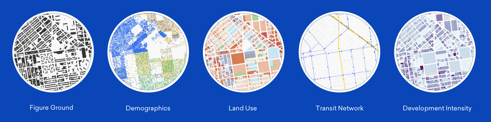
Data Layers
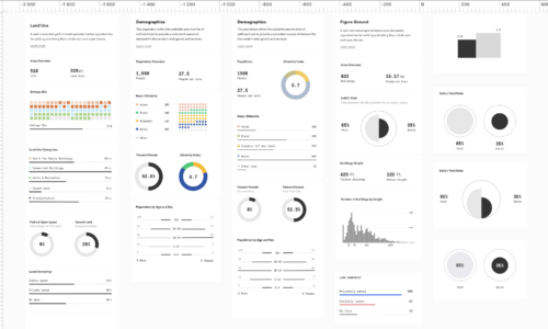
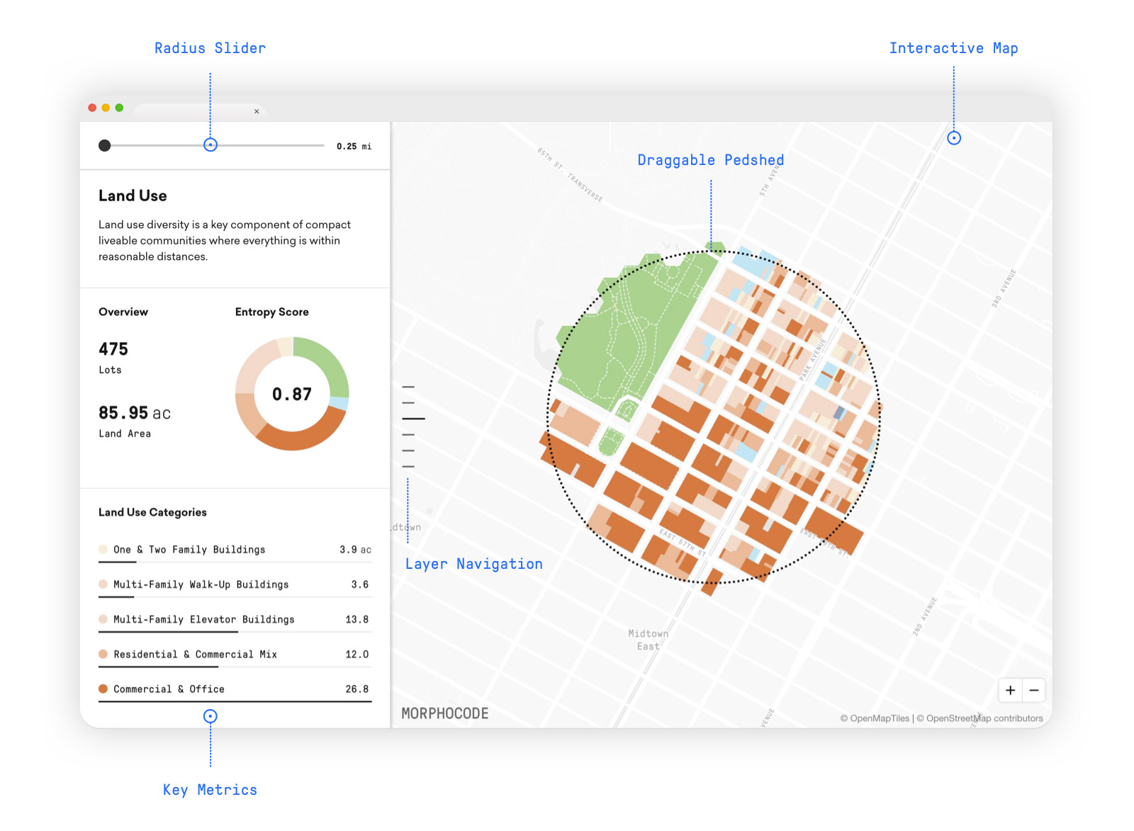
Thematic maps and key indicators
Morphocode Explorer lets you focus on your research and spend less time collecting, cleaning, and refining data.
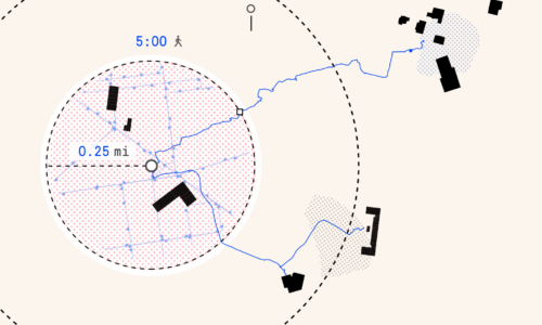
You can drag the interactive pedshed to select a location and explore multiple data layers in real-time. The tool lets you evaluate existing conditions and compare thematic maps on land use, development intensity, transit network, demographics, and urban morphology.
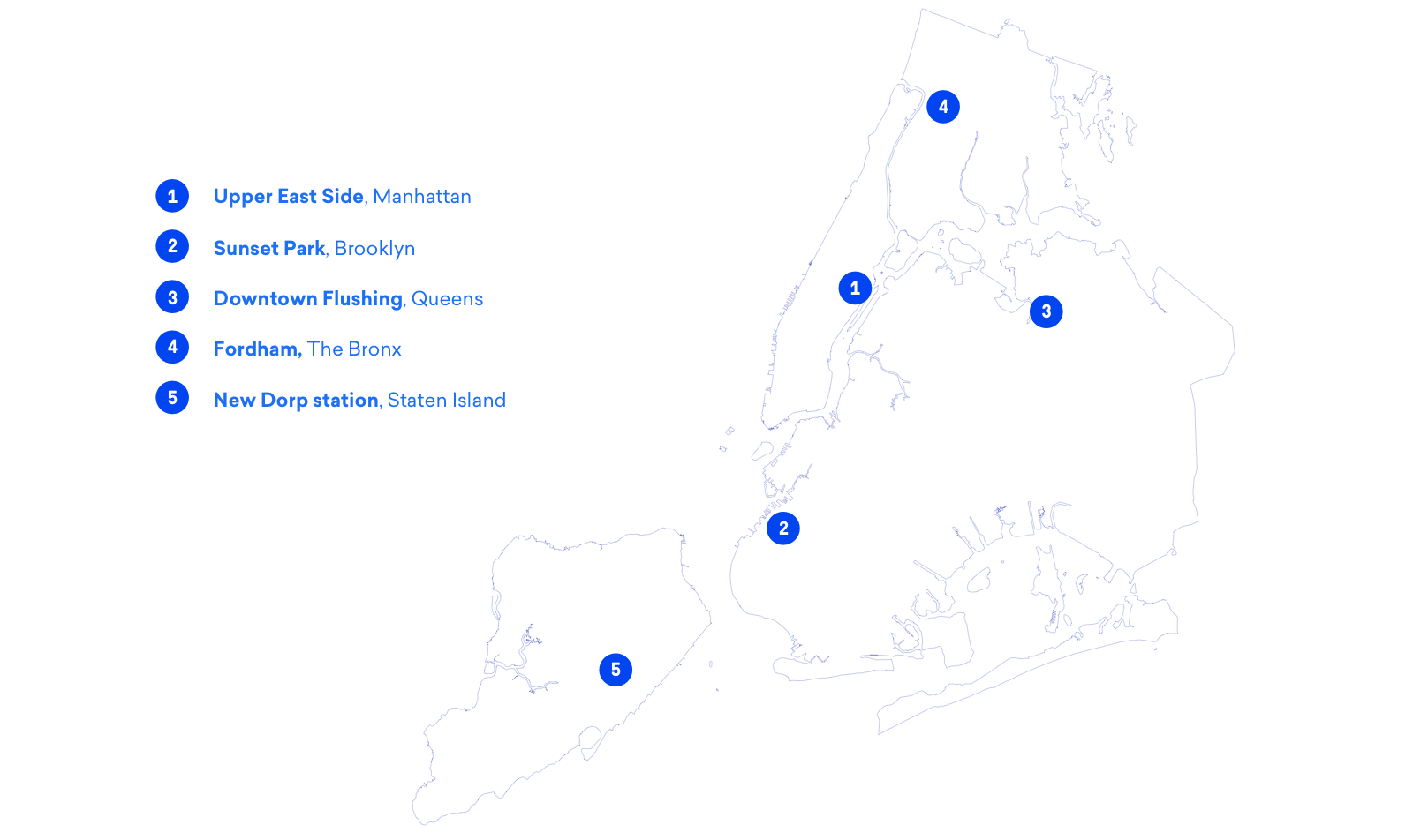
Case Study: New York City
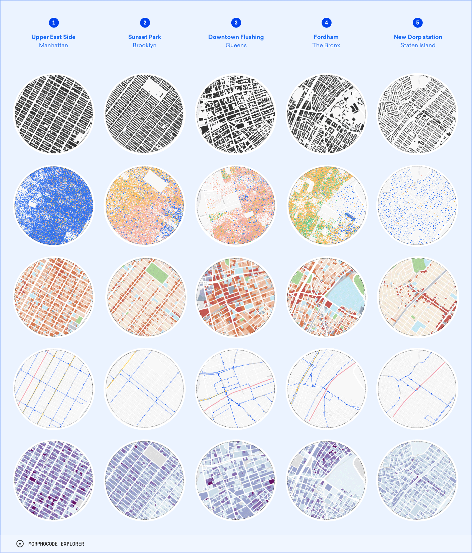
As the most populous city in the United States and the center of a dynamic metropolitan area, New York provides great opportunities for data exploration and comparative urban analysis.
To illustrate how you can understand a project’s context with Morphocode Explorer, we’ve chosen five locations that accommodate various urban conditions. Let’s take a closer look at the case study below:
Location Profiles

Comparable data mapped at the same scale for a number of cities are useful because unfamiliar situations are best described and understood by comparison with familiar situations.
Richard Saul Wurman and Joseph R. Passonneau
Urban Atlas: 20 American Cities
Move across cities
Morphocode Explorer is designed as an interactive urban atlas that will provide access to various thematic maps and key urban indicators for multiple cities.
While the beta version is launching for NYC only, we are currently expanding the data library and the interactive components to cover more cities across North America, Europe, and Australia.
The tool will allow you to compare various locations across multiple cities and answer core questions about access to transit, neighborhood diversity, proximity to destinations, and more.
User Experience
We believe that tools should allow us to work better and faster, and ultimately stretch our understanding of complex phenomena. But tools could also be fun and combine performance with playfulness.
The interactive controls of Morphocode Explorer work together to encourage active reading of the data and allow for unexpected discoveries as you study different locations. You can think of Morhocode Explorer as a tool for investigation, embracing speed and flexibility in the spirit of Engelbart’s conceptual frameworks.
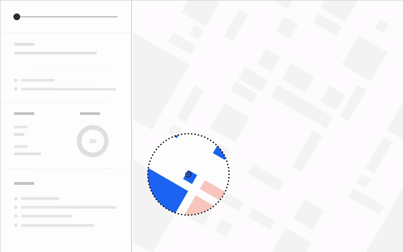
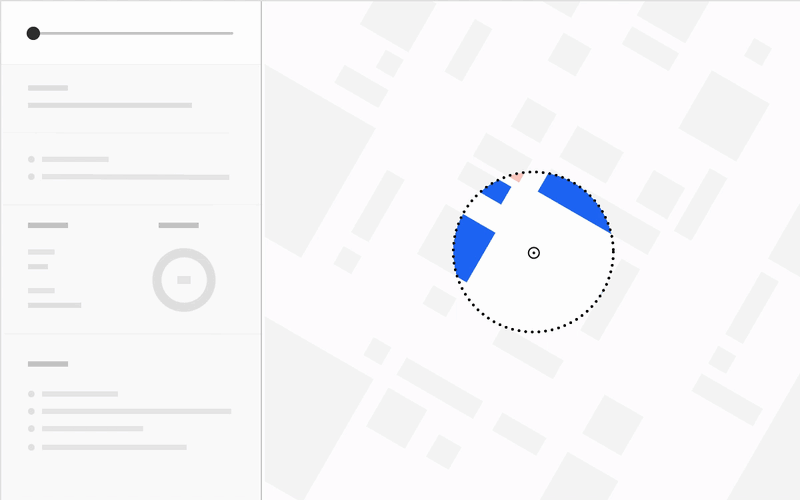
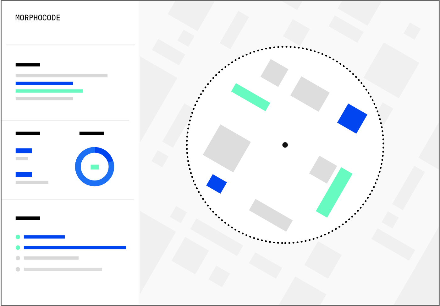
The custom data visualization components are at the core of Morphocode Explorer’s UX. Together with the interactive pedshed, they allow you to analyze your site quickly and explore various metrics. The data is calculated on the fly as you switch between the layers or change the location.
Morphocode Explorer: The Interface
Traditional GIS tools can be overwhelming to the user. The interface usually contains various checkboxes, toggles, and drop-downs. A decision needs to be made every step of the way to perform simple spatial operations. We wanted to reduce this cognitive load and provide an urban analysis tool with simple, yet powerful interactions.
To navigate the interface of Morphocode Explorer, you need to perform two simple actions – drag and scroll.
Scrolling is a continuous action that allows you to follow a pre-defined associative trail at a higher speed. While it feels somehow natural, scrolling can easily haul the user into a “flâneur” mode, followed by a gradual decrease in attention span. In Morphocode Explorer, each layer tells a different story and provides new information that keeps you engaged while scrolling.
Dragging feels just as familiar as scrolling. The drag–and–drop has been around since Jef Raskin conceived the Macintosh in the late 1970s. Dragging the interactive pedshed in Morphocode Explorer keeps the user in control. Your location, your choice.
Application Architecture
Interactive applications such as Morphocode Explorer are composed of many moving parts. The different UI components interact with each other and affect the state of the application. For example, dragging the pedshed redraws the map, but it also triggers an update of the metrics; scrolling through the sidebar updates the map layers, but it also fires network requests to fetch new data.
Keeping track of these dependencies is challenging because there is a large number of possible combinations. To tackle this issue, Morphocode Explorer manages the application state using a Flux-style architecture. The source code is organized into data stores, view components, and a central action dispatcher.
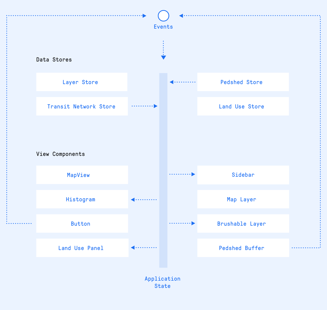
Data flows in one direction — from the data stores to the view components. Changes in the application state occur in response to events dispatched through the action dispatcher.
Data Sources
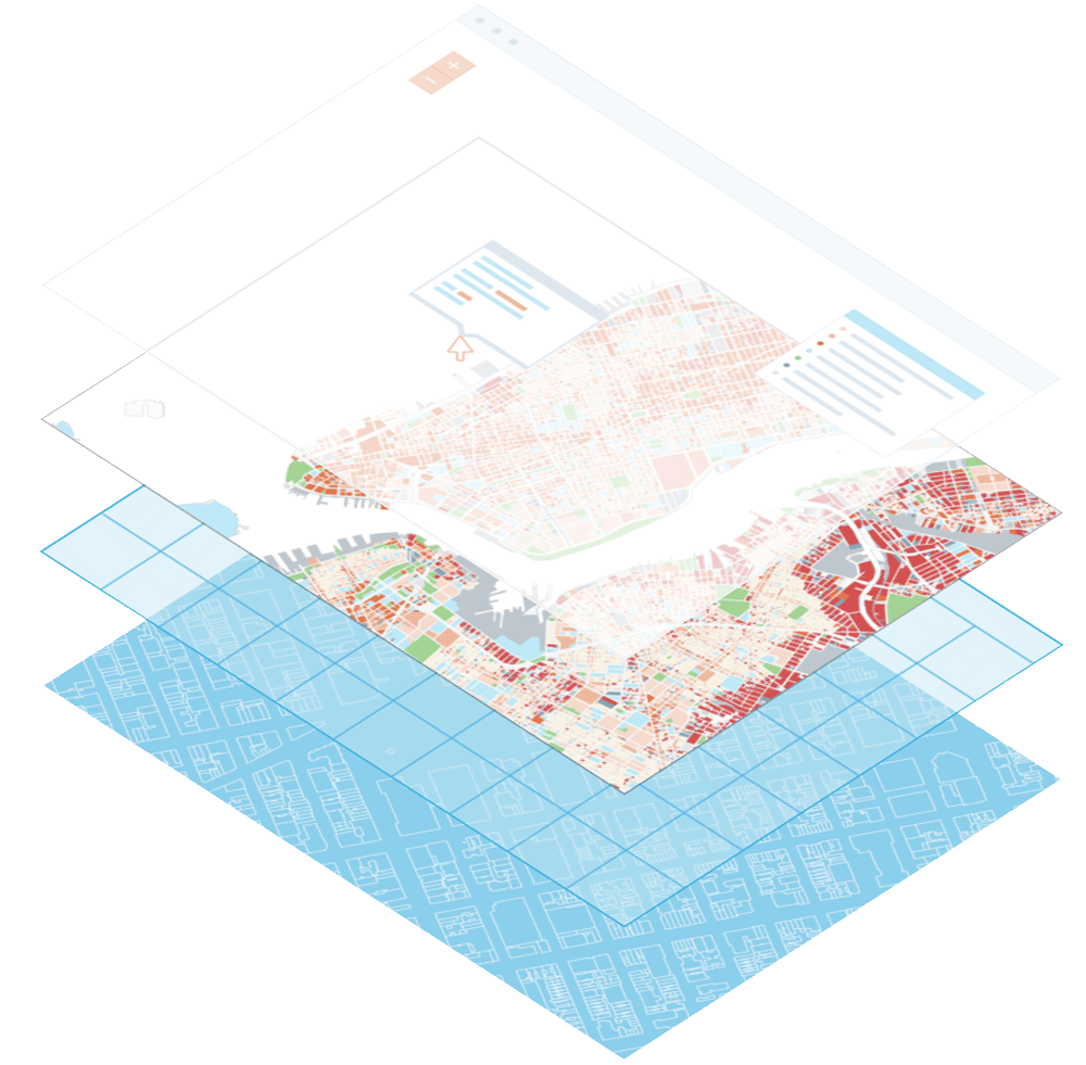
Every time you move the map or change the active map layer, Morphocode Explorer fetches new data from the server. The data is provided in the form of vector map tiles that contain both geometry and attributes.
We use a custom data pipeline written in python. It combines various data sources and generates web-friendly map tiles. The workflow involves a series of data processing steps that transform the raw data and produce multiple tilesets optimized for fast analysis in the browser.
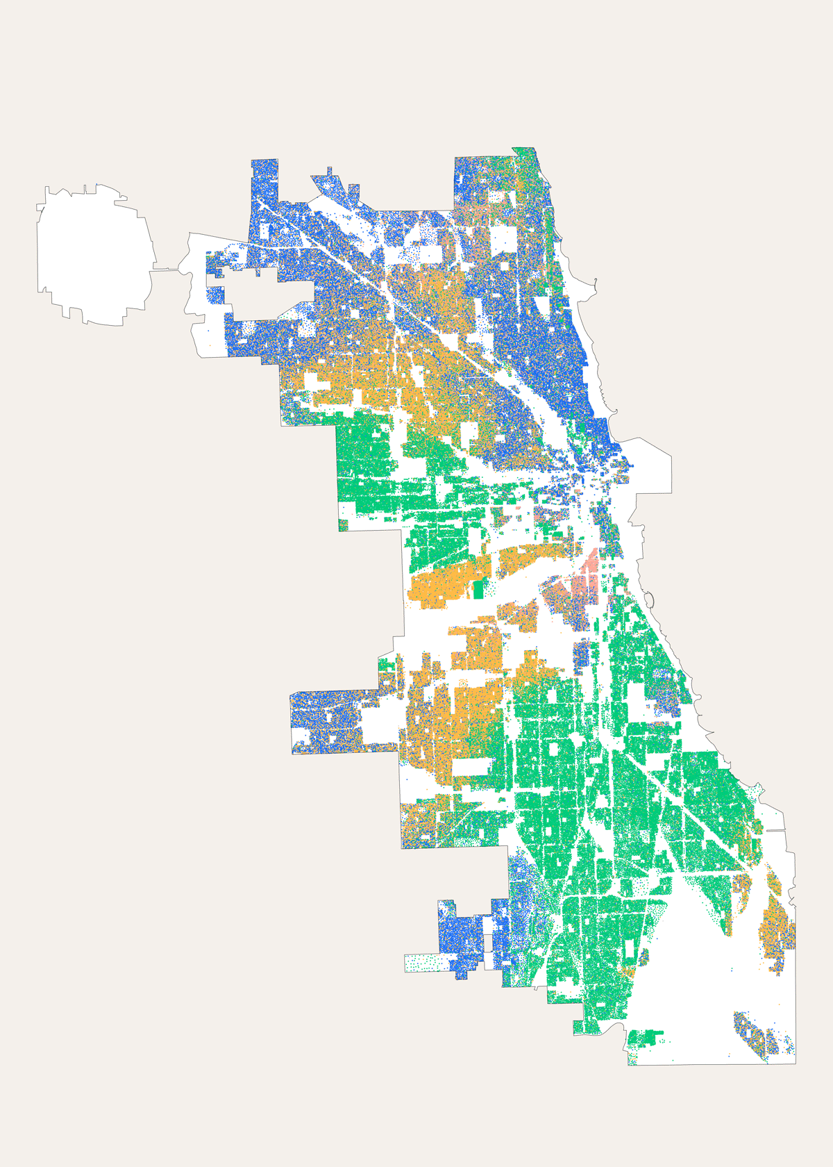
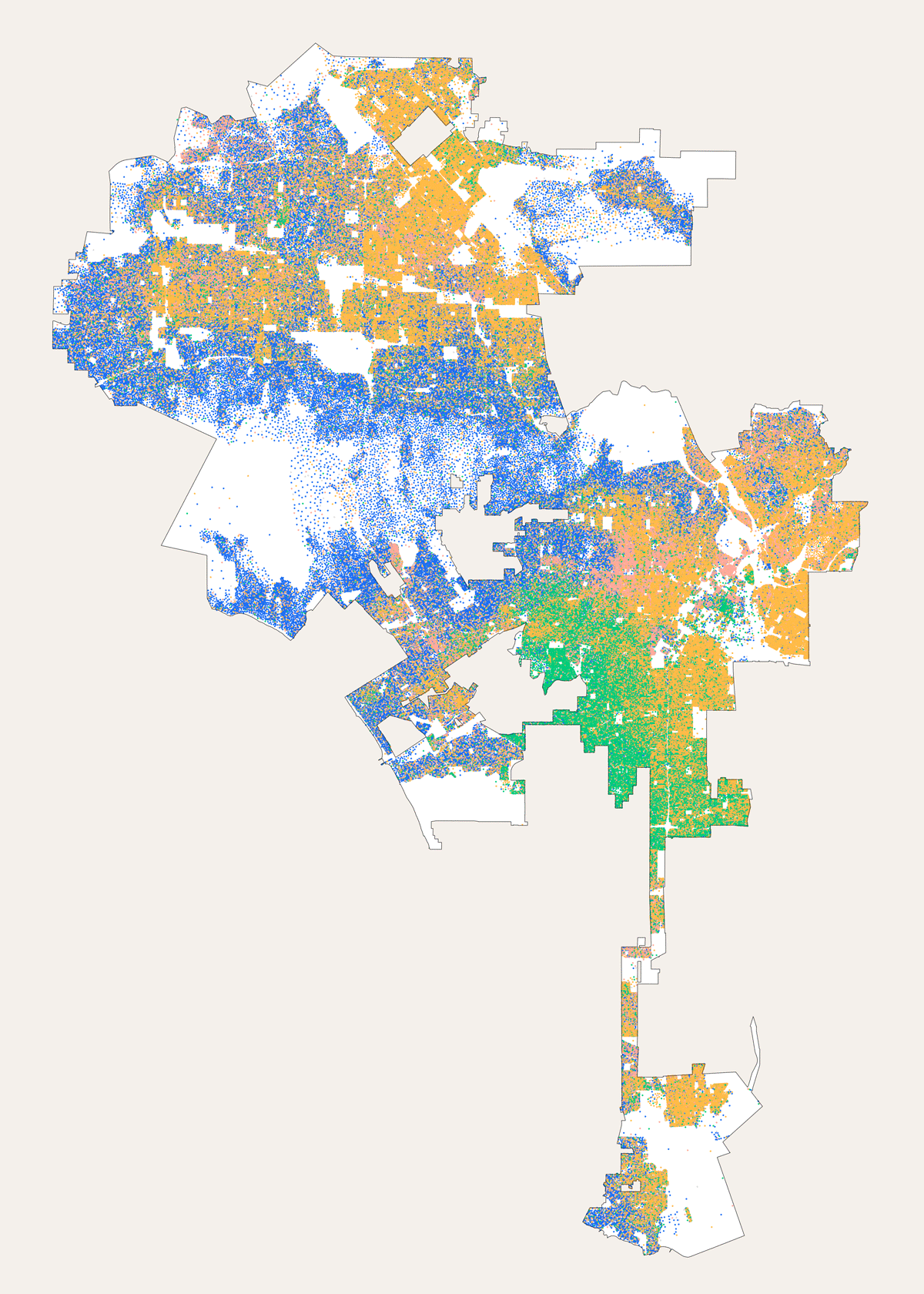
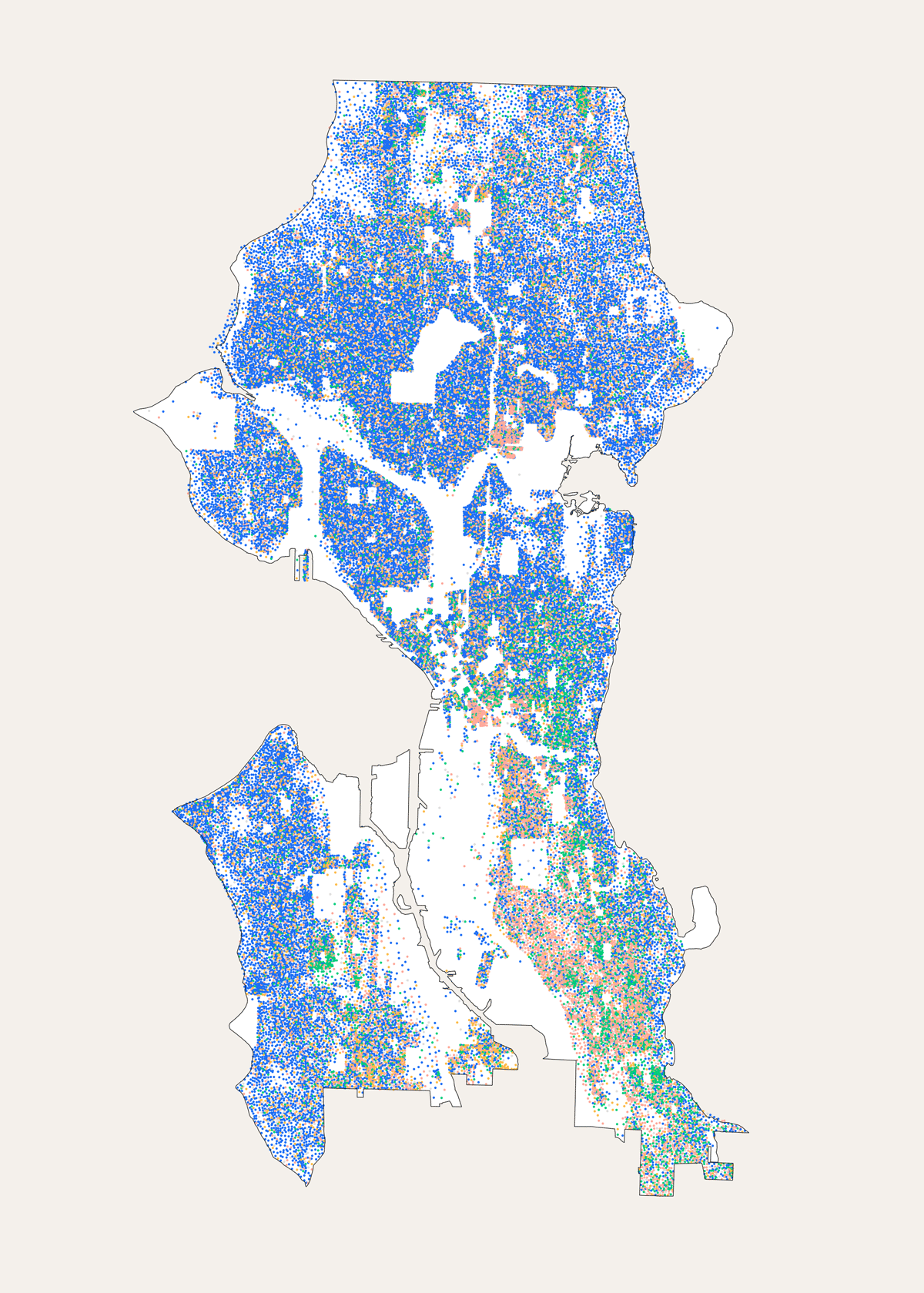
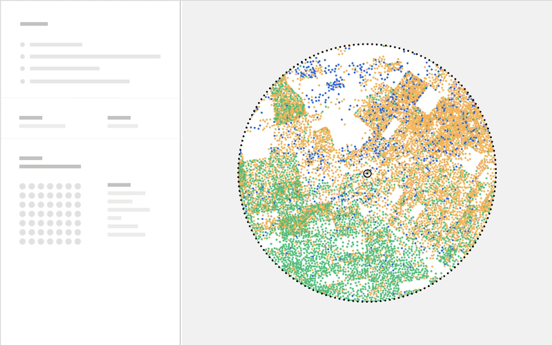
For example, the demographics layer of Morphocode Explorer is a dot density map that visualizes the population density and the predominant ethnicity groups in the area:
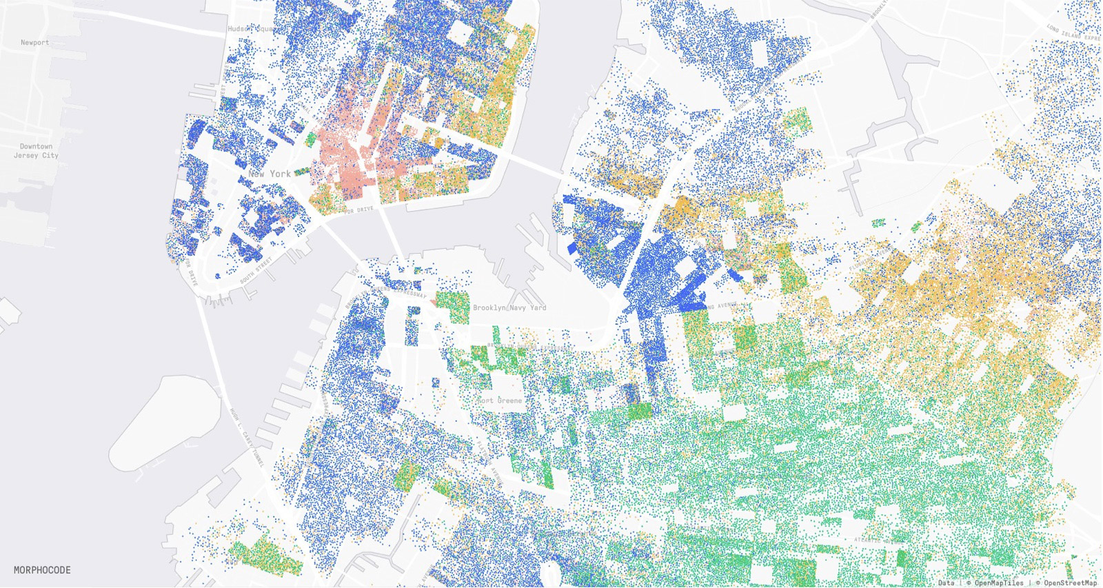
To build the layer, we use data from the Census API. The tabular data contains population counts, sex distribution, ethnicity/race groups, and other demographic properties. Each row is identified by a GEOID, making it possible to associate the demographic attributes to a census block.
To create the dot density map, we group the population into equal-sized bins based on race/ethnicity group and plot the dots uniformly according to the number of people in each census block.
🔎 Start Exploring
The design and development process has been a long journey. Along the way, we had to customize the .mvt format to store only attributes, build a new library of interactive DataViz components using d3, and even use machine learning to produce some of the data layers.
We are excited to see the tool online and hope that you will find it useful. Let us know what you think!
Stay in the loop
We are currently expanding the data library to cover more cities. Be the first to know about new features:
Mapping Urban Data
We have launched our first video course Mapping Urban Data. It contains 30 carefully organized and beautifully illustrated videos that will lay a solid foundation for your mapping skills.
Learn More