In this edition of Morphocode Picks, we’ve gathered the most interesting visual resources, research and articles that we came across recently. The list includes a 1955 Copenhagen diagram, open access research and a 4kb framework for creating sturdy frontend applications:
Who’s onboard 2019 report by TransitCenter
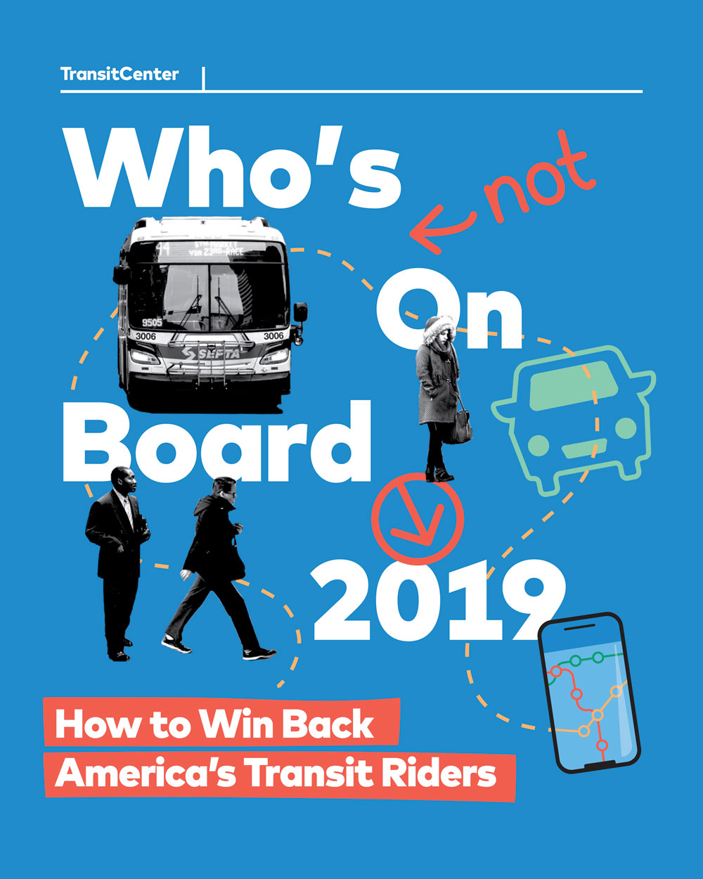
TransitCenter foundation’s latest report provides insight into the causes of declining transit ridership in the USA. The report draws on results from focus groups and an online survey of transit riders in New York City, Chicago, Los Angeles, Pittsburgh, Seattle, Denver, and New Orleans. According to the report, increased private car use is one of the main reasons for the decline in transit use.
“The private car is transit’s strongest competitor, but transportation network companies like Uber and Lyft are nibbling away at some transit trips, especially in dense cities such as Boston, Chicago, New York City, San Francisco, Seattle, and Washington, DC.”
The study also reveals that major personal events such as relocating for work or moving to a new home are related to substantial shifts in transit use. Another key finding is that low-income respondents are often displaced and pushed away from high-quality transit neighborhoods to less accessible places. Meanwhile, higher-income residents, who are less likely to use transit, replace them.
You can read the full report here.
The Finger plan
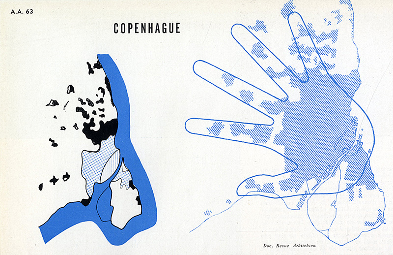
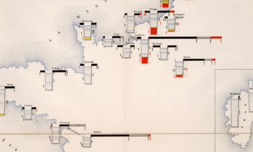
This urban development diagram of Copenhagen was originally published in the magazine Architecture D’Aujourd’Hui in 1955. We stumbled upon it on RNDRD – a digital archive of architectural drawings and models scanned from design publications throughout the 20th century. The so-called “Finger plan” was conceived in 1947 as a development strategy for the Copenhagen metropolitan area. It envisioned an urban expansion along five axes of commuter rail lines – the five fingers extending from the dense central core.

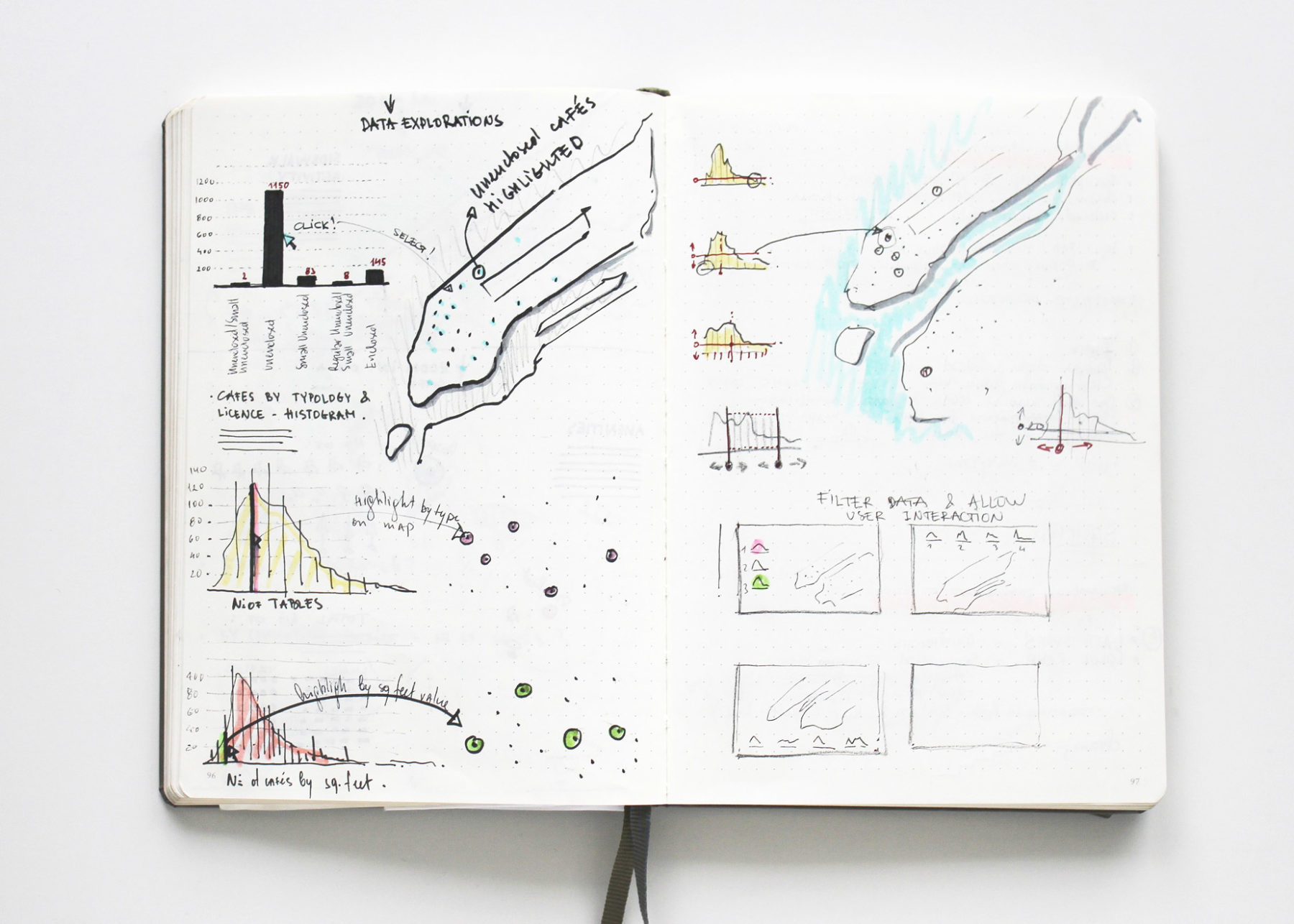
Morphocode sketchbooks
Everything we do involves a lot of research and sketching. We use sketchbooks to plan the stories in our blog and to draft ideas. Our data visualization and mapping projects also start with pen and paper. It’s always fun to look back and see how things evolve from rough drafts to prototypes and finished works.
In this album, you can find a short selection of pages from our sketchbooks.


“Walls” – Thinking Allowed
“I’ve distinguished between what I call thick ones and thin ones. The thin ones tend to be very one-dimensional – all they do is divide and all they do, really, is exclude. The thick ones are zones of transition…” — Prof. Wendy Pullan
Thinking Allowed is BBC Radio 4’s Wednesday afternoon discussion program hosted by Laurie Taylor. In the latest episode, Taylor talks to David Frye, Professor of History at Eastern Connecticut University and Wendy Pullan, Professor of Architecture and Urban Studies at the University of Cambridge on the subject of walls.
“A wider freeway won’t reduce traffic”
Traffic engineers and urban planners concerned with walkability and sustainable modes of transportation have a long-lasting argument over the benefits of road widening. Authors like Jeff Speck have argued that widening freeways actually leads to more traffic due to induced demand.
The same controversy is currently taking place in Portland. The Oregon Department of Transportation is proposing to widen a mile-long stretch of Interstate 5 at the cost of about $500 million to relieve congestion. Here is an interesting analysis of the case by City Observatory.
UCL Press open access
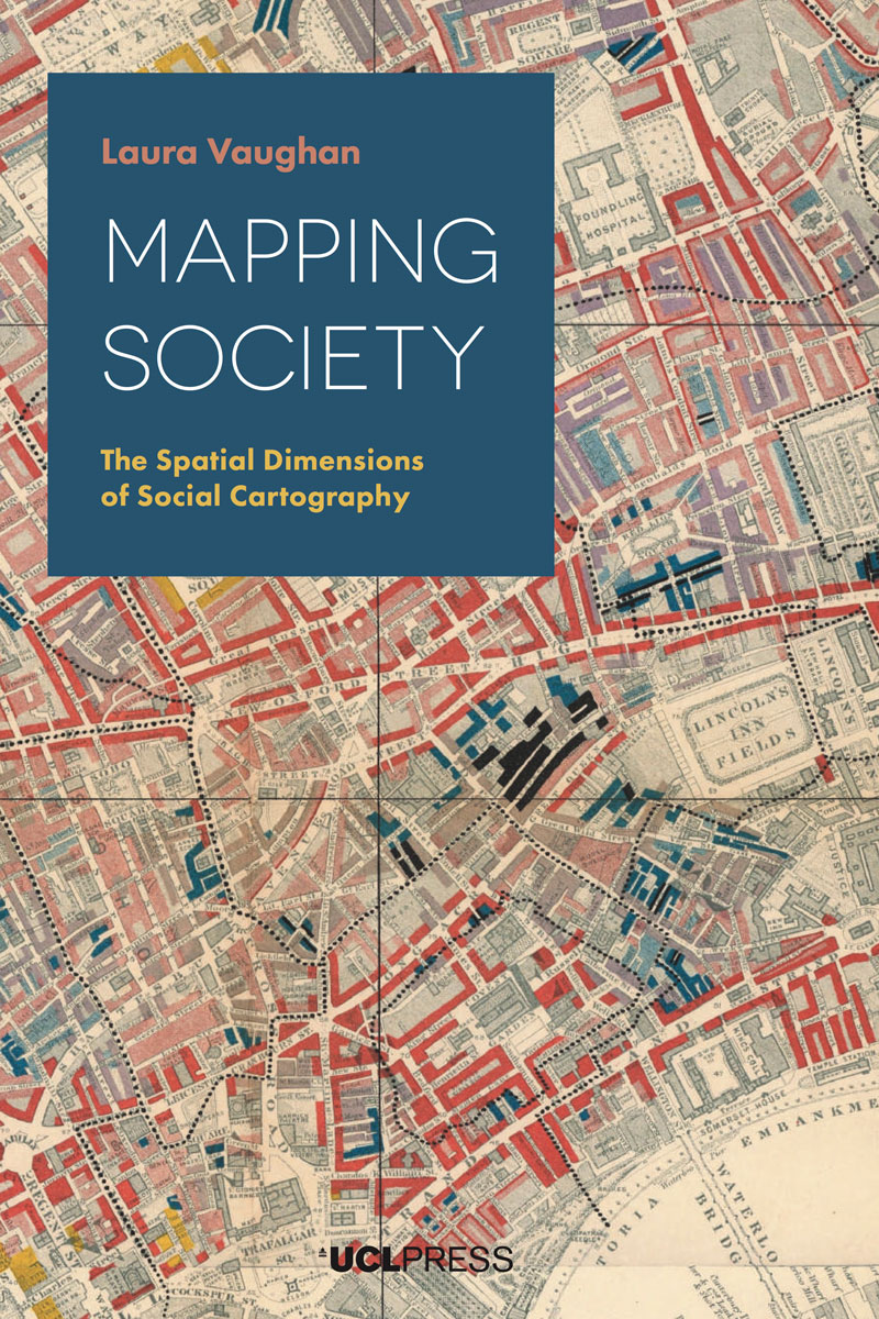
UCL Press is committed to providing open access to academic research for a global audience and is the first fully Open Access University Press in the UK. Since January 31, UCL Press is also accepting academic research submissions for its newly launched open access journal – UCL Open. Currently, you can access dozens of books on various topics like Built Environment, Architecture, Social Sciences and many more on their website.
One of our favorite publications is “Mapping Society: The Spatial Dimensions of Social Cartography” by Prof. Laura Vaughan. The book is available as a free pdf download and traces the evolution of social cartography over the past two centuries. It covers themes such as the use of visual rhetoric to change public opinion, the evolution of sociology as an academic practice, changing attitudes to physical disorder, and the complexity of segregation as an urban phenomenon.
Another interеsting title will be published in March – “Leading Cities: А global review of the state of city leadership”. Drawing on research into 202 cities in 100 countries, the book will provide a broad, international evidence base grounded in the experiences of all types of cities.
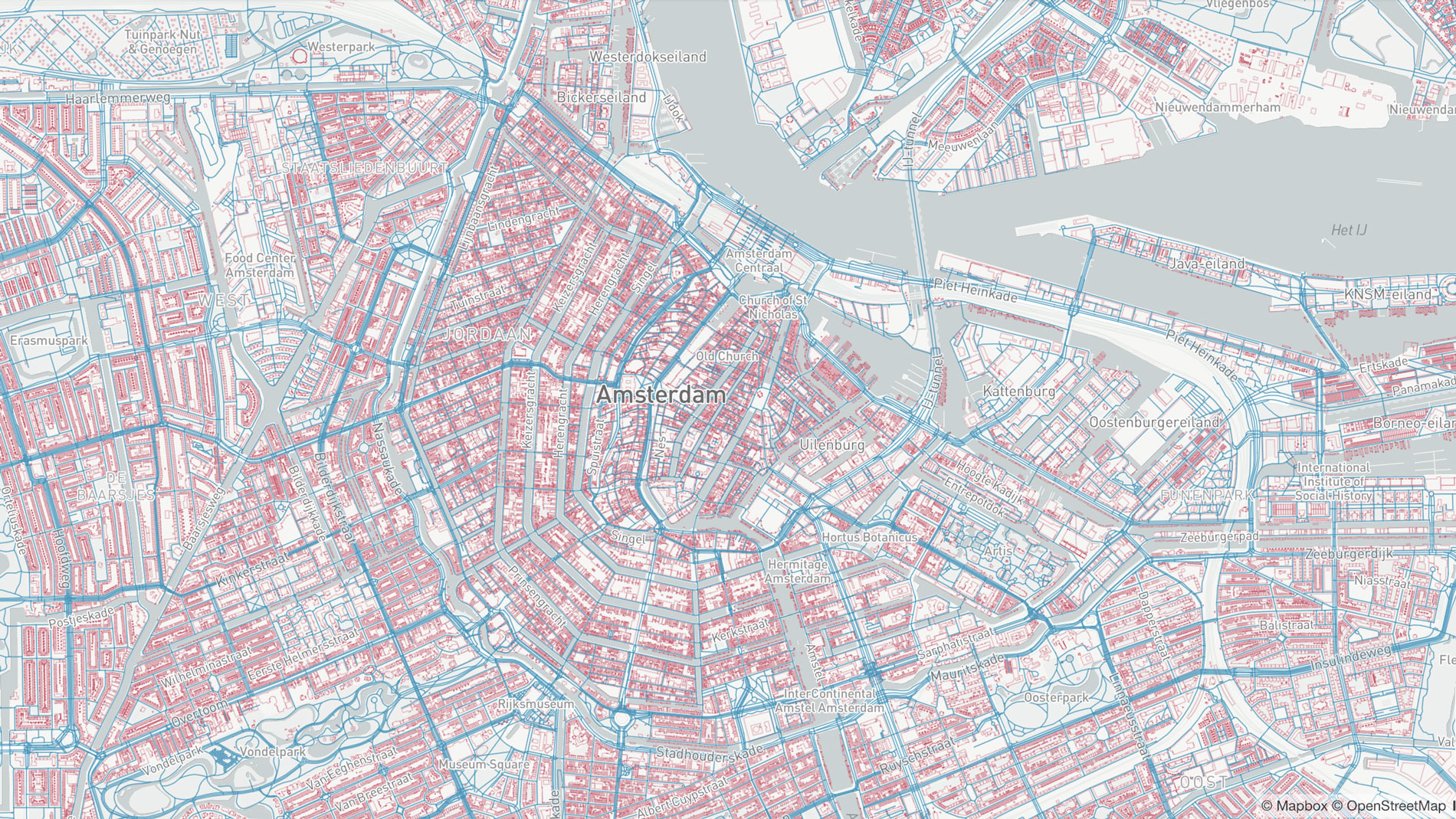
Evolution of Open Street Map
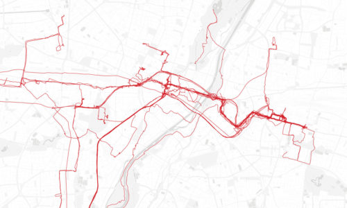
Animation toolkit for OpenStreetMap is a platform that allows you to create and save visualizations of your OpenStreetMap edits. This tools provides a great overview of the evolving community contributions across the world. The animation tool kit is design for Zoom levels 12 and higher.
This collaborative open source project was initially created in partnership with HOT, the Australian Government Department of Foreign affairs and Trade and the USAID Office of Foreign Disaster Assistance. The source code is available on GitHub.
FixMyStreet! : The Geography of Citizen Reporting on Neighbourhood Issues in the UK
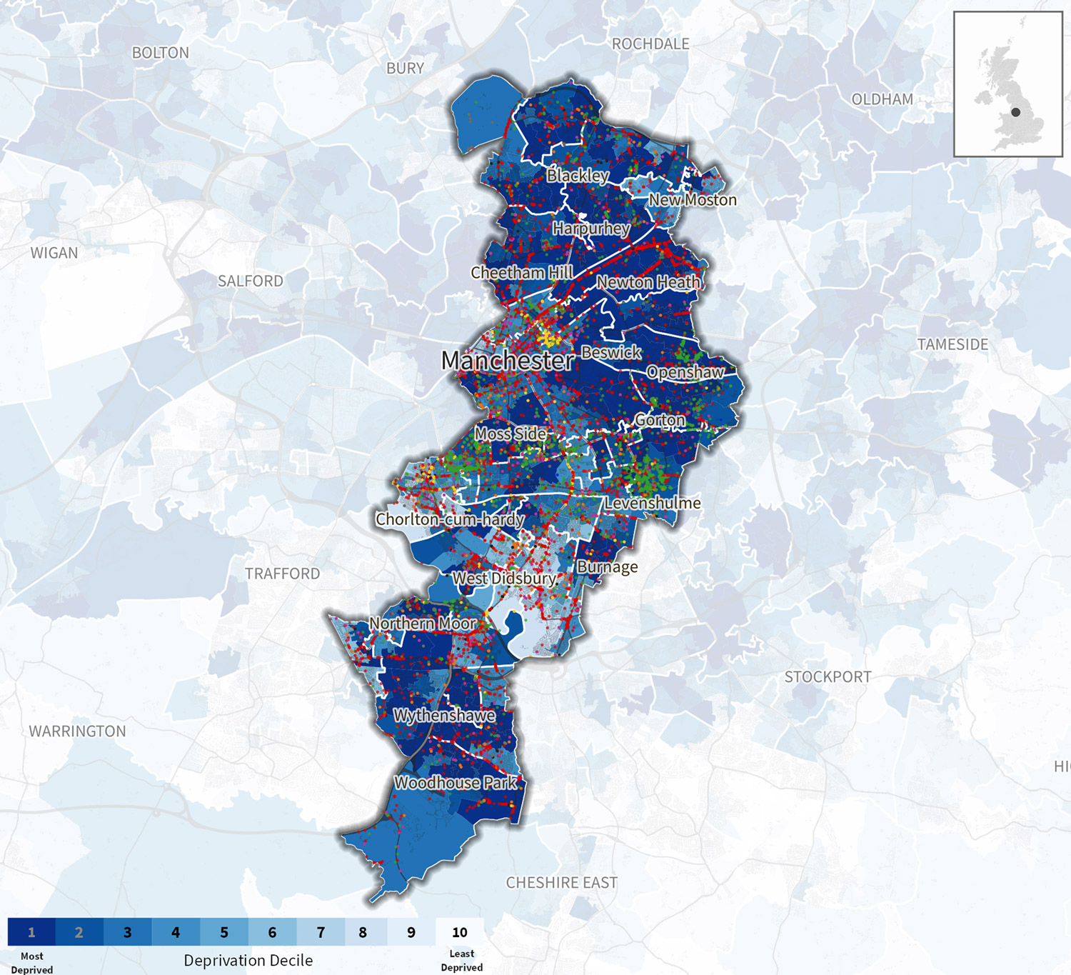
FixMyStreet! is a study featuring a short report, a set of online maps and data. It was produced by Peter Matthews (University of Stirling), Alasdair Rae and Elvis Nyanzu (University of Sheffield) and Alex Parsons (mySociety). The study analyses a database of reports to local councils submitted through the FixMyStreet website or app.
“Citizens are much more likely to report issues that are close to where they live and, possibly surprisingly, they are more likely to report these issues than issues where they spend significant amounts of their time (e.g. outside their workplace, or on regular journey routes).”
As budget cuts to local councils allow for fewer regular inspections, authorities often rely on citizens to report problems and defects in their area. This study provides an interesting insight into the distribution and density of citizen-initiated request in the UK. The authors also produced high resolution maps and data posters for every local authority in the United Kingdom, showing the location of reports, what category they fall in and how this compares to other areas.
Choo choo

React, Angular and Vue.js are some of the most popular tools in web development today. They allow you to write better code by structuring your application into components and managing how data flows from one part to another.
However, using these frameworks comes at a cost. You need to know what is the component lifecycle, how to combine reducers, dispatchers and stores together, how to pass properties, define property types, etc.
And this is where Choo comes in. It offers a simpler, lightweight alternative to the popular frontend frameworks. Its small API makes it easy to learn while still providing everything you would expect from a web framework: templating, routing, state management and server-side rendering.
The Topography of Wealth in L.A.
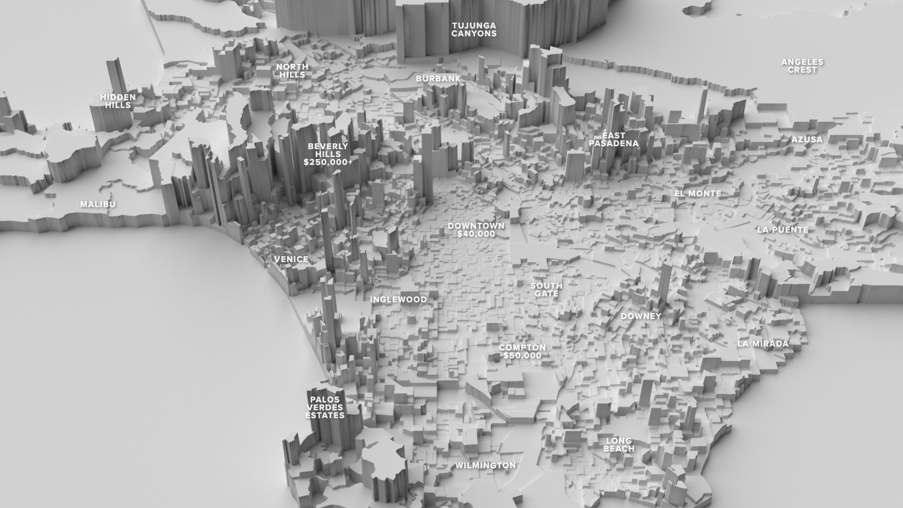
The Topography of Wealth in L.A. is an interactive story by Nick Underwood. It explores the topic of income inequality in the city and uses physical terrain as a metaphor to visualize the vast gaps in opportunity that exist between neighborhoods.
“Using 2017 census data, we displace each geographic unit vertically based on median annual household income. Low-income neighborhoods sink into canyons, while rich areas soar far above the city as high plateaus.” — Nick Underwood