In this edition of Morphocode Picks, we’ve gathered the most interesting visual resources, research papers and articles that we came across recently. The list includes an inspirational selection of flow maps, graphic notations, imaginary cities and a blueprint for autonomous urbanism:
Blueprint for autonomous urbanism by NACTO
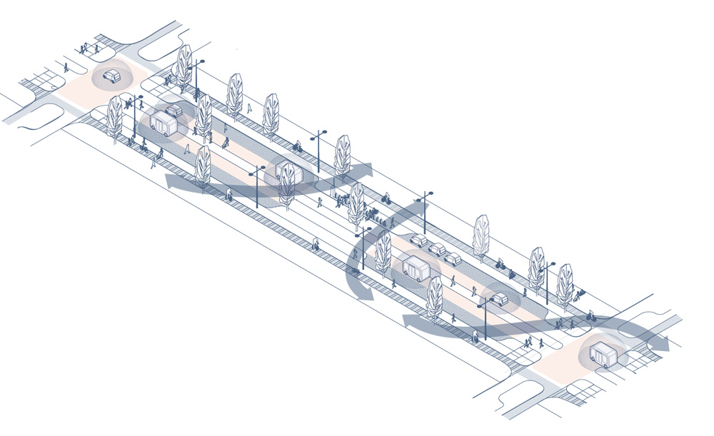
The Blueprint outlines a vision for future cities in which automated transportation is widely spread. According to Janette Sadik-Khan, who wrote the foreword for the document, this shift is a historic opportunity to reclaim the street and to correct the mistakes of a century of urban planning. Setting a human-oriented agenda for the future of urban mobility requires finding ways to use automation to promote safety, equity, public health, and sustainability.
“Data is replacing concrete, asphalt and steel as the foundation of 21st-century urban transportation planning and management.”
The document proposes several principles for autonomous urbanism identifying real-time, data-driven street management as one of the main pillars for the future of transportation.
Connected Urban Growth: Public-Private Collaborations for Transforming Urban Mobility
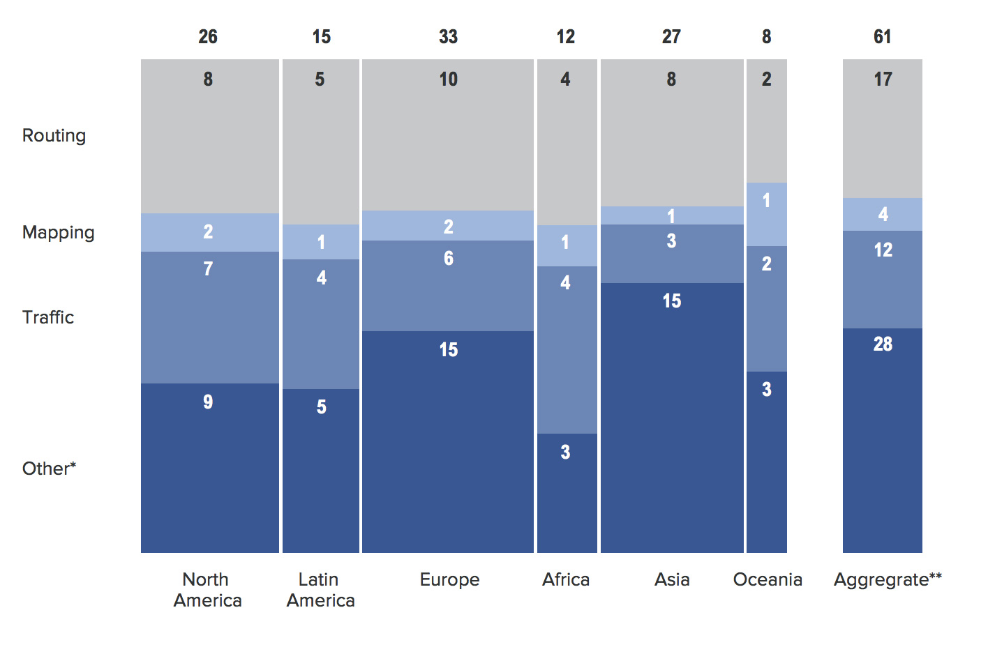
This working paper, prepared for the Coalition for Urban Transitions discusses the concept of “new mobility services” and how they can help improve the performance of urban transportation systems. The study evaluates how the demand for public transportation is affected by the development of new mobility services worldwide and analyses the potential for public-private collaborations in the sector.
Data-driven decision-making services mostly consist of mapping, routing, traffic monitoring, and other location-based services. Many of these services work on the back end of public-facing ones.
As a part of the new mobility wave, data-driven decision-making services provide an opportunity for more efficient transportation management and planning. According to the study, nearly one-third of data-driven decision-making start-ups focus on routing information.
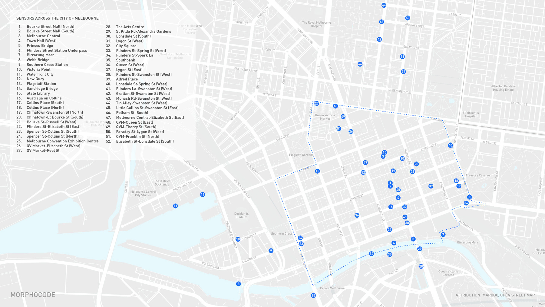
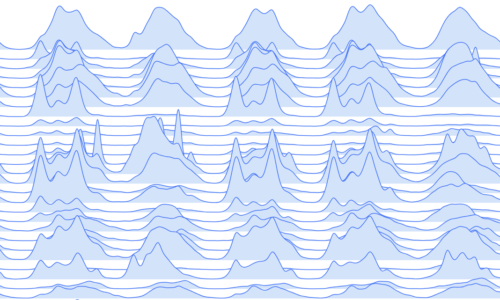
Visualizing Melbourne’s pedestrian traffic data
In our most recent urban data visualization case study we explore Melbourne’s pedestrian counting system data. We’ve put together a series of interactive graphics that will take you through common techniques for visualizing time series data and will let you explore the city’s pedestrian dynamics. You will also take a closer look at one of the best early examples of urban data visualization starring William H. Whyte and Seagram plaza.
The study was picked up by the dataviz community (thanks Nadieh!) and gained traction on twitter:
An interesting case study that uses multiple charts to show different insights into "visualizing pedestrian data" in this article by @morphocode (starts about halfway down the page) https://t.co/BBo8EA4Lzk pic.twitter.com/O5Rz2WNcpW
— Nadieh Bremer (@NadiehBremer) June 7, 2018
Smart cities: Digital solutions for a more livable future
The latest report by McKinsey Global Institute discusses what makes a city smart and how new applications can improve the quality of life in urban areas. It also provides a snapshot of deployment in 50 cities around the world showing that wealthier urban areas are generally transforming faster, although many have low public awareness and usage of the applications they have implemented. The research examines smart city applications in diverse domains: Security, Mobility, Healthcare, Energy, Waste, Economic development and housing, Engagement and community.
Quantifying the death of the classic American main street
“Quantifying the death of the classic American main street” – a talk for Sidewalk Labs’ blog with urban scholar Emily Talen about her attempt to track main street’s decline in Chicago. Her analysis, conducted in collaboration with Hyesun Jeong, discusses what metrics might be used to capture main street principles.
“Does the classic American main street still exist? An exploratory look” is the full paper that introduces eight variables covering servicing, opportunity and quality at the block level.
Carbon footprints of 13 000 cities
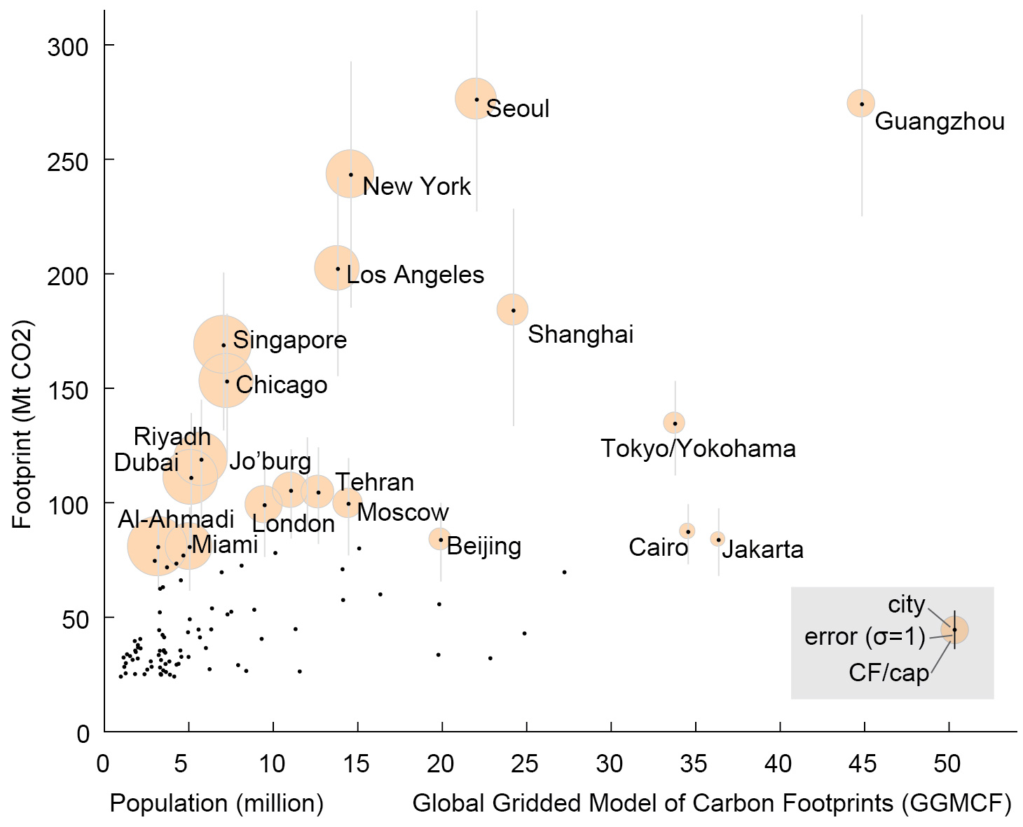
The Global Gridded Model of Carbon Footprints provides a globally consistent, spatially resolved (250m), estimate of carbon footprints in per capita and absolute terms across 189 countries. According to the study:
- Globally, carbon footprints are highly concentrated into a small number of dense, high-income cities and affluent suburbs
- 100 cities drive 18% of global emissions
- In most countries (98 of 187 assessed), the top three urban areas drive more than one-quarter of national emissions
More key findings from the Global Gridded Model of Carbon Footprints + data for the top 500 cities here: http://citycarbonfootprints.info/
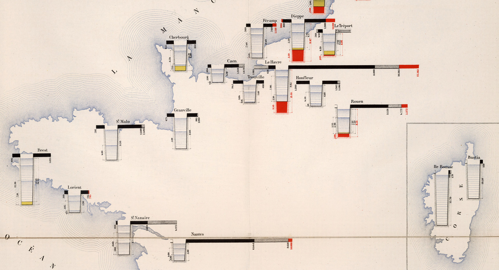
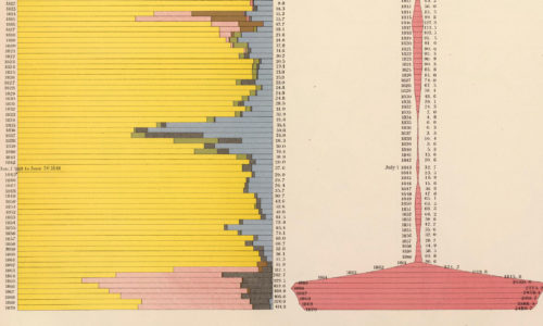
Album de Statistique Graphique (1888)
This 1888 data visualization focuses on shipping and shows operating conditions of the principal French seaports. It was designed by Émile Cheysson for the French Ministry of Public Works and is part of the “Album de Statistique Graphique de 1888”. Most maps in the atlas cover the region around Paris and were inspired by earlier works of Charles Joseph Minard.
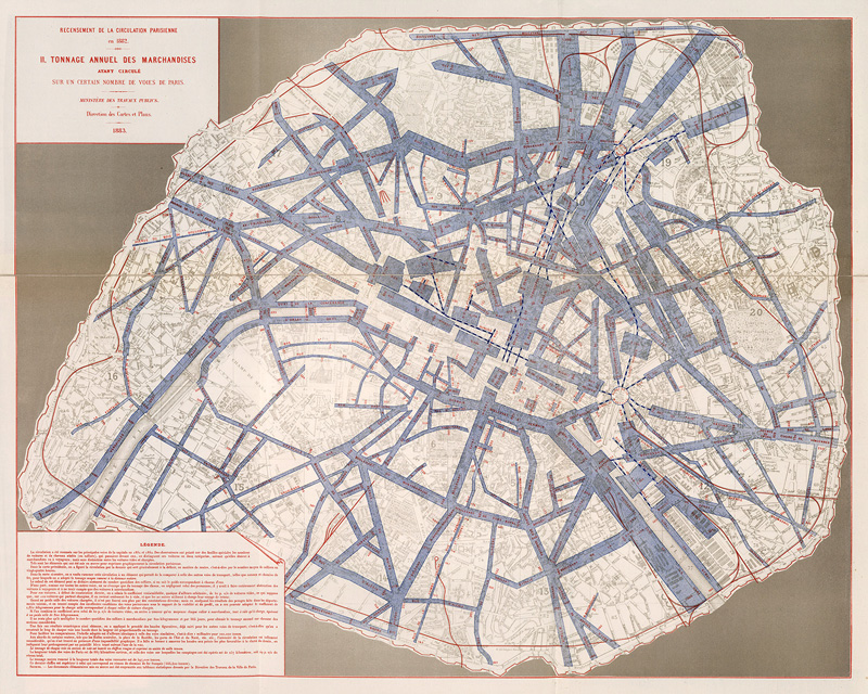
The atlas belongs to a series of annual or biannual editions from the period 1879 – 1900. These editions are available online through David Rumsey historical map collection. Most maps have a detailed inset showing the map’s theme as it applies to the vicinity of Paris. Above you can see an 1883 map of Paris Circulation Census
New Babylon by Constant
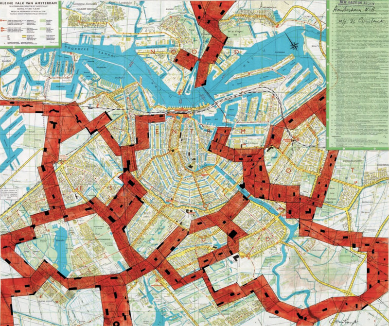
The interest that dutch visual artist Constant had in architecture, urbanism and mapping culminated in the 60’s. His concept New Babylon is an imaginary city for the homo ludens of the future, creating alternative life experiences, called “situations” (Constant was an influential figure of the Situationist movement). In this “world wide city for the future”, land is owned collectively, work is fully automated and the need to work – replaced with a nomadic life of creative play.
The environment of the homo ludens has, first of all, to be flexible, changeable, assuring any movement, any change of place or change in mood, any way to behave.
Constant, 1963
Graphic notations by Mark Applebaum
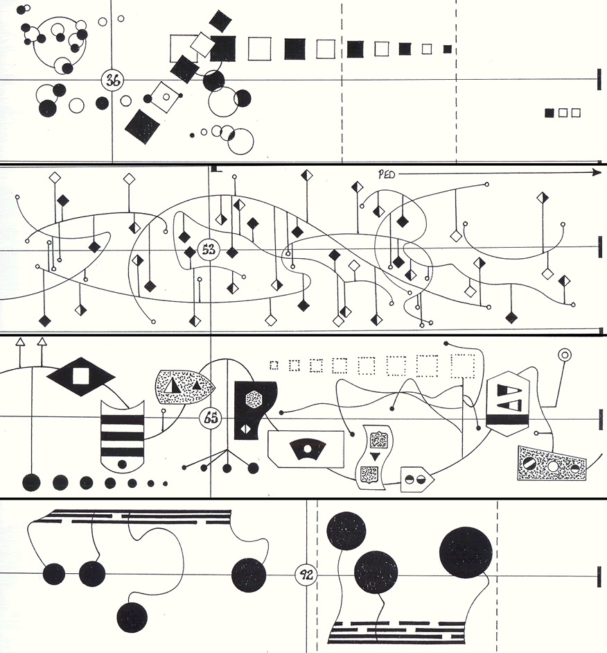
Mark Applebaum has long experimented with new forms of graphic scores for his compositions. This example is from the solo part to The Blue Cloak (2005). The Metaphysics of Notation is also quite stunning graphically. You can learn more about his work in the following article: Progress Report — The State of the Art after Sixteen Years of Designing and Playing Electroacoustic Sound-Sculptures.
1930’s flow maps
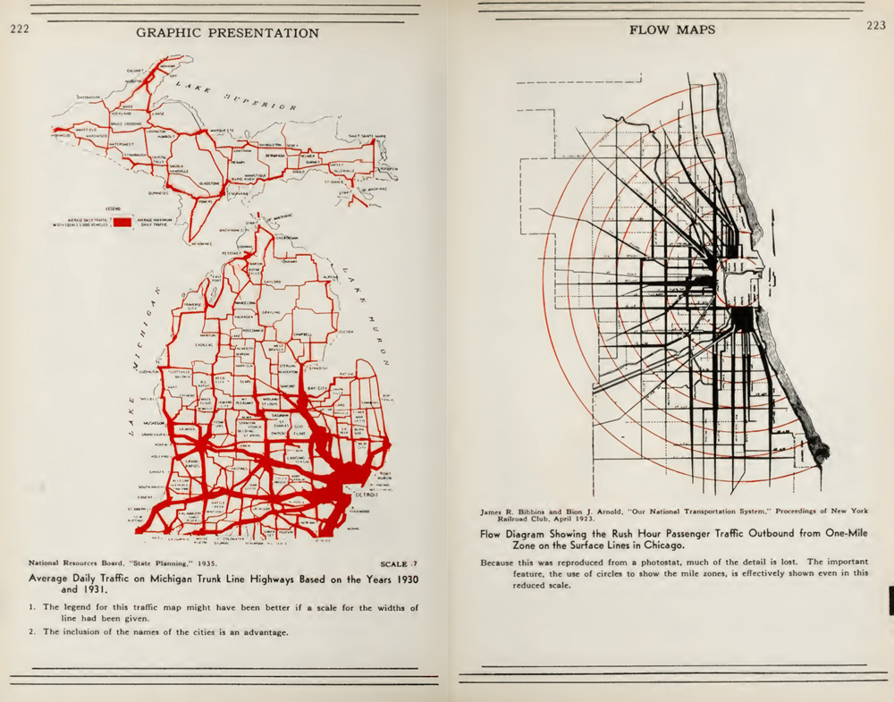
“Graphic presentation” by Willard C. Brinton is a milestone in the history of information design and a must-read for anyone interested in the graphic representation of data. The book was published in 1939 – 25 years after “Graphic methods for presenting facts” and gives invaluable advice on both how to read and make charts.
The words are carefully studied before they are qualified for admittance in a dictionary. No one knows how many distinct types of graphic charts are already in established use.
Willard C. Brinton (1939)