According to Eric Schmidt, former CEO of Google, the amount of data collected between the dawn of humanity and 2003 is equivalent to the amount we now produce every two days.
Urbanization and the spread of information technologies transform Cities into huge data pools. This big data provides new opportunities to reveal the hidden dimensions of the city and better understand the processes taking place within its physical boundaries.
In one of his recent editorials for “Environment and Planning B” – “The database of intentions“,Michael Batty notes that, despite its long-standing presence in urban studies, the theme of Complexity and the systems approach are no longer as popular as they once were: it is urban data that will play a major role in understanding how city areas have changed and are likely to change in the future.
Understanding Urban Data
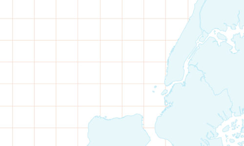
On July 25, 2013, the City of New York has released its biggest source of land use and geographic data: the Pluto Database. This “epic win for NYC’s open data community” was the result of a big community effort to open urban data that was once unaccessible.
Urban visualizations can create awareness about important urban conditions and provide a valuable insight into how cities perform and how people interact with the urban environment.
Here are some of the most interesting urban data visualizations that we’ve come across:
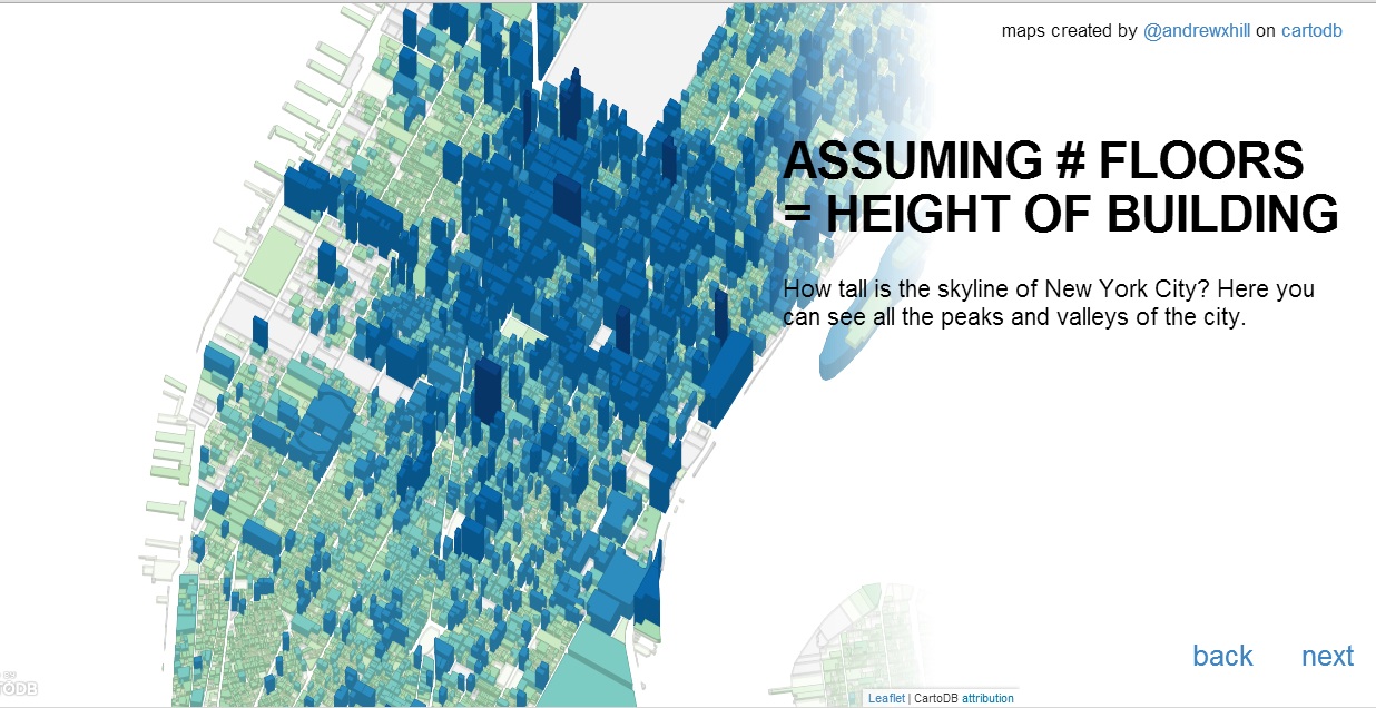
PLUTO Data Maps
This is a project created by Anrew Hill, developer at CartoDB.
The project presents a series of maps that reveal some insights and hidden patterns of New York’s built environment. For example: “Who owns the private land of Manhattan?” and “Which lots are the farthest from public spaces?”
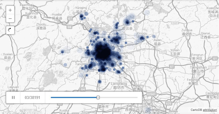
The Beijing City Lab (BCL)
The Beijing City Lab (BCL) is a virtual research community, dedicated (but not limited to) studying China’s capital Beijing.
They also have published a series of maps, exploring diverse themes such as “Communities of public transportation in Beijing” and “Beijing Planning Permits Vis (1997-2003)”
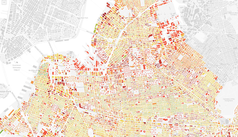
Block by Block, Brooklyn’s Past and Present
This is a map of Brooklyn’s building blocks by age. “The result is a snapshot of Brooklyn’s evolution, revealing how development has rippled across certain neighborhoods while leaving some pockets unchanged for decades, even centuries.”
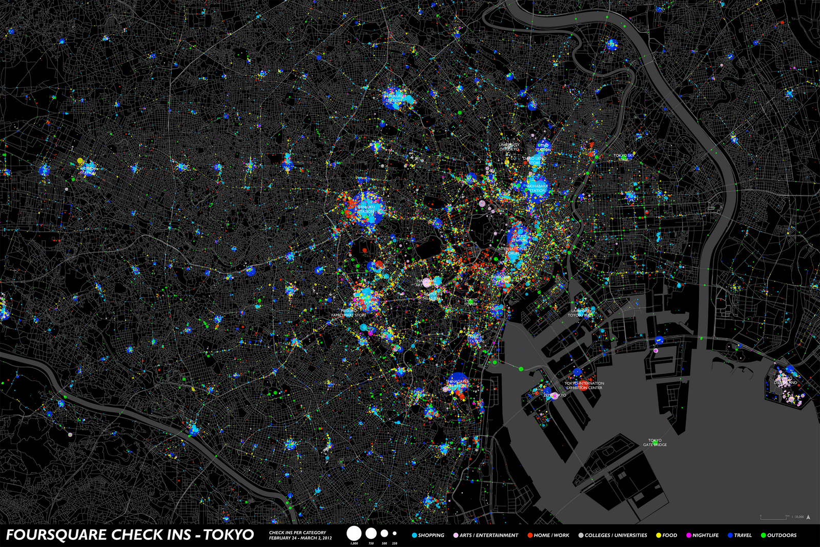
We are Here Now
A project of Spatial Information Design Lab that uses FourSquare check-in data from different cities around the world.
The data is plotted on a map, in order to explore urban patterns that might be hidden otherwise.
Visit the Flickr Set of the project.
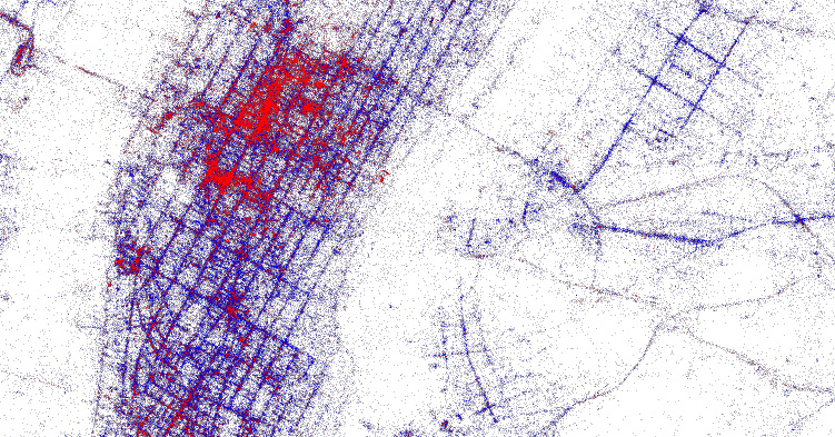
Locals & Tourists
Eric Fischer from MapBox and the Gnip team have used Twitter data to create a map of local allegiances.
Blue points on the map are Tweets posted by “Locals”. Red points are Tweets posted by “Tourists”.
![]()
Flocktracker
Flocktracker is an android application, designed to easily collect urban data in order to create “inexpensive, highly accurate, and robust data sets”. It has been developed by the Urban Launchpad – a global team of urban planners, designers and researchers. The app was used to create the first ever Bus Map of Dhaka.
Upcoming at Morphocode Academy
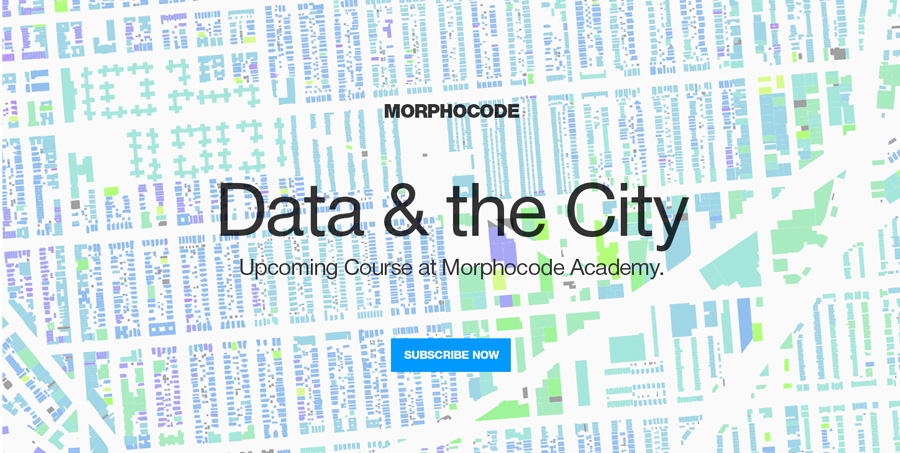
“Data and the City: Urban Visualizations” is an upcoming course at Morphocode Academy. It will discuss how to collect, store and visualize urban data in a useful way. The course is under development at the moment and will soon be available online to subscribers.