The most common ways to visually organize information are based on location and time. That is why we are all familiar with timelines and maps. Urban data visualization – whether it deals with hourly pedestrian counts, transportation patterns or census tracts – often relies on these two organizational frameworks.
A day in the life of the north front ledge at Seagram’s
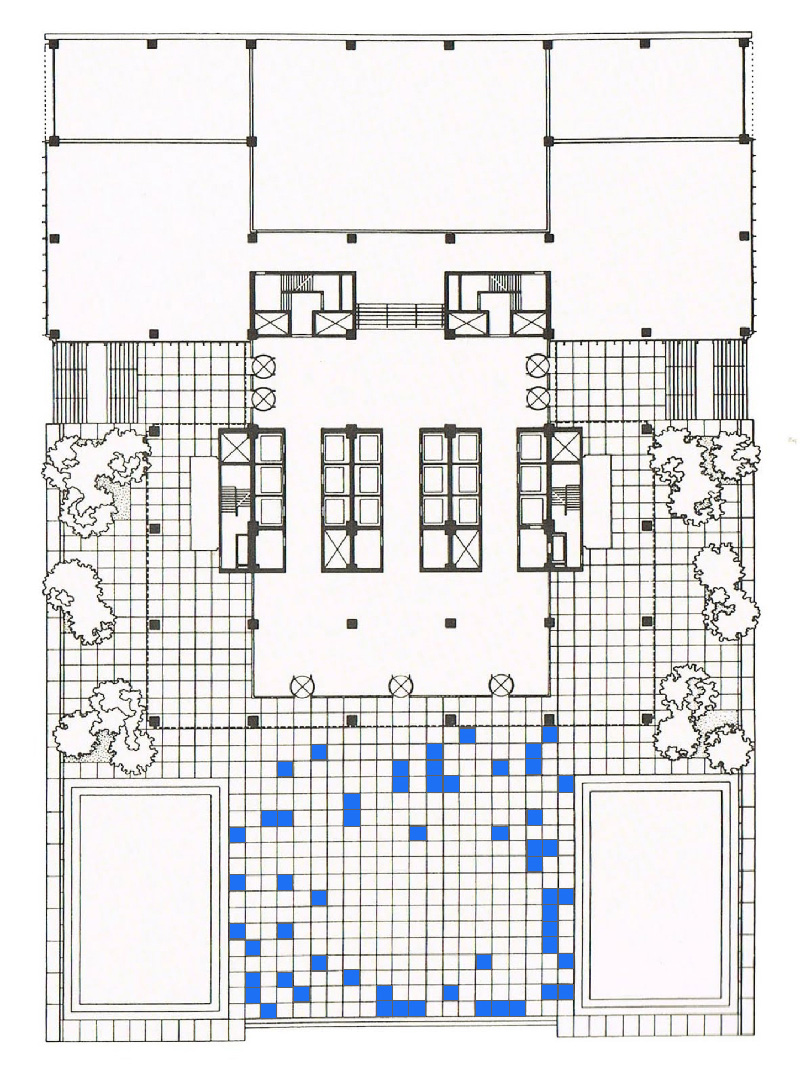
Consider for example William H. Whyte’s iconic visualization “A day in the life of the north front ledge at Seagram’s“. The diagram was part of a larger study on how public spaces work and shows sitting patterns at the north front ledge of the Seagram plaza. Using two time-lapse cameras, Whyte and his team observed where and for how long people sat on the ledge during the day.
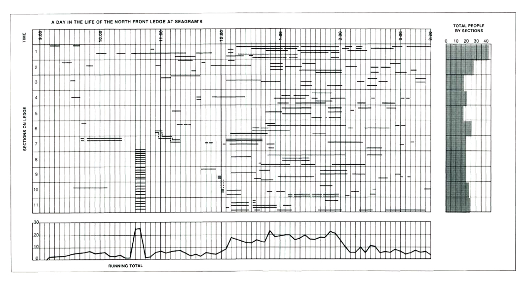
“I used the film to construct a chronological chart, which looks rather like a player piano roll. Each line represents a sitter; the length of the line, the time he spent sitting; the channel that the line is in denotes on which of 11 squares he sat. Each square is four feet eight inches wide; the total ledge, 51 feet. The continuous line at the bottom of the chart shows the total number of sitters at any one time.”
William H. Whyte
The chart shows not only people’s tendency to cluster but also an innate ability to self-regulate. During the busiest hours, the total number of people sitting on the ledge remained between 18 and 21.
William H. Whyte also mapped the main pedestrian paths along the plaza, as well as the places where people preferred to stand. His visual study explains the success of Seagram plaza and illustrates why it encouraged the development of ‘pocket parks’ in other areas of New York City. It is a great early example of how data analysis and visualization improve our understanding of public spaces and cities in general.
Temporal Primitives
“If we think of facts as a static image of the world, then we can treat events as a dynamic image of the world. Events happen, and their occurrences break the immobility of the world, initiate changes in it, i.e. in facts holding in it.”
E. Hajnicz (1996)
To visualize changes over time, we must first understand time itself. Different temporal models support different types of temporal primitives. Most often we use one of the three main types of temporal primitives: a time point; a time interval or a time span.
A time point or an instant is a single point in time. The time interval, on the other hand, has a duration and is constructed by two time points – a beginning and an end. We can think of time points as events, while intervals are associated with processes. The span is a directed amount of time units, for example, 12 days. It is a relative, unanchored temporal primitive without a fixed beginning on the time axis. In that sense time points and intervals are anchored or absolute temporal primitives, with a fixed location on the time axis.

There are different types of relationships between temporal primitives, based on their position relative to one another.
For example, the relationship between two time points is described in three possible ways: before, after or equal to one another. Intervals, on the other hand can meet, overlap, equal to each other or start at the same point. Relationships between an instant and interval are similar.
The structure of time
We perceive time passage in a linear fashion – graphically this is often associated with a horizontal axis and time running from left to right. A linear interpretation of time is bound to a successive progression of temporal units and usually reveals general trends in the data. If we are interested in periodic trends such as seasonal, weekly or daily changes in values a cyclic interpretation of time makes sense. Cyclic time is composed of recurring time values such as the seasons of the year.

“The decision to which category a time-oriented dataset belongs is not always fully determined, but can depend on the interpretation of the user, on the task, or on the application. If for instance a user seeks to find a general trend in the data, a linear interpretation of the time axis makes sense. On the other hand, detecting seasonal effects in the data can be easier if a cyclic time axis is assumed.”
Aigner, W. et al (2007)
Visualizing temporal data
Working with temporal data often means that we are working with time series: a sequence of data points, collected over a period of time. Time series data is usually indexed successively and over regular time intervals.
There are numerous methods for visualizing changes over time including bar charts; line graphs; Gantt charts; heat maps; stacked graphs; small multiples etc. More sophisticated data visualization methods include, but are not limited to spiral heatmaps, horizon charts, cycle plots. The list given here is not exhaustive but features the most common ways to present visually time-related data.
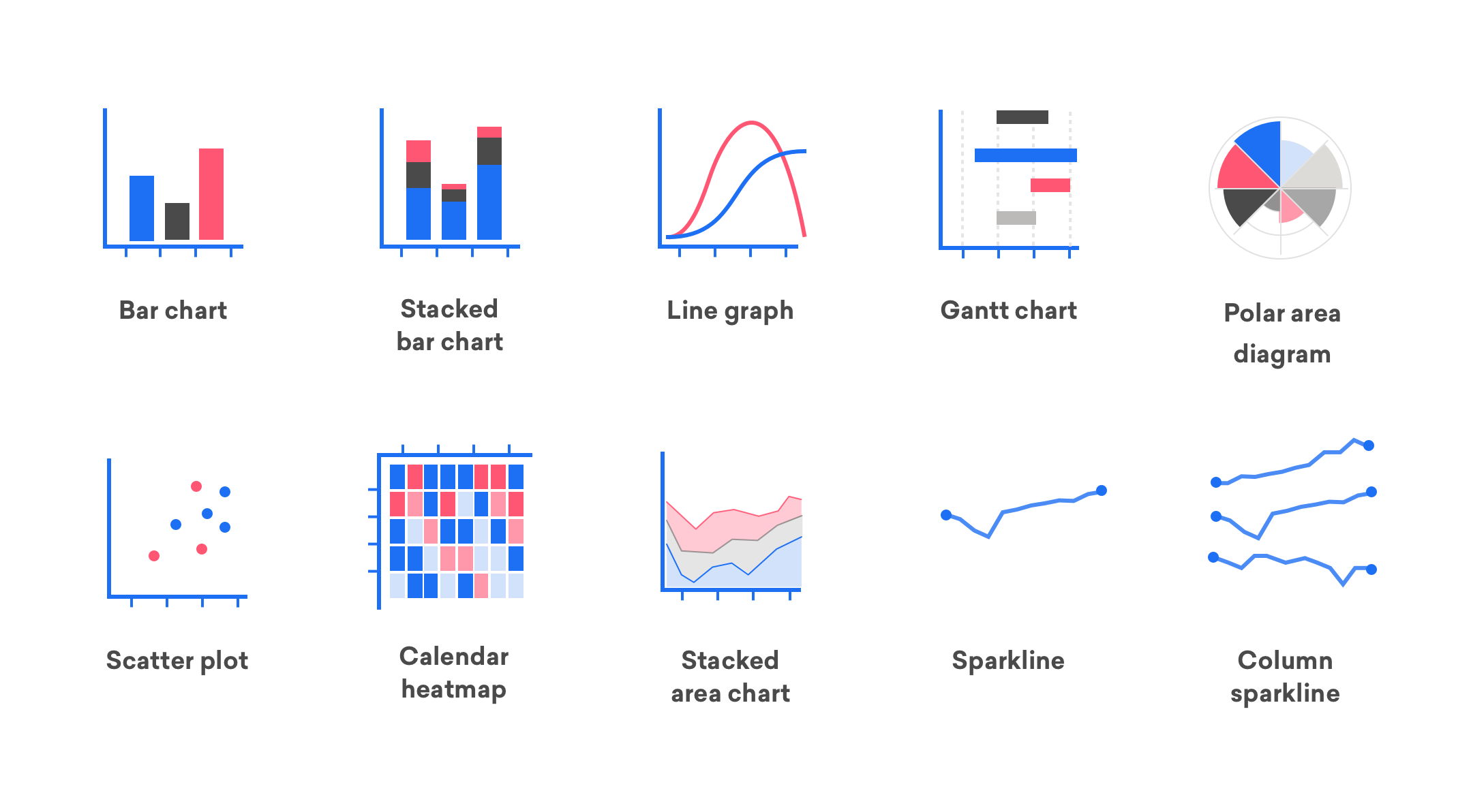
Line graphs and bar charts are some of the most common ways to visualize time series data. In this case, time is usually mapped on the horizontal axis, while the quantitative variable is mapped along the vertical axis.
Gantt charts are often used in project planning to visualize related time intervals.
Heatmaps encode data through color. The data values are translated into color values through a scale and then mapped onto a matrix. Heatmaps allow us to compare changes over time across multiple variables. A spiral heatmap is a specific type of heat map designed for comparing cycles like years or days.
Stacked area graphs also allow us to observe changes in multiple variables and how they affect the cumulative total. However, they can become hard to read when a large number of variables is introduced. Ideally, we should display 4-5 variables in a single chart to preserve the readability of the graphic. The choice of color is also an important factor when visualizing stacked area graphs.
Small multiples allow the comparative visual display of multivariable data that would otherwise be difficult to present in a single chart. Since all the elements share the same design and scale, once you’ve learned how to read a single element you can apply that knowledge to all other elements.
Cycle plots show both linear trends and cyclic patterns in a data set (Tominski et al., 2017, p.34). They are a great way to investigate trends both on the micro and macro levels.
Horizon Charts increase data density by preserving resolution at smaller heights. This allows plotting more data on less space, providing an effective method to compare multiple data sources in a single view.
Case study: visualizing pedestrian data
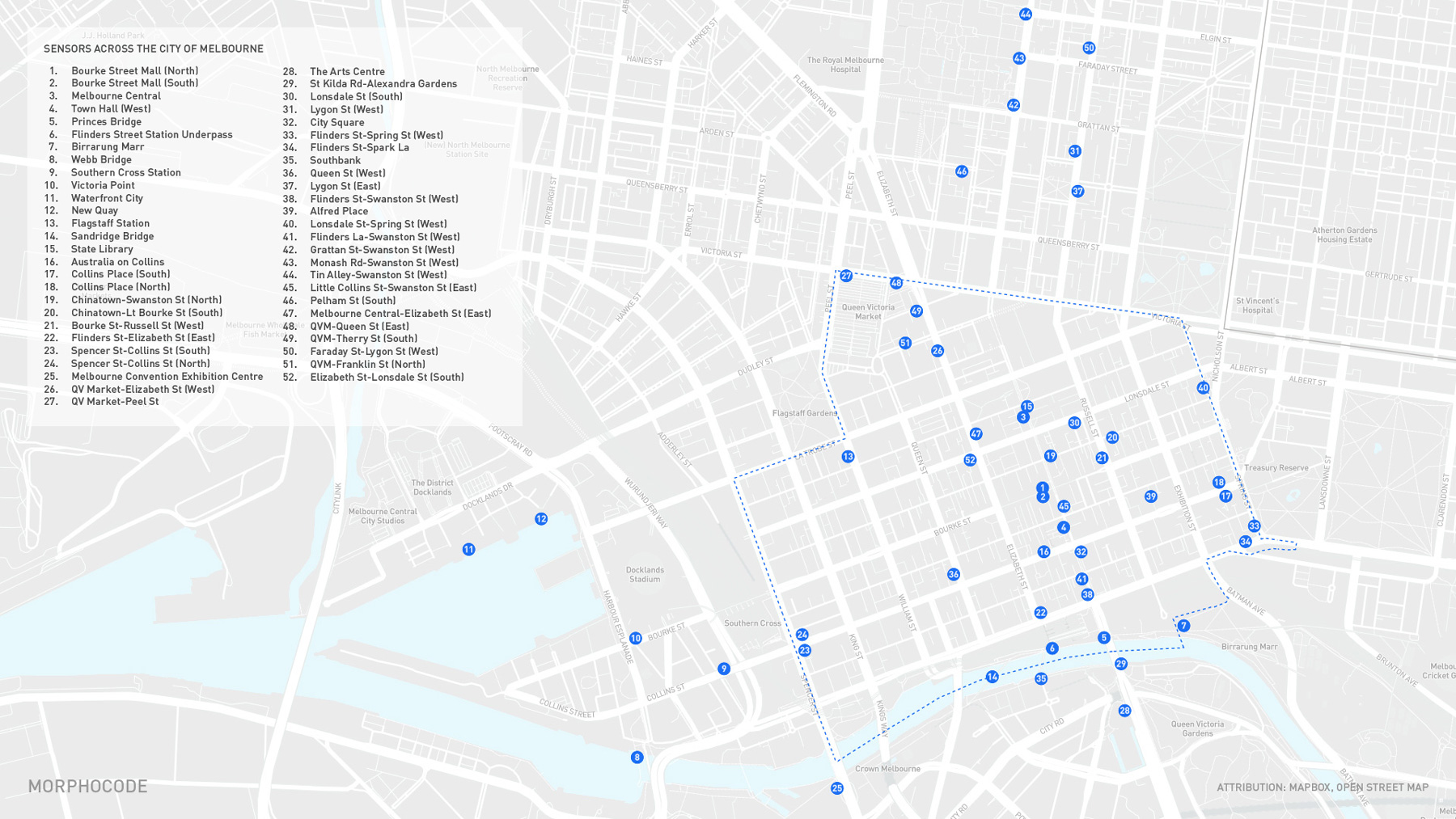
Pedestrian counting systems monitor pedestrian activity and provide data on volume variations throughout the day, week, month and year. They help determine how pedestrian patterns change across location and time.
In this case study, we take on a new look at Melbourne’s pedestrian counting system most recent data. Featuring a series of interactive graphics, it will guide you through common techniques for visualizing time series data and will let you explore the city’s pedestrian dynamics.
The big picture: total pedestrian volume
In the last several years the Municipality of Melbourne has installed about fifty sensors to measure pedestrian activity at strategic locations throughout the city. Each sensor is installed on a street pole or under a canopy to cover a pedestrian counting zone on the footpath below. The data is regularly updated and published on the city’s Open Data Portal in a .csv file format. The raw dataset is a tabular representation of hourly pedestrian counts at each measurement point.
Total number of pedestrians counted each week across all locations
Annual view: seasonal patterns and monthly dynamics
By aggregating the hourly counts into a total daily count, we can create a calendar heatmap and observe the data across multiple scales (days, week and months). The smallest possible time unit, in this case, is one day. At this resolution, we can detect both seasonal patterns and weekly dynamics, such as which days tend to be busier.
Certain locations, such as Spencer St-Collins St (North), are characterized by steady, large pedestrian volumes during the week and much lower volumes during the weekend days. In this case, the trend is observed all year round.

Other places get activated on Fridays and remain active on Saturday and Sunday. Lygon St East, for example, acquires more pedestrians during weekends, as opposed to the weekdays. This location also tends to be less active during September and October.

Daily pedestrian counts at Monash Rd-Swanston St (West) seem to be influenced by the course of the academic year. This location has two yearly spikes around the beginning of March and August when the semesters start.

A week in the life of a place
Let’s narrow the scope to a week and explore pedestrian activity at a resolution of one hour. At this scale, we can observe daily spikes, differences between workdays and holidays and smaller changes in pedestrian activity.
Below you can compare pedestrian volumes at two different locations: Southern Cross Station (top) and Alexandra Gardens (bottom). The data was collected during the last week of April 2018.
The 25th of April (Wednesday) is an official holiday in Australia and New Zealand so the typical daily spikes are not seen around Southern Cross station. Instead, we observe a rather flat curve, similar to a typical weekend pedestrian volume. Alexandra Gardens, on the other hand, saw a significant increase in pedestrian traffic during the whole day.
Daily activity: Monday vs. Saturday
In the following small multiple diagram, you can compare variations in pedestrian volumes during a typical Monday and a typical Saturday in April 2018.
Each chart represents a different location. Time runs along the X-axis, covering the span of a day (0-23h). Red lines visualize hourly pedestrian counts during Saturday, while blue lines represent pedestrian activity on Monday.
We can see that some locations are more active on the weekends, while others are busier on workdays.
Comparison of weekly activity
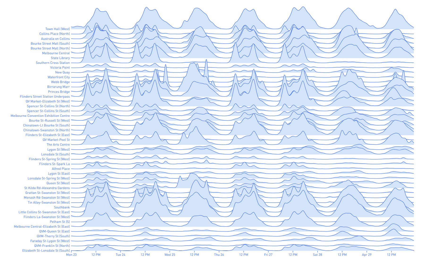
We can also compare how pedestrian volumes change across multiple locations throughout an entire week. By plotting the weekly activity next to each other in parallel bands, we can create a variation of the small multiple chart.
In the following example, we’ve used ridgeline plots to visualize pedestrian dynamics during a single week in April 2018. Time runs from left to right, and each row represents a single location.
A month in the life of Melbourne
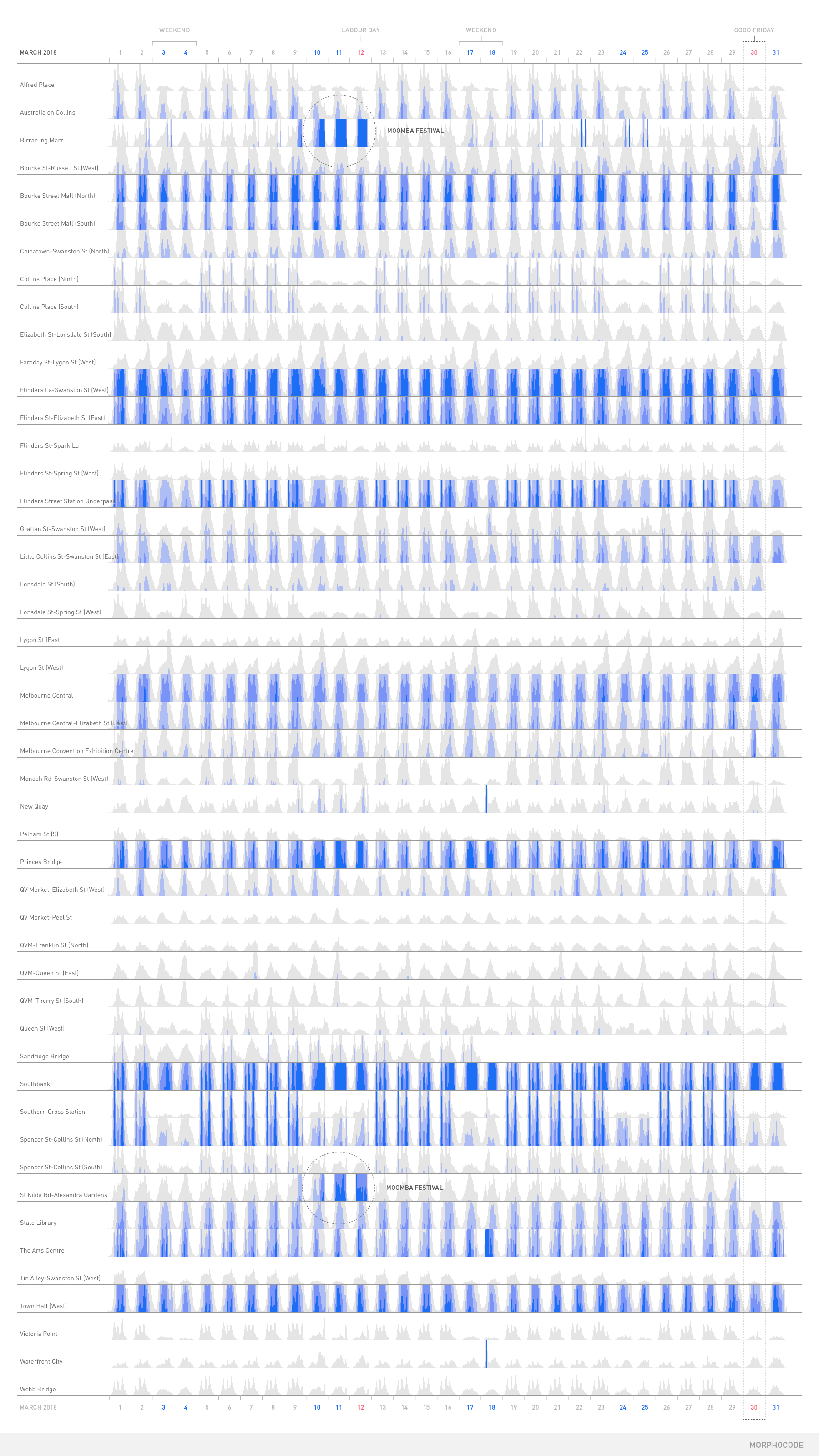
Horizon charts are a great way to compare data across multiple locations. They provide an overview effect of the data and preserve resolution at lower heights. This allows us to plot more data on less space and to compare effectively multiple data sources in a single view.
In this example, we’ve used our custom d3 plugin called d3-horizon-charts to visualize data from all sensors for an entire month. Each horizontal band represents a single location and allows us to observe the pulse of the place throughout the month of March 2018. We can detect right away unusual spikes related to public events, as well as flat curves during national holidays. This data visualization shows a month in the public life of Melbourne.
Upcoming course: Urban data analysis and visualization
We are currently working on our next video course dedicated to urban data analysis and visualization. Subscribe in the form below to learn more about the course.
Readings
1. Aigner, W. et al. (2007). Visualizing Time-Oriented Data – A Systematic View. Computers & Graphics,. June, 31(3), p. 401-409
2. Aigner, W. et al. (2011). Visualization of time-oriented data, p.59. Berlin: Springer.
3. Bettini, C. et al. (1998). A glossary of time granularity concepts. In Proceedings of Temporal Databases: Research and Practice, 406–413. Berlin: Springer‐Verlag. in the series Lecture Notes in Computer Science, Vol. 1399
4. Hajnicz, E. (1996). Time Structures. Formal Description and Algorithmic Representation. Lecture Notes in Artificial Intelligence, vol. 1047. Springer, Berlin, Heidelberg
5. Robbins, N. B. 2008. Introduction to cycle plots. Perceptual Edge Visual Business Intelligence Newsletter January
6. Tominski, C. et al. (2017). Images of Time: Visual Representations of Time-Oriented Data. in Black, A.; Lund, O.; Walker, S.(eds): Information Design: Research and Practice, p.34, Routledge, 2017, ISBN: 9780415786324
7. Whyte, W.H. (1980). The social life of small urban spaces.
Mapping Urban Data
We have launched our first video course Mapping Urban Data. It contains 30 carefully organized and beautifully illustrated videos that will lay a solid foundation for your mapping skills.
Learn More

