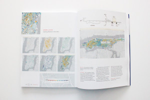
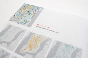
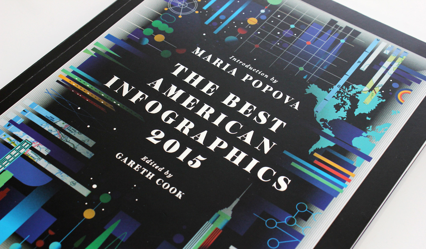
We are extremely happy to be included in the The Best American Infographics. The third volume in the series captures the finest visual representations of data from the last year. Our project Urban Layers has been selected among the top 10 interactive infographics in the book and is featured in the “Interactive” section curated by Simon Rogers — Data Editor at Google and founder of the Guardian Datablog.
Under the vigilant editing of Pulitzer Prize-winning journalist, Gareth Cook and with a thoughtful introduction from Brain Pickings’ mastermind, Maria Popova, the book is already a bestseller. It features a great variety of works on topics, from sports and cinema to drones, health and politics, organized in four sections. The diversity of topics, visual techniques and approaches to information design makes the book just as suitable for a genuine curious mind as for design professionals.
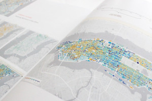
Urban Layers is an interactive visualization that we published an year ago. The project allows you to navigate through historical layers of Manhattan’s built environment, revealing hidden patterns and preserved fragments. The visualization was featured on CityLab, FastCodesign, gizmodo, curbedNY and was selected by Google Maps Mania among the Top 100 maps of 2014.
The Best American Infographics 2015
In March, Gareth Cook approached us with the news that Urban Layers was selected among the Best American infographics of 2015. The full selection in the “special interactive section” of the book features works by The New York Times Graphics Department, the Washington Post and Fathom.
“I chose these works because it felt to me that each illustrated some of the new approaches, from the established media houses to the newest of the new.”
Simon Rogers
Here is a short overview of the 10 best interactive infographics as they appear in the book:
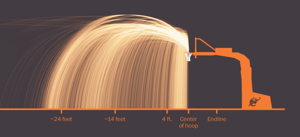
The Wizards’ shooting stars
Authors: Todd Lindeman and Lazaro Gamio — Washington Post
The Wizards’ shooting stars is a visual data analysis of the team’s shooting performance. The visualization makes a statistical breakdown of how well each player shoots from various distances and illustrates how data metrics can improve scoring efficiency.
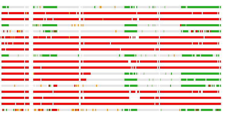
Inside the Firewall
Authors: Sisi Wei, Lena Groeger, Mike Tigas and Yue Qiu — ProPublica
Inside the Firewall tracks the news censorship in China. The website-blocking policy used by the Chinese government is often referred as the “Great Firewall of China”.

The colors of motion
Author: Charlie Clark
This interactive infographic explores the use of color in moving images, with a focus on film. The average color of each frame is extracted and presented as an interactive poster.

Urban Layers
Authors: Greta Dimitrova and Kiril Mandov — Morphocode
Urban Layers explores the structure of Manhattan’s urban fabric and lets you navigate through historical fragments of the city. The visualization allows you to interact with more than 45 000 buildings directly in the browser.
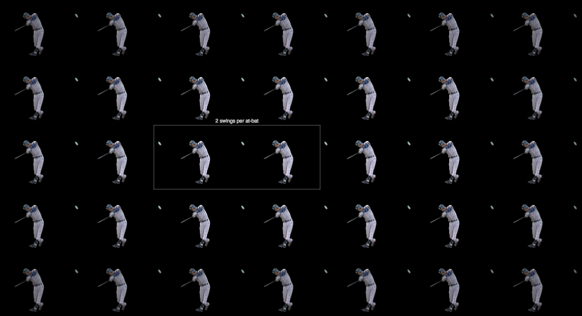
A Career at Bat
Authors: Shan Carter, Joe Ward and David Waldstein — New York Times
A Career at Bat is an interactive visualization answers the question “How many times had Derek Jeter swung a baseball bat in his professional career?”.
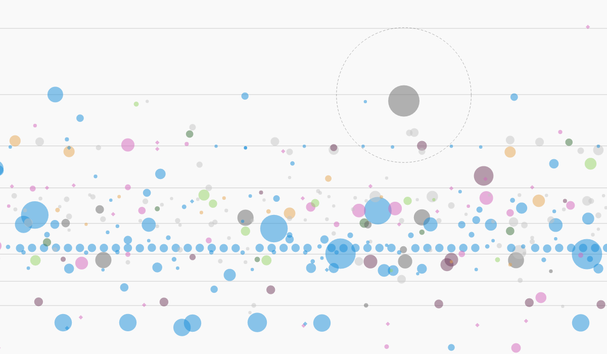
A map of Every Satellite
Authors: David Yanofsky and Tim Fernholz — Quartz
This interactive graphic allows the reader to sort and explore the entire satellite ecosystem, from milk-carton-size microsats to school-bus-sized spy satellites.

A day in the life of a Taxi
Author: Chris Whong
This web infographic animates the route and activities of a single random New York City taxicab over a single day. The animation shows pickups and drop-offs, passengers, approximate routes traveled, and fares earned.
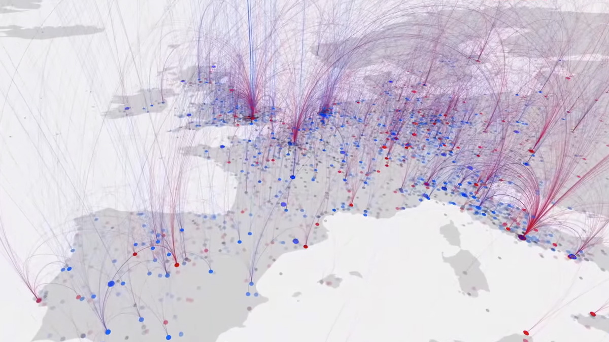
Born Here, Died There
Authors: Maximilian Schich, Mauro Martino, Kerri Smith, Charlotte Stoddart — Nature
This video animation tracks over 100.000 births and deaths, showing where and when notable people were born and where they died. The visualization identifies intellectual hotspots and tracks how empires rise and crumble throughout history.
What the world eats
Authors: Xaquín González Veira, Jason Treat, John Kondis, Alex Stegmaier — National Geographic / Fathom
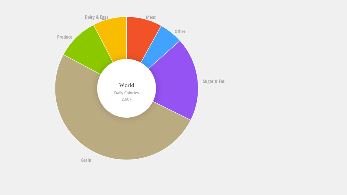
This graphic shows country-by-country patterns of food consumption and how they change over time. The results, based on data from the UN’s Food and Agriculture Organization, demonstrate trends and tell interesting stories.

NYC Henge
Authors: Andrew Hill, Sergio Alvarez and Javier Arce — CartoDB
NYCHenge is an interactive map that allows the viewer to explore the angle of the setting sun for any evening of the year and see what streets in New York City align with that sunset.
Thanks
We would like to thank Gareth Cook — for reaching out and starting this amazing series and Simon Rogers — for appreciating our work and placing it in the top ten interactive infographics of the year!

Learn more
The Best American Infographics was published in October this year. You can find it on on Amazon, B&N, BAM and Indiebound.
More information about Urban Layers can be found in the post “The Making of Urban Layers“. We are currently working on our long-awaited video course Data & the City that will discuss how to find, analyze and visualize spatial data to better understand urban dynamics. More on that in Morphocode Academy!


