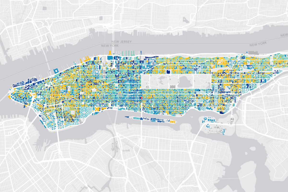
Urban Layers is an interactive map created by Morphocode that explores Manhattan’s urban fabric. The project uses some of the latest mapping technologies to visualize more than 45 000 buildings.
In this article, we will share with you some of the technical details behind the project.
The Data
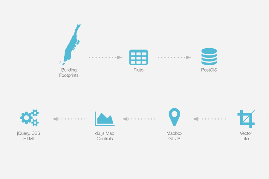
Urban Layers is based on two data sets: PLUTO and the Building Footprints dataset.
PLUTO contains various information about each building in NYC: year built, height, borough, etc. It was released to the public in 2013 and is considered a huge win for the open data community.
The building footprints are available as a shape file from the NYC Open Data portal. The file was imported into a PostGIS database using Shp2pgsql.
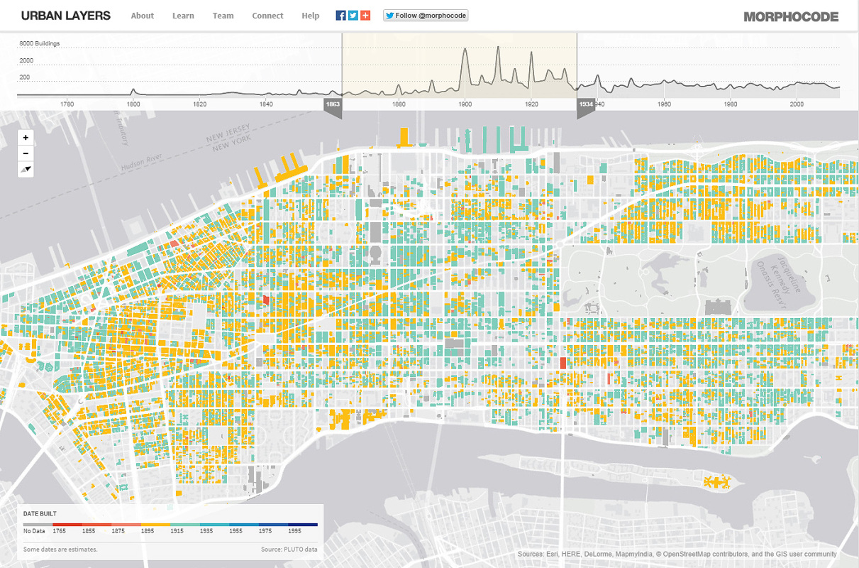
Each building footprint is then matched to a row in PLUTO by using the BBL field (a combination of Boro code, Block and Lot). This approach allows us to find the ‘year built’ for more than 98% of the footprints. For the rest of the buildings, the year of construction is not specified. They are coloured in gray on the map.
The “year built” data is not entirely accurate. Some of the dates are estimates. There are also dates that seem to be wrong.
Choosing the right Platform
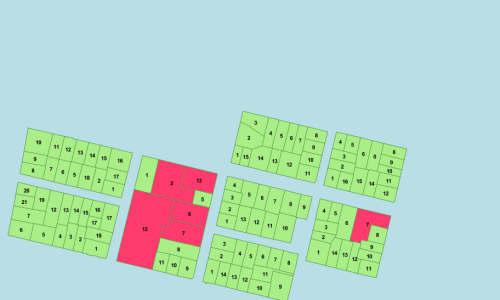
There are more than 1 000 000 buildings in NYC. This prooved to be too much to display at once. So we selected only the buildings that are located in Manhattan. That alone makes 45 968 buildings.
This presents multiple challenges for the implementation: how to draw so many polygons and how to control what is visible and what is not with the help of a slider.
There are several standard technical solutions: Raster map tiles, SVGs and canvas.
Raster map tiles are good for static maps. They can provide basic mouse-over interactivity through the use of UTFGrids. Since the GIS data is pre-rendered – there’s no way to control individual GIS features separately in the browser. The only option is to rebuild the raster tiles and while this may work in some scenarios, it was not applicable here.
SVGs empower D3.js and Leaflet.js. We’ve converted the building footprints to GeoJSON and used Leaflet’s vector layers to show them on the map. Although this solution worked, the performance wasn’t good enough. It was taking too much time to draw the polygons and pan the map.
Canvas usually provides good performance. Leaflet.js can render to a canvas. There are also a couple of plug-ins, such as Sumbera’s Leaflet Canvas Overlay. CartoDB have successfully used canvas in their popular Torque library. Up until recently, this would have been the natural choice. Things changed when Mapbox announced their latest project – Mapbox GL for Web.
Using Mapbox GL
Mapbox GL JS is still a young technology but it already seems very promising. The performance is great, since it is based on WebGL.
Mapbox GL uses vector data both for storage and rendering. It’s vector all the way down.
The GIS data is stored as vector.pbf – an optimized file format based on Protocol Buffers. Combined with the powerful webgl renderer, it provides great flexibility. The GIS features can be filtered and styled on the fly in the browser.
A Vector Source is used to load the buildings from a set of vector tiles. A couple of tileJson files are used to configure the data sources and the stylesheet.
The Downside is that Mapbox-gl-js is currently supported only in Chrome and Firefox on the desktop. IE11+ support is coming.
Web Development
The web layout was built using Bootstrap. JQuery was used to glue all components together.
d3.js was used to draw the Graph that shows when were current buildings of Manhattan built.
The X axis represents the year of construction, while the Y axis shows the number of buildings.
The Sliders based on jQuery Draggable, allow you to isolate only buildings built during the selected time frame.
The color palette is based on colors from colorbrewer.
The map legend was built using advice from Chris Amico.
Intro.js was used for the introductory tutorial.
The Basemap is provided by Esri.
Learn More
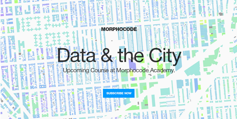
“Data and the City: Urban Visualizations” is an upcoming course at Morphocode Academy. The course will discuss how to find, store and visualize urban data.
The course will be available to subscribers of Morphocode Academy.

Thanks for the great post! I love seeing how you put this together.
I wonder why you included jQuery in your toolbox, given the overlap with D3’s functionality? Was there a particular feature that was more easily or better implemented with jQuery?
Hi AJ,
We wanted to have the slider thumbs overlay the map. That was kind of tricky with d3 because the whole svg has to overlay the map to get that effect. So we’ve used jQ draggable and it worked.
Looking back now it seems like using jQ Draggable for the thumbs is an overkill. It would be better indeed to have the thumbs built as part of the d3 graph.
Hope that answers the question 🙂
Best Regards,
Morphocode
Awesome work, thanks for sharing it and the information behind. Looking forward to do the course for my thesis work soon.
Best regards e cheers from Brazil,
Eric Palmeira