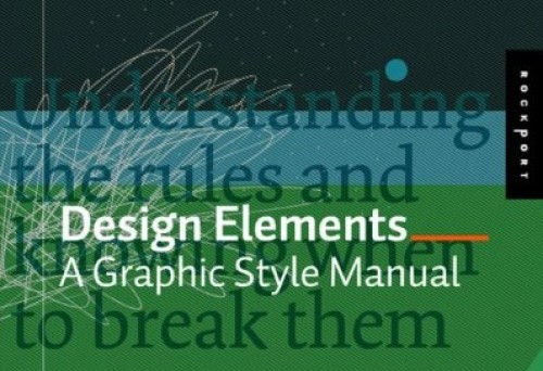
Graphic design and architecture share a lot of similar characteristics. Especially when looking for solution of compositional problems( spatial or planar)
We are posting few quotes from the book Design Elements: A Graphic Style Manual
by Timothy Samara to give a proof:
“Take a look at everything, from the big picture down to the tiniest detail, and ask yourself: “Does everything relate harmoniously to everything else?””
“Being universal is the domain of the designer. A very large audience not a few people who are “in the know” has to know what you mean with those shapes, that color, and that image you chose.”
“Create contrasts in density and rhythm by pulling some material closer together and pushing other material further apart. Be rhytmic about it. Give the spaces between things a pulse by making some tighter and some looser unless, of course, you’re trying to make something dull, lifeless, and uninteresting.”
“Controlling the eye’s movement through, and creating harmonic relationships among, form elements….might be facilitated by creating a system of recognizable, repeated intervals to which both positive and negative elements adhere.”


Грабна ме! Интересува ме дали имате книжката, защото ако е така, ще се радвам да дочета горезапочнатото от вас!
Поздрави 🙂
Pingback: “Универсални принципи на дизайн” | MORPHOCODE / BLOG