Context
In 2007, the global urban population reached the 50% threshold and for the first time in history exceeded the global rural population. The same year, the first iPhone was released and set the tone for a smartphone revolution that changed the way we experience, navigate and interact with our immediate urban environment. We are now living in increasingly data-rich environments where open data platforms allow us to access, collect and analyse information about the city. As urban sensors become more and more ubiquitous and spatial information even more abundant, data vizualisation allows a critical evaluation of active policies and city services by transforming otherwise hidden patterns into visual arguments.
The amount of data generated by our daily activities and interactions will increase persistently, as digital devices continue to permeate our lives. And while we use those devices as a central access point to information, the data we generate on a daily basis — either directly or as a by-product of our social activities — is often associated with contextual meta-information about location, usage and people. In other words, data gives a valuable insight into both our social interactions and the environment that staged those interactions. Furthermore there is a strong tendency to open data repositories that were once locked within government agencies. Open access to information, as well as the emergence of low-cost or free analysis web tools, allows citizens to look for patterns in government activity or to use data analysis to advocate for change.
We refer to the process of making urban data visible, accessible and actionable as Data Urbanism.
Data Urbanism suggests an iterative approach to urban planning that starts with harnessing the potential of open spatial data by enabling hands-on interaction with it and transfoming the invisible bits into a coherent exploratory mechanism.
Cities: The Global Urban Transition
The trends of urbanization differ across the globe. In 2014, Latin America and the Caribbean and Northern America had the highest levels of urbanization, at or above 80%. Europe remains in third place with 73% of its population currently living in urban areas and is expected to reach 80% urban by 2050. Between now and 2050, 90% of the expected increase in the world’s urban population will take place in the urban areas of Africa and Asia [1]. In other words, the projected urban growth will be concentrated in cities in the developing world where the correlation of the rate of urbanization with economic growth has been weaker. Expansion of urban areas is also on average twice as fast as urban population with significant consequences for greenhouse gas emissions and climate change [2].
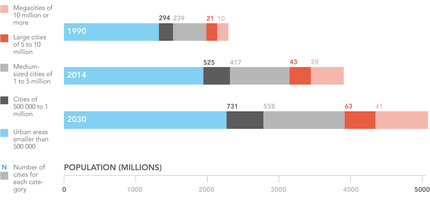
Above: Global urban population growth. Data Source: United Nations, World Urbanization Prospects: The 2014 Revision. Image by Morphocode.
Cities were once defined by Jane Jacobs as “problems in organized complexity”. Today, they are seen as engines of innovation and growth on a global scale which explains the general shift in urban planning thought from problems of equity to problems of efficiency [3]. But the problems of cities go beyond mere benchmarking of sustainability indicators. Social and economic issues in cities are what planners call “wicked problems”. Due to their complexity, they remain computationally intractable and cannot be solved in a top-down fashion by a central planner regardless the amount of data available [4].
Above: Global urban population growth is propelled by the growth of cities of all sizes. Data Source: United Nations, World Urbanization Prospects: The 2014 Revision. Image by Morphocode.
As rapid urbanization and advances in ICT are shaping the course of contemporary culture and society, the “Smart City” agenda is also gaining momentum. Focused mainly on issues of efficiency and optimal performance, this vision of the city suggests that every human action is quantifiable and therefore predictable. A technocratic take on urban governance that often fails to acknowledge the wider social effects of culture and politics shaping the complexities of urban life. Aside from transforming our cities into optimal systems and turning data into a huge commodity market, the smart tech sector has fewer things to say about the importance of civic engagement.
Making Data Visible, Accessible and Actionable
Data science can be understood in terms of seven stages: acquire, parse, filter, mine, represent, refine, and interact [5]. The first step, acquire, is associated with an open data release. This is a critical stage allowing civic hackers and data journalists to harness the revelatory power of data repositories. The other six steps, however, remain an impossible leap for the average citizen. These steps are strongly associated with the practice of citizen-centered design.[6]
In the best case scenario open data is first released in machine readable format, say a .csv file or a .json file. Even then it is rarely usable by the majority of citizens as making sense of it requires a certain amount of technical skills. Few people, even within the city administration, are capable of transforming data repositories into visual elements of spatio-temporal order. This is where the open data movement is still in its infacy. And as we fail to reveal the full potential of open data, more people fail to recognize it as an integral part of their rights as citizens. In order to bridge the gap between open data and civic society data should be made visible, accessible and actionable for a variety of audiences.
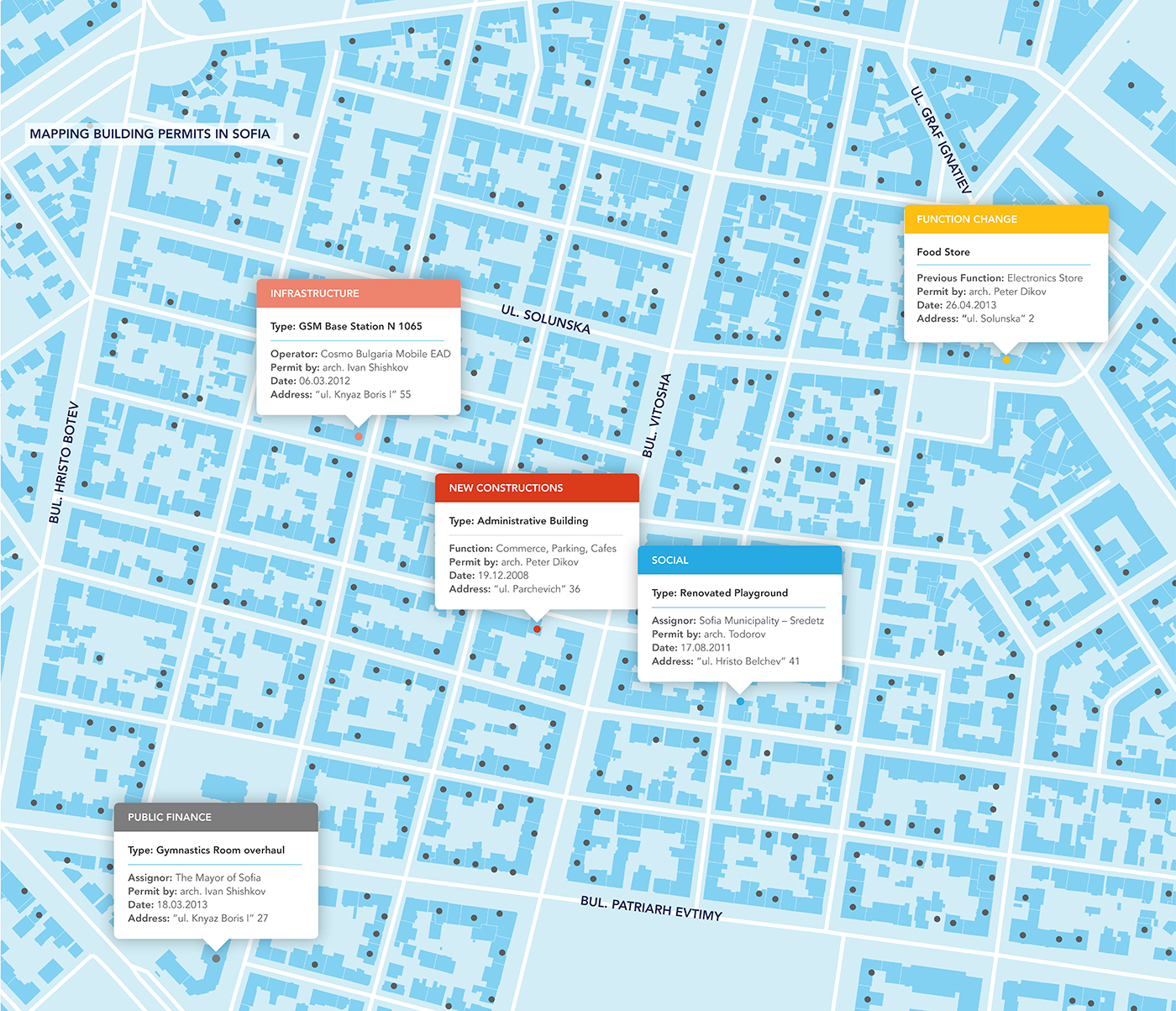
Above: Mapping building permits in Sofia. Image by Morphocode
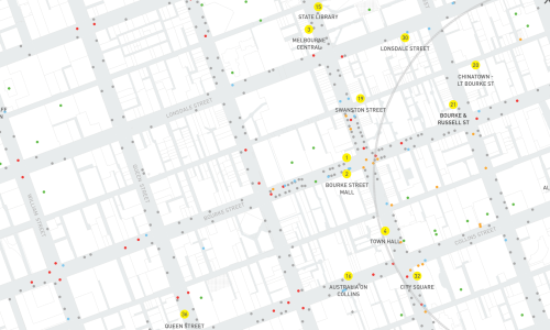
Public data is often locked behind proprietary web interfaces. This prevents the re-use of data and stops citizens from exploring, interacting with and making sense of available datasets. This is the case of the Building Permits in Sofia – a public register that keeps track of all recent building permits issued by the municipality of Sofia. While the data is publicly accessible, it is impossible to download or export it in a machine readable format. The raw data is essentially locked behind a single access point – the clunky interface of the web application. This prevents the re-use of data to create maps and visualizations; to ask questionts and search for answers in the data. As we mapped and visualized this single dataset a variety of questions, concerning the built environment emerged: How is the urban landscape changing and what trends are expected in the years to come?; What are the dynamics of local businesses? How often does public space renovation happen around the city? How is public money spent? etc. (More updates on this project soon).
Data Visualization: Revealing Urban Insights
When Scottish engineer and economist William Playfair invented graphical statistics in the end of the 18th century, no one assumed the impact they would have on modern information design. His early attempts to analyse data from England’s import-export statistics at that time are exemplary for their visual literacy and simplicity. The foundations of graphic representation: line graphs; bar charts of economic data; pie charts and circle graphs – all originated at that time and still remain some of the basic elements of data visualization. More recently the rise of data journalism has brought a new light to the importance of information graphics in contemporary culture, where reading habits are shaped by the ubiquity of digital devices. Collecting data is important, but what’s even more important is connecting them to a specific context and revealing networks of interdependencies. And the best way to convey this type of information is through means of visual communication.
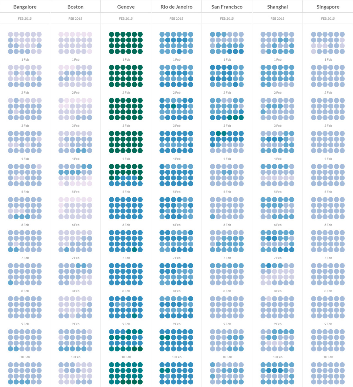
Above: Visualizing pollution patterns. The data is collected from various sensors deployed in 7 cities around the globe and is part of the Data Canvas initiative. Visit project
Visualizing urban data is a critical task as cities continue to dominate global concerns about climate change, economic prosperity and social equity. Interactive visualizations reveal how cities perform and how people interact with the urban environment by exposing the underlying logic of demographic processes, mobility patterns and digitalized daily transactions. In that sense they are the key to maximizing data efficiency and upgrading urban governance to a more open and agile model. As we strive for more compact, connected and coordinated urban growth, visualizing the dynamics of urban processes becomes both an integral part of city governance and an instrument for civic engagement. Urban data has been explored widely across the globe and the resulting outcomes differ in scale and type: from large scale projects for real-time observation such as the IBM Intelligent Operation Center in Rio de Janeiro, to interactive urban dashboards, mobile applications and hackathons.
In all cases the main challenges for generating dialogue through urban data visualizations consist of choosing the right type of visual strategy and achieving high standarts for data accuracy.
References:
1. United Nations, Department of Economic and Social Affairs, Population Division (2014). World Urbanization Prospects: The 2014 Revision, Highlights (ST/ESA/SER.A/352).
2. IPCC, 2014: Climate Change 2014: Mitigation of Climate Change. Contribution of Working Group III to the Fifth Assessment Report of the Intergovernmental Panel on Climate Change [Edenhofer, O., R. Pichs-Madruga, Y. Sokona, E. Farahani, S. Kadner, K. Seyboth, A. Adler, I. Baum, S. Brunner, P. Eickemeier, B. Kriemann, J. Savolainen, S. Schlömer, C. von Stechow, T.Zwickel and J.C. Minx (eds.)]. Cambridge University Press, Cambridge, United Kingdom and New York, NY, USA.
3. Batty, M. (2012). Lecture: Smart Cities & Big Data How We Can Make Cities More Resilient[PDF]. University University College College Dublin
4. Bettencourt, L.M.A. (2013) The Kind of Problem a City is. Santa Fe institute Working Paper. Paper #: 2013-03-008.
5. Fry, B. (2004). Computational Information Design. PhD Thesis, Massachusetts Institute of Technology.
6. Harrel, C.(2013). The Beginning of a Beautiful Friendship: Data and Design in Innovative Citizen Experiences. In Goldstein, B. and Dyson, L.(Eds.). Beyond Transparency: Open Data and the Future of Civic Innovation. San Francisco, CA. Code for America Press.